Basic Syntax Overview
With a basic understanding of the ArkTS language, let's look into the composition of ArkTS through an example. As shown below, when the user clicks the button, the text content changes from Hello World to Hello ArkUI.
Figure 1 Example effect drawing

In this example, the basic composition of ArkTS is as follows.
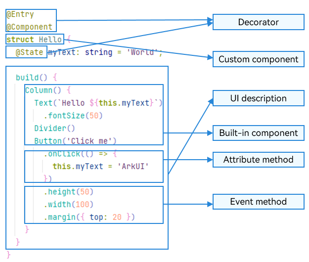
Figure 2 Basic composition of ArkTS
NOTE
The name of a custom variable cannot be the same as that of any universal attribute or event.
-
Decorator: design pattern used to decorate classes, structs, methods, and variables to assign special meanings to them. In the preceding sample code, @Entry, @Component, and @State are decorators. @Component indicates a custom component, @Entry indicates that the custom component is an entry component, and @State indicates a state variable in the component, whose change will trigger the UI to re-render.
-
UI description: declarative description of the UI structure, such as the code block of the build() method.
-
Custom component: reusable UI unit, which can be used with other components, such as the struct Hello decorated by @Component.
-
Built-in component: default basic or container component preset in ArkTS, which can be directly invoked, such as <Column>, <Text>, <Divider>, and <Button> components in the sample code.
-
Attribute method: method used to configure component attributes, such as fontSize(), width(), height(), and backgroundColor(). You can configure multiple attributes of a component in method chaining mode.
-
Event method: method used to add the logic for a component to respond to an event. In the sample code, onClick() following Button is an event method. You can configure response logic for multiple events in method chaining mode.
-
For details about how to use built-in components, attribute methods, and event methods, see ArkTS-based Declarative Development Paradigm.
ArkTS extends multiple syntax paradigms to make development a more enjoyable experience.
-
@Builder/@BuilderParam: special method for encapsulating UI descriptions. It enables UI descriptions to be encapsulated and reused in a fine-grained manner.
-
@Extend/@Styles: decorator that extends built-in components and encapsulates attribute styles to combine built-in components more flexibly.
-
stateStyles: polymorphic style, which can be set based on the internal state of the component.