Text
The <Text> component is used to display a piece of textual information.
NOTE
This component is supported since API version 7. Updates will be marked with a superscript to indicate their earliest API version.
Child Components
This component can contain the <Span> and <ImageSpan> child components.
APIs
Text(content?: string | Resource)
Since API version 9, this API is supported in ArkTS widgets.
Parameters
| Name | Type | Mandatory | Description |
|---|---|---|---|
| content | string | Resource | No | Text content. The content and style set for the <Text> component do not take effect when it contains the <Span> child component. Default value: ' ' |
Attributes
In addition to the universal attributes and universal text attributes, the following attributes are supported.
| Name | Type | Description |
|---|---|---|
| textAlign | TextAlign | Horizontal alignment mode of the text. Default value: TextAlign.Start NOTE The text takes up the full width of the <Text> component. To set vertical alignment for the text, use the align attribute. The align attribute alone does not control the horizontal position of the text. In other words, Alignment.TopStart, Alignment.Top, and Alignment.TopEnd produce the same effect, top-aligning the text; Alignment.Start, Alignment.Center, and Alignment.End produce the same effect, centered-aligning the text vertically; Alignment.BottomStart, Alignment.Bottom, and Alignment.BottomEnd produce the same effect, bottom-aligning the text. Yet, it can work with the textAlign attribute to jointly determine the horizontal position of the text. When textAlign is set to TextAlign.JUSTIFY, the text in the last line is horizontally aligned with the start edge. Since API version 9, this API is supported in ArkTS widgets. |
| textOverflow | {overflow: TextOverflow} | Display mode when the text is too long. Default value: {overflow: TextOverflow.Clip} NOTE Text is clipped at the transition between words. To clip text in the middle of a word, add \u200B between characters. If overflow is set to TextOverflow.None, TextOverflow.Clip, or TextOverflow.Ellipsis, this attribute must be used with maxLines for the settings to take effect. TextOverflow.None produces the same effect as TextOverflow.Clip. If overflow is set to TextOverflow.MARQUEE, the text scrolls in a line, and neither maxLines nor copyOption takes effect. In this case, the <ImageSpan> component is not supported, and textAlign takes effect only when the text is not scrollable. Since API version 9, this API is supported in ArkTS widgets. |
| maxLines | number | Maximum number of lines in the text. NOTE By default, text is automatically folded. If this attribute is specified, the text will not exceed the specified number of lines. If there is extra text, you can use textOverflow to specify how it is displayed. Since API version 9, this API is supported in ArkTS widgets. |
| lineHeight | string | number | Resource | Text line height. If the value is less than or equal to 0, the line height is not limited and the font size is adaptive. If the value of the number type, the unit fp is used. Since API version 9, this API is supported in ArkTS widgets. |
| decoration | { type: TextDecorationType, color?: ResourceColor } |
Style and color of the text decorative line. Default value: { type: TextDecorationType.None, color: Color.Black } Since API version 9, this API is supported in ArkTS widgets. |
| baselineOffset | number | string | Baseline offset of the text. The default value is 0. Since API version 9, this API is supported in ArkTS widgets. NOTE If this attribute is set to a percentage, the default value is used. |
| letterSpacing | number | string | Letter spacing. Since API version 9, this API is supported in ArkTS widgets. NOTE If this attribute is set to a percentage, the default value is used. If this attribute is set to a negative value, the text is compressed. A negative value too large may result in the text being compressed to 0 and no content being displayed. |
| minFontSize | number | string | Resource | Minimum font size. For the setting to take effect, this attribute must be used together with maxFontSize and maxLines, or layout constraint settings. It has no effect on child components. When the adaptive font size is used, the fontSize settings do not take effect. Since API version 9, this API is supported in ArkTS widgets. |
| maxFontSize | number | string | Resource | Maximum font size. For the setting to take effect, this attribute must be used together with minFontSize and maxLines, or layout constraint settings. It has no effect on child components. When the adaptive font size is used, the fontSize settings do not take effect. Since API version 9, this API is supported in ArkTS widgets. |
| textCase | TextCase | Text case. Default value: TextCase.Normal Since API version 9, this API is supported in ArkTS widgets. |
| copyOption9+ | CopyOptions | Whether copy and paste is allowed. Default value: CopyOptions.None This API is supported in ArkTS widgets. NOTE When this attribute is set to CopyOptions.InApp or CopyOptions.LocalDevice, a long press on the text will display a context menu that offers the copy and select-all options. |
| draggable | boolean | Drag effect of the selected text. This attribute cannot be used with the onDragStart event. It must be used together with copyOption. When it is set to true and copyOptions is set to CopyOptions.InApp or CopyOptions.LocalDevice, the selected text can be dragged and copied to the text box. Default value: false NOTE This API is supported since API version 9. |
| textShadow10+ | ShadowOptions | Text shadow. |
| heightAdaptivePolicy10+ | TextHeightAdaptivePolicy | How the adaptive height is determined for the text. Default value: TextHeightAdaptivePolicy.MAX_LINES_FIRST NOTE When this attribute is set to TextHeightAdaptivePolicy.MAX_LINES_FIRST, the maxLines attribute takes precedence for adjusting the text height. If the maxLines setting results in a layout beyond the layout constraints, the text will shrink to a font size between minFontSize and maxFontSize to allow for more content to be shown.When this attribute is set to TextHeightAdaptivePolicy.MIN_FONT_SIZE_FIRST, the minFontSize attribute takes precedence for adjusting the text height. If the text can fit in one line with the minFontSize setting, the text will enlarge to the largest possible font size between minFontSize and maxFontSize. When this attribute is set to TextHeightAdaptivePolicy.LAYOUT_CONSTRAINT_FIRST, the layout constraints take precedence for adjusting the text height. If the resultant layout is beyond the layout constraints, the text will shrink to a font size between minFontSize and maxFontSize to respect the layout constraints. If the layout still exceeds the layout constraints after the font size is reduced to minFontSize, the lines that exceed the layout constraints are deleted. |
| textIndent10+ | number | string | Indentation of the first line. Default value: 0 |
| font10+ | Font | Text style, covering the font size, font width, Font family, and font style. |
NOTE
The <Text> component cannot contain both text and the child component <Span> or <ImageSpan>. If both of them exist, only the content in <Span> or <ImageSpan> is displayed.
For the <Text> component, the default value of the universal attribute clip is true, which means that the content outside of the component's content area is clipped. To display the content in full, set clip to false.
The typesetting engine rounds down the value of width to ensure that the value is an integer. If the typesetting engine rounds up the value instead, the right side of the text may be clipped.
Events
The universal events are supported.
Example
Example 1
// xxx.ets
@Entry
@Component
struct TextExample1 {
build() {
Flex({ direction: FlexDirection.Column, alignItems: ItemAlign.Start, justifyContent: FlexAlign.SpaceBetween }) {
// Set the horizontal alignment mode for the text.
// Single-line text
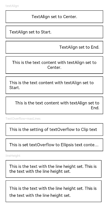
Text('textAlign').fontSize(9).fontColor(0xCCCCCC)
Text('TextAlign set to Center.')
.textAlign(TextAlign.Center)
.fontSize(12)
.border({ width: 1 })
.padding(10)
.width('100%')
Text('TextAlign set to Start.')
.textAlign(TextAlign.Start)
.fontSize(12)
.border({ width: 1 })
.padding(10)
.width('100%')
Text('TextAlign set to End.')
.textAlign(TextAlign.End)
.fontSize(12)
.border({ width: 1 })
.padding(10)
.width('100%')
// Multi-line text
Text('This is the text content with textAlign set to Center.')
.textAlign(TextAlign.Center)
.fontSize(12)
.border({ width: 1 })
.padding(10)
.width('100%')
Text('This is the text content with textAlign set to Start.')
.textAlign(TextAlign.Start)
.fontSize(12)
.border({ width: 1 })
.padding(10)
.width('100%')
Text('This is the text content with textAlign set to End.')
.textAlign(TextAlign.End)
.fontSize(12)
.border({ width: 1 })
.padding(10)
.width('100%')
// Set the display mode when the text is too long.
Text('TextOverflow+maxLines').fontSize(9).fontColor(0xCCCCCC)
// Clip the text when the value of maxLines is exceeded.
Text('This is the setting of textOverflow to Clip text content This is the setting of textOverflow to None text content. This is the setting of textOverflow to Clip text content This is the setting of textOverflow to None text content.')
.textOverflow({ overflow: TextOverflow.Clip })
.maxLines(1)
.fontSize(12)
.border({ width: 1 })
.padding(10)
// Show an ellipsis (...) when the value of maxLines is exceeded.
Text('This is set textOverflow to Ellipsis text content This is set textOverflow to Ellipsis text content.'.split('')
.join('\u200B'))
.textOverflow({ overflow: TextOverflow.Ellipsis })
.maxLines(1)
.fontSize(12)
.border({ width: 1 })
.padding(10)
Text('lineHeight').fontSize(9).fontColor(0xCCCCCC)
Text('This is the text with the line height set. This is the text with the line height set.')
.fontSize(12).border({ width: 1 }).padding(10)
Text('This is the text with the line height set. This is the text with the line height set.')
.fontSize(12).border({ width: 1 }).padding(10)
.lineHeight(20)
}.height(600).width(350).padding({ left: 35, right: 35, top: 35 })
}
}
Example 2
@Entry
@Component
struct TextExample2 {
build() {
Flex({ direction: FlexDirection.Column, alignItems: ItemAlign.Start, justifyContent: FlexAlign.SpaceBetween }) {
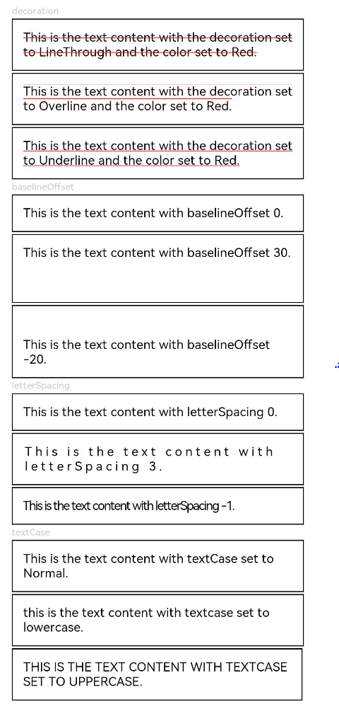
Text('decoration').fontSize(9).fontColor(0xCCCCCC)
Text('This is the text content with the decoration set to LineThrough and the color set to Red.')
.decoration({
type: TextDecorationType.LineThrough,
color: Color.Red
})
.fontSize(12)
.border({ width: 1 })
.padding(10)
.width('100%')
Text('This is the text content with the decoration set to Overline and the color set to Red.')
.decoration({
type: TextDecorationType.Overline,
color: Color.Red
})
.fontSize(12)
.border({ width: 1 })
.padding(10)
.width('100%')
Text('This is the text content with the decoration set to Underline and the color set to Red.')
.decoration({
type: TextDecorationType.Underline,
color: Color.Red
})
.fontSize(12)
.border({ width: 1 })
.padding(10)
.width('100%')
// Set the text baseline offset.
Text('baselineOffset').fontSize(9).fontColor(0xCCCCCC)
Text('This is the text content with baselineOffset 0.')
.baselineOffset(0)
.fontSize(12)
.border({ width: 1 })
.padding(10)
.width('100%')
Text('This is the text content with baselineOffset 30.')
.baselineOffset(30)
.fontSize(12)
.border({ width: 1 })
.padding(10)
.width('100%')
Text('This is the text content with baselineOffset -20.')
.baselineOffset(-20)
.fontSize(12)
.border({ width: 1 })
.padding(10)
.width('100%')
// Set the letter spacing.
Text('letterSpacing').fontSize(9).fontColor(0xCCCCCC)
Text('This is the text content with letterSpacing 0.')
.letterSpacing(0)
.fontSize(12)
.border({ width: 1 })
.padding(10)
.width('100%')
Text('This is the text content with letterSpacing 3.')
.letterSpacing(3)
.fontSize(12)
.border({ width: 1 })
.padding(10)
.width('100%')
Text('This is the text content with letterSpacing -1.')
.letterSpacing(-1)
.fontSize(12)
.border({ width: 1 })
.padding(10)
.width('100%')
Text('textCase').fontSize(9).fontColor(0xCCCCCC)
Text('This is the text content with textCase set to Normal.')
.textCase(TextCase.Normal)
.fontSize(12)
.border({ width: 1 })
.padding(10)
.width('100%')
// Display the text in lowercase.
Text('This is the text content with textCase set to LowerCase.')
.textCase(TextCase.LowerCase)
.fontSize(12)
.border({ width: 1 })
.padding(10)
.width('100%')
// Display the text in uppercase.
Text('This is the text content with textCase set to UpperCase.')
.textCase(TextCase.UpperCase)
.fontSize(12).border({ width: 1 }).padding(10)
}.height(700).width(350).padding({ left: 35, right: 35, top: 35 })
}
}
Example 3
@Entry
@Component
struct TextExample {
build() {
Column({ space: 8 }) {
// Set the text shadow.
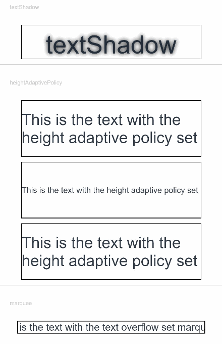
Text('textShadow').fontSize(9).fontColor(0xCCCCCC).margin(15).width('90%')
Text('textShadow')
.width('80%')
.height(55)
.fontSize(40)
.lineHeight(55)
.textAlign(TextAlign.Center)
.textShadow({ radius: 10, color: Color.Black, offsetX: 0, offsetY: 0 })
.borderWidth(1)
Divider()
// Set how the adaptive height is determined for the text.
Text('heightAdaptivePolicy').fontSize(9).fontColor(0xCCCCCC).margin(15).width('90%')
Text('This is the text with the height adaptive policy set')
.width('80%')
.height(90)
.borderWidth(1)
.minFontSize(10)
.maxFontSize(30)
.maxLines(3)
.textOverflow({ overflow: TextOverflow.Ellipsis })
.heightAdaptivePolicy(TextHeightAdaptivePolicy.MAX_LINES_FIRST)
Text('This is the text with the height adaptive policy set')
.width('80%')
.height(90)
.borderWidth(1)
.minFontSize(10)
.maxFontSize(30)
.maxLines(3)
.textOverflow({ overflow: TextOverflow.Ellipsis })
.heightAdaptivePolicy(TextHeightAdaptivePolicy.MIN_FONT_SIZE_FIRST)
Text('This is the text with the height adaptive policy set')
.width('80%')
.height(90)
.borderWidth(1)
.minFontSize(10)
.maxFontSize(30)
.maxLines(3)
.textOverflow({ overflow: TextOverflow.Ellipsis })
.heightAdaptivePolicy(TextHeightAdaptivePolicy.LAYOUT_CONSTRAINT_FIRST)
Divider()
// Set the text to continuously scroll when text overflow occurs.
Text('marquee').fontSize(9).fontColor(0xCCCCCC).margin(15).width('90%')
Text('This is the text with the text overflow set marquee')
.width(300)
.borderWidth(1)
.textOverflow({ overflow: TextOverflow.MARQUEE })
}
}
}