渐变样式
组件普遍支持的在style或css中设置的 可以平稳过渡两个或多个指定的颜色。
说明:
从API Version 8 开始支持。后续版本如有新增内容,则采用上角标单独标记该内容的起始版本。
开发框架支持线性渐变 (linear-gradient)和重复线性渐变 (repeating-linear-gradient)两种渐变效果。
线性渐变/重复线性渐变
使用渐变样式,需要定义过渡方向和过渡颜色。
过渡方向
通过direction或者angle指定过渡方向。
-
direction:进行方向渐变。
-
angle:进行角度渐变。
background: linear-gradient(direction/angle, color, color, ...);
background: repeating-linear-gradient(direction/angle, color, color, ...);
过渡颜色
支持以下四种方式:#ff0000、#ffff0000、rgb(255, 0, 0)、rgba(255, 0, 0, 1),需要指定至少两种颜色。
参数:
| 名称 | 类型 | 默认值 | 必填 | 描述 |
|---|---|---|---|---|
| direction | to <side-or-corner> <side-or-corner> = [left | right] || [top | bottom] | to bottom (由上到下渐变) | 否 | 指定过渡方向,如:to left (从右向左渐变) ,或者to bottom right (从左上角到右下角)。 |
| angle | <deg> | 180deg | 否 | 指定过渡方向,以元素几何中心为坐标原点,水平方向为X轴,angle指定了渐变线与Y轴的夹角(顺时针方向)。 |
| color | <color> [<length>|<percentage>] | - | 是 | 定义使用渐变样式区域内颜色的渐变效果。 |
示例:
-
默认渐变方向为从上向下渐变。
#gradient {
  height: 300px;
  width: 600px;
  /* 从顶部开始向底部由红色向绿色渐变 */
  background: linear-gradient(red, #00ff00);
}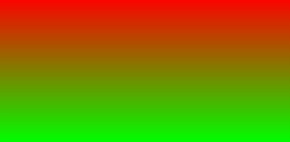
-
45度夹角渐变。
/* 45度夹角,从红色渐变到绿色 */
  background: linear-gradient(45deg, rgb(255, 0, 0),rgb(0, 255, 0));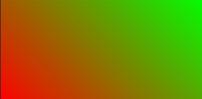
-
设置方向从左向右渐变。
/* 从左向右渐变,在距离左边90px和距离左边360px (600*0.6) 之间270px宽度形成渐变 */
background: linear-gradient(to right, rgb(255, 0, 0) 90px, rgb(0, 255, 0) 60%);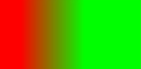
-
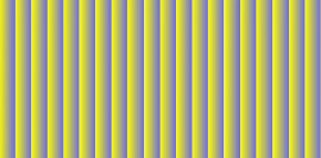
重复渐变。
  /* 从左向右重复渐变,重复渐变区域30px(60-30)透明度0.5 */
  background: repeating-linear-gradient(to right, rgba(255, 255, 0, 1) 30vp,rgba(0, 0, 255, .5) 60vp);