slider
NOTE
This component is supported since API version 4. Updates will be marked with a superscript to indicate their earliest API version.
The <slider> component is used to quickly adjust settings, such as the volume and brightness.
Child Components
Not supported
Attributes
In addition to the universal attributes, the following attributes are supported.
| Name | Type | Default Value | Mandatory | Description |
|---|---|---|---|---|
| min | number | 0 | No | Minimum value of the slider. |
| max | number | 100 | No | Maximum value of the slider. |
| step | number | 1 | No | Step of each slide. |
| value | number | 0 | No | Initial value of the slider. |
| mode5+ | string | outset | No | Slider style. Available values are as follows: - outset: The slider is on the slider track. - inset: The slider is in the slider track. |
| showsteps5+ | boolean | false | No | Whether to display slider scales. |
| showtips5+ | boolean | false | No | Whether a tooltip is displayed to show the percentage value on the slider. |
Styles
In addition to the universal styles, the following styles are supported.
| Name | Type | Default Value | Mandatory | Description |
|---|---|---|---|---|
| color | <color> | #19000000 | No | Background color of the slider. |
| selected-color | <color> | #ff007dff | No | Selected color of the slider. |
| block-color | <color> | #ffffff | No | Slider color. |
Events
In addition to the universal events, the following events are supported.
| Name | Parameter | Description |
|---|---|---|
| change | ChangeEvent | Triggered when the value changes. |
Table 1 ChangeEvent
| Attribute | Type | Description |
|---|---|---|
| value5+ | number | Current value of the slider. |
| mode5+ | string | Type of the change event. Available values are as follows: - start: The value starts to change. - move: The value is changing with users' dragging. - end: The value stops changing. - click: The value changes upon a touch on the slider. |
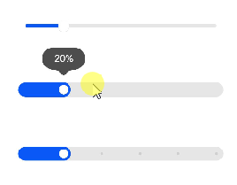
Example
<!-- xxx.hml -->
<div class="container">
    <slider min="0" max="100" value="{{ value }}" mode="outset" showtips="true"></slider>
    <slider class="" min="0" max="100" value="{{ value }}" step="20" mode="inset"  showtips="true"></slider>
    <slider class="" min="0" max="100" value="{{ value }}" showsteps="true" step="20" mode="inset"  showtips="false"></slider>
</div>
/* xxx.css */
.container {
    flex-direction: column;
    justify-content: center;
    align-items: center;
}
slider{
    margin-top: 100px;
}