Basics
The <svg> component is used as the root node of the SVG canvas and can be nested in the SVG. For details, see svg.
NOTE
The width and height must be defined for the <svg> parent component or <svg> component. Otherwise, the component is not drawn.
Creating an <svg> Component
Create a <svg> component in the .hml file under pages/index.
<!-- xxx.hml -->
<div class="container">
  <svg width="400" height="400">  </svg>
</div>
/* xxx.css */
.container{
  width: 100%;
  height: 100%;
  flex-direction: column;
  align-items: center;
  justify-content: center;
  background-color: #F1F3F5;
}
svg{
  background-color: blue;
}

Setting Attributes
Set the width, height, x, y, and viewBox attributes to define the width, height, X coordinate, Y coordinate, and SVG viewport of the <svg> component.
<!-- xxx.hml -->
<div class="container">
  <svg width="400" height="400" viewBox="0 0 100 100">
    <svg class="rect" width="100" height="100" x="20" y="10">
    </svg>
  </svg>
</div>
/* xxx.css */
.container{
  width: 100%;
  height: 100%;
  flex-direction: column;
  align-items: center;
  justify-content: center;
  background-color: #F1F3F5;
}
svg{
  background-color: yellow;
}
.rect{
  background-color: red;
}
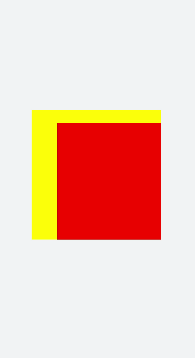
NOTE
If the <svg> component is the root node, the X-axis and Y-axis attributes are invalid.
If the width and height of viewBox are inconsistent with those of the <svg> component, the view box will be scaled in center-aligned mode.