ListItem
The <ListItem> component displays specific items in the list. It must be used together with <List>.
NOTE
This component is supported since API version 7. Updates will be marked with a superscript to indicate their earliest API version.
Child Components
This component can contain a single child component.
APIs
Since API version 9, this API is supported in ArkTS widgets.
ListItem10+
ListItem(value?: ListItemOptions)
Parameters
| Name | Type | Mandatory | Description |
|---|---|---|---|
| value | ListItemOptions | No | Value of the list item, containing the style parameter of the ListItemStyle enum type. |
ListItem(deprecated)
ListItem(value?: string)
This API is deprecated since API version 10. You are advised to use ListItem10+ instead.
Parameters
| Name | Type | Mandatory | Description |
|---|---|---|---|
| value | string | No | N/A |
Attributes
In addition to the universal attributes, the following attributes are supported.
| Name | Type | Description |
|---|---|---|
| sticky(deprecated) | Sticky | Sticky effect of the list item. Default value: Sticky.None This attribute is deprecated since API version 9. You are advised to use the sticky attribute of the <List> component instead. |
| editable(deprecated) | boolean | EditMode | Whether to enter editing mode, where the list item can be deleted or moved. This API is deprecated since API version 9. There is no substitute API. Default value: false |
| selectable8+ | boolean | Whether the current list item is selectable by mouse drag. NOTE This attribute takes effect only when mouse frame selection is enabled for the parent <List> container. Default value: true |
| selected10+ | boolean | Whether the list item is selected. This attribute supports $$ for two-way binding of variables. NOTE This attribute must be used before the style for the selected state is set. Otherwise, the style settings will not take effect. Default value: false |
| swipeAction9+ | { start?: CustomBuilder | SwipeActionItem, end?:CustomBuilder | SwipeActionItem, edgeEffect?: SwipeEdgeEffect, } |
Swipe action displayed when the list item is swiped out from the screen edge. - start: swipe action displayed on the left of the list item when the item is swiped right (in vertical list layout) or above the list item when the item is swiped down (in horizontal list layout). - end: swipe action displayed on the right of the list item when the item is swiped left (in vertical list layout) or below the list item when the item is swiped up (in horizontal list layout). - edgeEffect: scroll effect. NOTE - The top level of the @builder function corresponding to start and end must be a single component and cannot be an if/else, ForEach, or LazyForEach statement. - The swipe gesture works only in the list item area. If a swipe causes a child component to extend beyond the list item area, the portion outside the area does not respond to the swipe. In light of this, avoid setting swipeAction to a component too wide in a multi-column list. |
Sticky(deprecated)
This API is deprecated since API version 9. You are advised to use the stickyStyle enum of the <List> component instead.
| Name | Value | Description |
|---|---|---|
| None | 0 | The list item is not sticky. |
| Normal | 1 | The list item is sticky with no special effects. |
| Opacity | 2 | The list item is sticky with opacity changes. |
EditMode(deprecated)
This API is deprecated since API version 9. There is no substitute API.
| Name | Value | Description |
|---|---|---|
| None | 0 | The editing operation is not restricted. |
| Deletable | 1 | The list item can be deleted. |
| Movable | 2 | The list item can be moved. |
SwipeEdgeEffect9+
| Name | Value | Description |
|---|---|---|
| Spring | 0 | When the list item scrolls to the edge of the list, it can continue to scroll for a distance. If the delete area is set, the list item can continue to scroll after the scroll distance exceeds the delete threshold and, after being released, rebound following the spring curve. |
| None | 1 | The list item cannot scroll beyond the edge of the list. If the delete area is set, the list item cannot continue to scroll after the scroll distance exceeds the delete threshold. If the delete callback is set, it is triggered when the delete threshold is reached and the list item is released. |
SwipeActionItem10+
Describes the swipe action item.
For a list in vertical layout, it refers to the delete option displayed on the left (or right) of the list item when the list item is swiped right (or left).
For a list in horizontal layout, it refers to the delete option displayed below (or above) the list item when the list item is swiped up (or down).
| Name | Type | Mandatory | Description |
|---|---|---|---|
| actionAreaDistance | Length | No | Swipe distance threshold for deleting the list item. Default value: 56vp NOTE This parameter cannot be set in percentage. If the value is greater than the list item width minus the width of swipeAction, or is less than or equal to 0, the delete area will not be set. |
| onAction | () => void | No | Callback invoked when the list item is released while in the delete area. NOTE This callback is invoked only when the list item is released in a position that meets or goes beyond the specified swipe distance threshold (which must be valid) for deleting the list item. |
| onEnterActionArea | () => void | No | Callback invoked each time the list item enters the delete area. |
| onExitActionArea | () => void | No | Callback invoked each time the list item exits the delete area. |
| builder | CustomBuilder | No | Swipe action item displayed when the list item is swiped left or right (in vertical list layout) or up or down (in horizontal list layout). |
ListItemOptions10+
| Name | Type | Mandatory | Description |
|---|---|---|---|
| style | ListItemStyle | No | Style of the list item. Default value: ListItemStyle.NONE If this parameter is set to ListItemStyle.NONE, no style is applied. If this parameter is set to ListItemStyle.CARD, the default card style is applied, but only when ListItemGroupStyle.CARD is set for <ListItemGroup>. In the default card style, the list item has a 48 vp height and 100% width. It can be in focus, hover, press, selected, or disable style depending on the state. NOTE In the default card style, the list has its listDirection attribute fixed at Axis.Vertical and alignListItem attribute at ListItemAlign.Center. If ListItemStyle.CARD is set and ListItemGroupStyle.CARD is not, only some card styles and functions are available. |
ListItemStyle10+
| Name | Value | Description |
|---|---|---|
| NONE | 0 | No style. |
| CARD | 1 | Default card style. |
Events
| Name | Description |
|---|---|
| onSelect(event: (isSelected: boolean) => void)8+ | Triggered when the selected state of the <ListItem> changes. isSelected: Returns true if the <ListItem> is selected by mouse drag; returns false otherwise. |
Example
Example 1
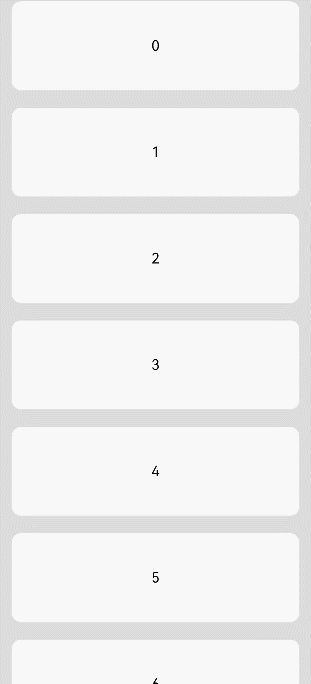
// xxx.ets
@Entry
@Component
struct ListItemExample {
  private arr: number[] = [0, 1, 2, 3, 4, 5, 6, 7, 8, 9]

  build() {
    Column() {
      List({ space: 20, initialIndex: 0 }) {
        ForEach(this.arr, (item: number) => {
          ListItem() {
            Text('' + item)
              .width('100%')
              .height(100)
              .fontSize(16)
              .textAlign(TextAlign.Center)
              .borderRadius(10)
              .backgroundColor(0xFFFFFF)
          }
        }, (item: string) => item)
      }.width('90%')
      .scrollBar(BarState.Off)
    }.width('100%').height('100%').backgroundColor(0xDCDCDC).padding({ top: 5 })
  }
}
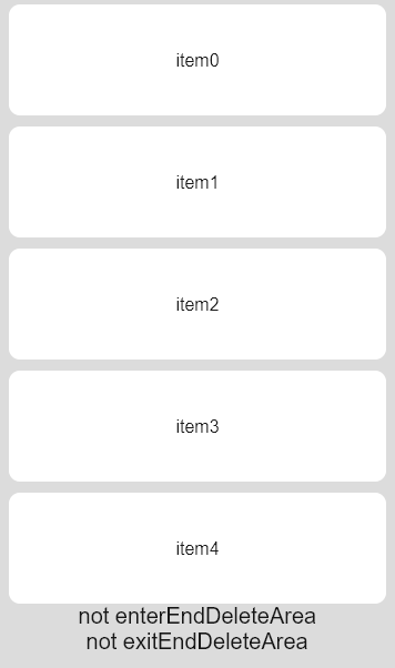
Example 2
// xxx.ets
@Entry
@Component
struct ListItemExample2 {
  @State arr: number[] = [0, 1, 2, 3, 4]
  @State enterEndDeleteAreaString: string = "not enterEndDeleteArea"
  @State exitEndDeleteAreaString: string = "not exitEndDeleteArea"

  @Builder itemEnd() {
    Row() {
      Button("Delete").margin("4vp")
      Button("Set").margin("4vp")
    }.padding("4vp").justifyContent(FlexAlign.SpaceEvenly)
  }

  build() {
    Column() {
      List({ space: 10 }) {
        ForEach(this.arr, (item: number) => {
          ListItem() {
            Text("item" + item)
              .width('100%')
              .height(100)
              .fontSize(16)
              .textAlign(TextAlign.Center)
              .borderRadius(10)
              .backgroundColor(0xFFFFFF)
          }
          .transition({ type: TransitionType.Delete, opacity: 0 })
          .swipeAction({
            end: {
              builder: () => { this.itemEnd() },
              onAction: () => {
                animateTo({ duration: 1000 }, () => {
                  let index = this.arr.indexOf(item)
                  this.arr.splice(index, 1)
                })
              },
              actionAreaDistance: 56,
              onEnterActionArea: () => {
                this.enterEndDeleteAreaString = "enterEndDeleteArea"
                this.exitEndDeleteAreaString = "not exitEndDeleteArea"
              },
              onExitActionArea: () => {
                this.enterEndDeleteAreaString = "not enterEndDeleteArea"
                this.exitEndDeleteAreaString = "exitEndDeleteArea"
              }
            }
          })
        }, (item: string) => item)
      }
      Text(this.enterEndDeleteAreaString).fontSize(20)
      Text(this.exitEndDeleteAreaString).fontSize(20)
    }
    .padding(10)
    .backgroundColor(0xDCDCDC)
    .width('100%')
    .height('100%')
  }
}
Example 3
// xxx.ets
@Entry
@Component
struct ListItemExample3 {
  build() {
    Column() {
      List({ space: "4vp", initialIndex: 0 }) {
        ListItemGroup({ style: ListItemGroupStyle.CARD }) {
          ForEach([ListItemStyle.CARD, ListItemStyle.CARD, ListItemStyle.NONE], (itemStyle: number, index?: number) => {
            ListItem({ style: itemStyle }) {
              Text("" + index)
                .width("100%")
                .textAlign(TextAlign.Center)
            }
          })
        }
        ForEach([ListItemStyle.CARD, ListItemStyle.CARD, ListItemStyle.NONE], (itemStyle: number, index?: number) => {
          ListItem({ style: itemStyle }) {
            Text("" + index)
              .width("100%")
              .textAlign(TextAlign.Center)
          }
        })
      }
      .width('100%')
      .multiSelectable(true)
      .backgroundColor(0xDCDCDC)
    }
    .width('100%')
    .padding({ top: 5 })
  }
}
