@ohos.arkui.advanced.Dialog (Dialog Box)
The dialog box is a modal window that commands attention while retaining the current context. It is frequently used to draw the user's attention to vital information or prompt the user to complete a specific task. As all modal windows, this component requires the user to interact before exiting.
NOTE
This component is supported since API version 10. Updates will be marked with a superscript to indicate their earliest API version.
Modules to Import
import { TipsDialog, SelectDialog, ConfirmDialog, AlertDialog, LoadingDialog } from '@ohos.arkui.advanced.Dialog'
Child Components
Not supported
Attributes
The universal attributes are not supported.
TipsDialog
TipsDialog({controller: CustomDialogController, imageRes: Resource, imageSize: SizeOptions, title: ResourceStr, content?: ResourceStr, checkTips?: ResourceStr, ischecked?: boolean, primaryButton?: ButtonOptions, secondaryButton?: ButtonOptions})
Displays an image-attached confirmation dialog box. If necessary, the confirmation dialog box can be displayed in a graphical manner.
Decorator type: @CustomDialog
System capability: SystemCapability.ArkUI.ArkUI.Full
Parameters
| Name | Type | Mandatory | Decorator | Description |
|---|---|---|---|---|
| controller | CustomDialogController | Yes | - | Dialog box controller. |
| imageRes | Resource | Yes | - | Image to be displayed. |
| imageSize | SizeOptions | Yes | - | Image size. |
| title | ResourceStr | Yes | - | Title of the dialog box. |
| content | ResourceStr | No | - | Content of the dialog box. |
| checkTips | ResourceStr | No | - | Content of the check box. |
| isChecked | boolean | No | @Prop | Whether to select the check box. The value true means to select the checkbox , and false means the opposite. Default value: false |
| primaryButton | ButtonOptions | No | - | Left button of the dialog box. |
| secondaryButton | ButtonOptions | No | - | Right button of the dialog box. |
SelectDialog
SelectDialog({controller: CustomDialogController, title: ResourceStr, content?: ResourceStr, selectedIndex?: number, confirm?: ButtonOptions, radioContent: Array<SheetInfo>})
Displays a dialog box from which the user can select options presented in a list or grid.
Decorator type: @CustomDialog
System capability: SystemCapability.ArkUI.ArkUI.Full
Parameters
| Name | Type | Mandatory | Description |
|---|---|---|---|
| controller | CustomDialogController | Yes | Dialog box controller. |
| title | ResourceStr | Yes | Title of the dialog box. |
| content | ResourceStr | No | Content of the dialog box. |
| selectedIndex | number | No | Index of the selected option in the dialog box. Default value: -1 |
| confirm | ButtonOptions | No | Button at the bottom of the dialog box. |
| radioContent | Array<SheetInfo> | Yes | List of subitems in the dialog box. You can set text and a select callback for each subitem. |
ConfirmDialog
ConfirmDialog({controller: CustomDialogController, title: ResourceStr, content?: ResourceStr, checkTips?: ResourceStr, ischecked?: boolean, primaryButton?: ButtonOptions, secondaryButton?: ButtonOptions})
Displays an error dialog box that informs the user of an operational error (for example, a network error or low battery level) or an incorrect operation (for example, fingerprint enrollment).
Decorator type: @CustomDialog
System capability: SystemCapability.ArkUI.ArkUI.Full
Parameters
| Name | Type | Mandatory | Decorator | Description |
|---|---|---|---|---|
| controller | CustomDialogController | Yes | - | Controller of the dialog box. |
| title | ResourceStr | Yes | - | Title of the dialog box. |
| content | ResourceStr | No | - | Content of the dialog box. |
| checkTips | ResourceStr | No | - | Content of the check box. |
| isChecked | boolean | No | @Prop | Whether to select the check box. The value true means to select the checkbox , and false means the opposite. Default value: false |
| primaryButton | ButtonOptions | No | - | Left button of the dialog box. |
| secondaryButton | ButtonOptions | No | - | Right button of the dialog box. |
AlertDialog
AlertDialog({controller: CustomDialogController, content: ResourceStr, primaryButton?: ButtonOptions, secondaryButton?: ButtonOptions})
Displays an alert dialog box to prompt the user to confirm an action that is irreversible and may cause serious consequences, such as deletion, reset, editing cancellation, and stop.
Decorator type: @CustomDialog
System capability: SystemCapability.ArkUI.ArkUI.Full
Parameters
| Name | Type | Mandatory | Description |
|---|---|---|---|
| controller | CustomDialogController | Yes | Controller of the dialog box. |
| content | ResourceStr | Yes | Content of the dialog box. |
| primaryButton | ButtonOptions | No | Left button of the dialog box. |
| secondaryButton | ButtonOptions | No | Right button of the dialog box. |
LoadingDialog
LoadingDialog({controller: CustomDialogController, content?: ResourceStr})
Displays a loading dialog box to inform the user of the operation progress.
Decorator type: @CustomDialog
System capability: SystemCapability.ArkUI.ArkUI.Full
Parameters
| Name | Type | Mandatory | Description |
|---|---|---|---|
| controller | CustomDialogController | Yes | Controller of the dialog box. |
| content | ResourceStr | No | Content of the dialog box. |
ButtonOptions
System capability: SystemCapability.ArkUI.ArkUI.Full
| Name | Type | Mandatory | Description |
|---|---|---|---|
| value | ResourceStr | Yes | Content of the button. |
| action | () => void | No | Click event of the button. |
| background | ResourceColor | No | Background of the button. |
| fontColor | ResourceColor | No | Font color of the button. |
Events
The universal events are not supported.
Example
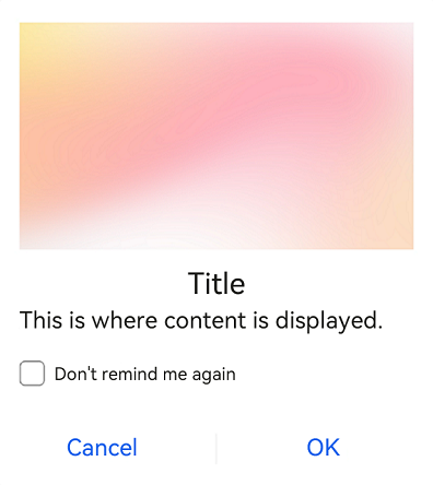
Example 1
import { TipsDialog } from '@ohos.arkui.advanced.Dialog'
@Entry
@Component
struct Index {
  isChecked = false;
  dialogControllerImage: CustomDialogController = new CustomDialogController({
    builder: TipsDialog({
      imageRes: $r('app.media.icon'),
      imageSize: { width: 100, height: 100 },
      title:'Title',
      content: 'This is where content is displayed.',
      isChecked: this.isChecked,
      checkTips:'Don't remind me again',
      primaryButton: {
        value: 'Cancel',
        action: () => {
          console.info('Callback when the CheckBox is clicked')
        },
      },
      secondaryButton: {
        value: 'OK',
        action: () => {
          console.info('Callback when the second button is clicked')
        }
      },
    }),
    autoCancel: true,
    customStyle: true,
    alignment: DialogAlignment.Bottom
  })

  build() {
    Row() {
      Stack() {
        Column(){
          Button ("Text Below Image")
            .width(96)
            .height(40)
            .onClick(() => {
              this.dialogControllerImage.open()
            })
          }.margin({bottom: 300})
        }.align(Alignment.Bottom)
        .width('100%').height('100%')
      }
     .backgroundImageSize({ width: '100%', height: '100%' })
     .height('100%')
   }
}
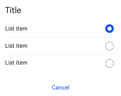
Example 2
import { SelectDialog } from '@ohos.arkui.advanced.Dialog'
@Entry
@Component
struct Index {
  radioIndex = 0;
  dialogControllerList: CustomDialogController = new CustomDialogController({
    builder: SelectDialog({
      title:'Title',
      selectedIndex: this.radioIndex,
      confirm: {
        value: 'Cancel',
        action: () => {},
      },
      radioContent: [
        {
          title: 'List item',
          action: () => {
            this.radioIndex = 0
          }
        },
        {
          title: 'List item',
          action: () => {
            this.radioIndex = 1
          }
        },
        {
          title: 'List item',
          action: () => {
            this.radioIndex = 2
          }
        },
      ]
    }),
    customStyle: true,
    alignment: DialogAlignment.Bottom,
    autoCancel: false
  })

  build() {
    Row() {
      Stack() {
        Column() {
          Button("List Dialog Box")
            .width(96)
            .height(40)
            .onClick(() => {
              this.dialogControllerList.open()
            })
        }.margin({ bottom: 300 })
      }.align(Alignment.Bottom)
      .width('100%').height('100%')
    }
    .backgroundImageSize({ width: '100%', height: '100%' })
    .height('100%')
  }
}
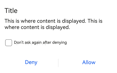
Example 3
import { ConfirmDialog } from '@ohos.arkui.advanced.Dialog'
@Entry
@Component
struct Index {
  isChecked = false;
  dialogControllerCheckBox: CustomDialogController = new CustomDialogController({
    builder: ConfirmDialog({
      title:'Title',
      content: 'This is where content is displayed. This is where content is displayed. ',
      isChecked: this.isChecked,
      checkTips:'Don't ask again after denying',
      primaryButton: {
        value: 'Deny',
        action: () => {},
      },
      secondaryButton: {
        value: 'Allow',
        action: () => {
          this.isChecked = false
          console.info('Callback when the second button is clicked')
        }
      },
    }),
    autoCancel: true,
    customStyle: true,
    alignment: DialogAlignment.Bottom
  })

  build() {
    Row() {
      Stack() {
        Column(){
          Button ("Text + Check Box Dialog Box")
            .width(96)
            .height(40)
            .onClick(() => {
              this.dialogControllerCheckBox.open()
            })
        }.margin({bottom: 300})
      }.align(Alignment.Bottom)
      .width('100%').height('100%')
    }
    .backgroundImageSize({ width: '100%', height: '100%' })
    .height('100%')
  }
}
Example 4
import { AlertDialog } from '@ohos.arkui.advanced.Dialog'
@Entry
@Component
struct Index {
dialogControllerConfirm: CustomDialogController = new CustomDialogController({
builder: AlertDialog({
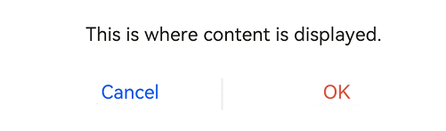
content: 'This is where content is displayed.',
primaryButton: {
value: 'Cancel',
action: () => {},
},
secondaryButton: {
value: 'OK',
fontColor: $r('sys.color.ohos_id_color_warning'),
action: () => {
console.info('Callback when the second button is clicked')
}
},
}),
autoCancel: true,
customStyle: true,
alignment: DialogAlignment.Bottom
})
build() {
Row() {
Stack() {
Column(){
Button("Text Dialog Box")
.width(96)
.height(40)
.onClick(() => {
this.dialogControllerConfirm.open()
})
}.margin({bottom: 300})
}.align(Alignment.Bottom)
.width('100%').height('100%')
}
.backgroundImageSize({ width: '100%', height: '100%' })
.height('100%')
}
}
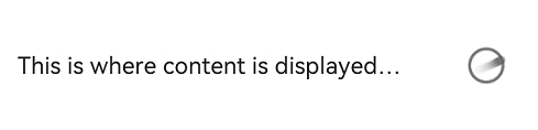
Example 5
import { LoadingDialog } from '@ohos.arkui.advanced.Dialog'
@Entry
@Component
struct Index {
  dialogControllerProgress: CustomDialogController = new CustomDialogController({
    builder: LoadingDialog({
      content: 'This is where content is displayed...',
    }),
    autoCancel: true,
    customStyle: true,
    alignment: DialogAlignment.Bottom
  })

  build() {
    Row() {
      Stack() {
        Column() {
          Button ("Progress Dialog Box")
            .width(96)
            .height(40)
            .onClick(() => {
              this.dialogControllerProgress.open()
            })
        }.margin({ bottom: 300 })
      }.align(Alignment.Bottom)
      .width('100%').height('100%')
    }
    .backgroundImageSize({ width: '100%', height: '100%' })
    .height('100%')
  }
}