Badge
A budge reminds users that the application has a request to be processed.
How to Use
-
Use badges on components such as bottom tabs, list items, toolbar icons, category icons in the content area, and avatars.
-
Use badges to mark new events that require users' attention in the application.
-
Do not abuse badges. If a user touches a marked item and the content is not as user expected, the user will lose interest in badges, resulting in a drop in the click-through rate.
Category
-
Dots
-
Numbers
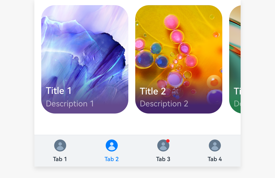 |
 |
|---|---|
| Dots | Numbers |
Dots
-
Dots mark minor events in applications and are usually displayed on bottom tabs, list items, toolbar icons, category icons in the content area, and avatars. A dot disappears after being touched.
-
When an event expires, the dot disappears.
-
When there is only text, the red dot is placed on the right of the text.
-
When there are an icon and text, the red dot is placed in the upper right corner of the icon.
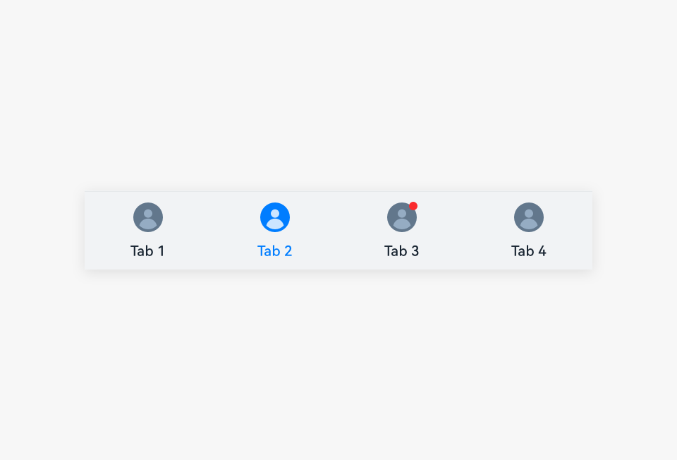 |
 |
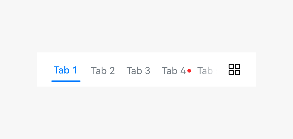 |
|---|---|---|
| Dot on an icon | Dot in a list | Dot on a subtab |
Numbers
-
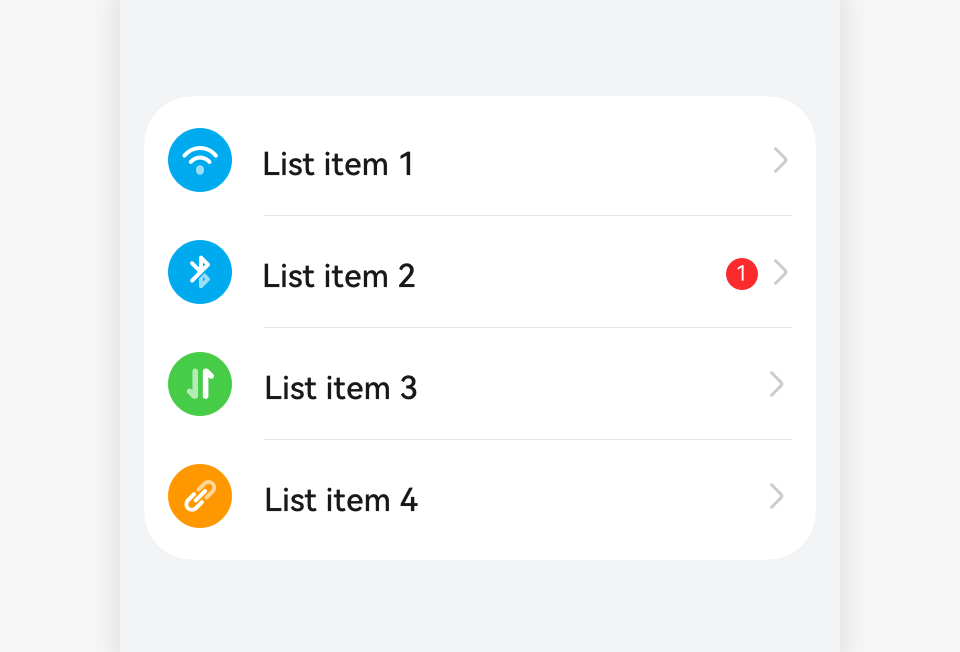
Numbers mark only major events in the applications. For example, if there are multiple types of events such as application update (major event) and promotional events in the application market, a number indicates the application update is displayed on the application icon on the home screen.
-
The number for System update in Settings corresponds to the number displayed on the Settings icon on the home screen.
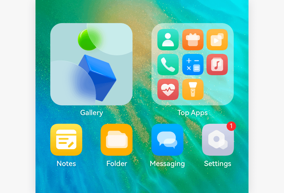 |
 |
|---|---|
| Number on an icon on the home screen | Number in a list |
-
The dot width is adaptive to the text width. The maximum number is 99+.

Resources
For details about the development guide related to the badge, see Badge.