ListItemGroup
The <ListItemGroup> component is used to display list item groups. It must be used with the <List> component and, if not otherwise specified, takes up the entire width of the <List>.
NOTE
This component is supported since API version 9. Updates will be marked with a superscript to indicate their earliest API version.
Usage Guidelines
If the listDirection attribute of the parent <List> component is set to Axis.Vertical, the height attribute of the <ListItemGroup> component is fixed at the sum of the component's header height, footer height, and total height of the list items. If the listDirection attribute of the parent <List> component is set to Axis.Horizontal, the width attribute of the <ListItemGroup> component is fixed at the sum of the component's header width, footer width, and total width of the list items.
The list items in the <ListItemGroup> component cannot be edited or dragged. That is, their editable attribute does not take effect.
Child Components
This component supports the <ListItem> child component.
APIs
ListItemGroup(options?: ListItemGroupOptions)
Parameters
| Name | Type | Mandatory | Description |
|---|---|---|---|
| options | ListItemGroupOptions | Yes | Parameters of the list item group. |
ListItemGroupOptions
| Name | Type | Mandatory | Description |
|---|---|---|---|
| header | CustomBuilder | No | Header of the list item group. NOTE Only one child component can be placed. |
| footer | CustomBuilder | No | Footer of the list item group. NOTE Only one child component can be placed. |
| space | number | string | No | Spacing between list items. This parameter is valid only between list items, but not between the header and list item or between the footer and list item. |
| style10+ | ListItemGroupStyle | No | Style of the list item group. Default value: ListItemGroupStyle.NONE If this parameter is set to ListItemGroupStyle.NONE, no style is applied. If this parameter is set to ListItemGroupStyle.CARD, the default card style is applied, but only when ListItemStyle.CARD is set for <ListItem>. In the default card style, list items can be in focus, hover, press, selected, or disable style depending on their state. NOTE In the default card style, the parent <List> component has its listDirection attribute fixed at Axis.Vertical and its alignListItem attribute defaulted at ListItemAlign.Center; the header and footer parameters cannot be set for the list item group. If ListItemGroupStyle.CARD is set and ListItemStyle.CARD is not, only some card styles and functions are available. |
Attributes
| Name | Type | Description |
|---|---|---|
| divider | { strokeWidth: Length, color?: ResourceColor, startMargin?: Length, endMargin?: Length } | null |
Style of the divider for the list items. By default, there is no divider. - strokeWidth: stroke width of the divider. - color: color of the divider. - startMargin: distance between the divider and the start of the list. - endMargin: distance between the divider and the end of the list. strokeWidth, startMargin, and endMargin cannot be set in percentage. |
ListItemGroupStyle10+
| Name | Value | Description |
|---|---|---|
| NONE | 0 | No style. |
| CARD | 1 | Default card style. |
NOTE
The <ListItemGroup> component does not support the universal attribute aspectRatio.
If the main axis of <ListItemGroup> runs in the vertical direction, the height setting does not take effect.
If the main axis of <ListItemGroup> runs in the horizontal direction, the width setting does not take effect.
Example
Example 1
// xxx.ets
@Entry
@Component
struct ListItemGroupExample {
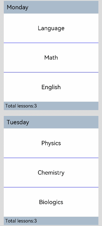
private timeTable: TimeTable[] = [
{
title: 'Monday',
projects: ['Language', 'Math', 'English']
},
{
title: 'Tuesday',
projects: ['Physics', 'Chemistry', 'Biologics']
},
{
title: 'Wednesday',
projects: ['History', 'Geography', 'Politics']
},
{
title: 'Thursday',
projects: ['Art', 'Music', 'Sports']
}
]
@Builder
itemHead(text: string) {
Text(text)
.fontSize(20)
.backgroundColor(0xAABBCC)
.width("100%")
.padding(10)
}
@Builder
itemFoot(num: number) {
Text(''Total lessons:'+ num")
.fontSize(16)
.backgroundColor(0xAABBCC)
.width("100%")
.padding(5)
}
build() {
Column() {
List({ space: 20 }) {
ForEach(this.timeTable, (item: TimeTable) => {
ListItemGroup({ header: this.itemHead(item.title), footer: this.itemFoot(item.projects.length) }) {
ForEach(item.projects, (project: string) => {
ListItem() {
Text(project)
.width("100%")
.height(100)
.fontSize(20)
.textAlign(TextAlign.Center)
.backgroundColor(0xFFFFFF)
}
}, (item: string) => item)
}
.divider ({ strokeWidth: 1,color:Color.Blue }) // Divider between lines
})
}
.width('90%')
.sticky(StickyStyle.Header | StickyStyle.Footer)
.scrollBar(BarState.Off)
}.width('100%').height('100%').backgroundColor(0xDCDCDC).padding({ top: 5 })
}
}
interface TimeTable {
title: string;
projects: string[];
}
Example 2
// xxx.ets
@Entry
@Component
struct ListItemGroupExample2 {
  private arr: ArrObject[] = [
    {
      style: ListItemGroupStyle.CARD,
      itemStyles: [ListItemStyle.CARD, ListItemStyle.CARD, ListItemStyle.CARD]
    },
    {
      style: ListItemGroupStyle.CARD,
      itemStyles: [ListItemStyle.CARD, ListItemStyle.CARD, ListItemStyle.NONE]
    },
    {
      style: ListItemGroupStyle.CARD,
      itemStyles: [ListItemStyle.CARD, ListItemStyle.NONE, ListItemStyle.CARD]
    },
    {
      style: ListItemGroupStyle.NONE,
      itemStyles: [ListItemStyle.CARD, ListItemStyle.CARD, ListItemStyle.NONE]
    }
  ]

  build() {
    Column() {
      List({ space: "4vp", initialIndex: 0 }) {
        ForEach(this.arr, (item: ArrObject, index?: number) => {
          ListItemGroup({ style: item.style }) {
            ForEach(item.itemStyles, (itemStyle: number, itemIndex?: number) => {
              ListItem({ style: itemStyle }) {
                if (index != undefined && itemIndex != undefined) {
                  Text("Item" + (itemIndex + 1) +" in group" + (index + 1) +" ")
                    .width("100%")
                    .textAlign(TextAlign.Center)
                }
              }
            }, (item: string) => item)
          }
        })
      }
      .width('100%')
      .multiSelectable(true)
      .backgroundColor(0xDCDCDC)
    }
    .width('100%')
    .padding({ top: 5 })
  }
}

interface ArrObject {
  style: number;
  itemStyles: number[];
}
