Divider
The <Divider> component is used to separate content blocks and elements.
NOTE
This component is supported since API version 7. Updates will be marked with a superscript to indicate their earliest API version.
Child Components
Not supported
APIs
Divider()
Since API version 9, this API is supported in ArkTS widgets.
Attributes
In addition to the universal attributes, the following attributes are supported.
| Name | Type | Description |
|---|---|---|
| vertical | boolean | Whether a vertical divider is used. false: A horizontal divider is used. true: A vertical divider is used. Default value: false Since API version 9, this API is supported in ArkTS widgets. |
| color | ResourceColor | Color of the divider. Default value: '#33182431' Since API version 9, this API is supported in ArkTS widgets. |
| strokeWidth | number | string | Width of the divider. Default value: 1px Unit: vp Since API version 9, this API is supported in ArkTS widgets. NOTE This attribute cannot be set to a percentage. The priority of this attribute is lower than that of the universal attribute height. If the value of this attribute is greater than that of the universal attribute, cropping is performed based on the universal attribute settings. |
| lineCap | LineCapStyle | Cap style of the divider. Default value: LineCapStyle.Butt Since API version 9, this API is supported in ArkTS widgets. |
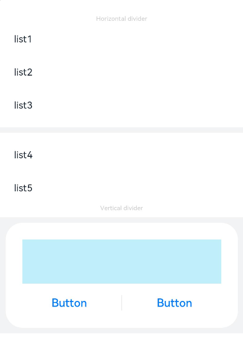
Example
// xxx.ets
@Entry
@Component
struct DividerExample {
  build() {
    Column() {
      // Use horizontal dividers.
      Text('Horizontal divider').fontSize(9).fontColor(0xCCCCCC)
      List() {
        ForEach([1, 2, 3], (item: number) => {
          ListItem() {
            Text('list' + item).width('100%').fontSize(14).fontColor('#182431').textAlign(TextAlign.Start)
          }.width(244).height(48)
        }, (item: number) => item.toString())
      }.padding({ left: 24, bottom: 8 })

      Divider().strokeWidth(8).color('#F1F3F5')
      List() {
        ForEach([4, 5], (item: number) => {
          ListItem() {
            Text('list' + item).width('100%').fontSize(14).fontColor('#182431').textAlign(TextAlign.Start)
          }.width(244).height(48)
        }, (item: number) => item.toString())
      }.padding({ left: 24, top: 8 })

      // Use vertical dividers.
      Text('Vertical divider').fontSize(9).fontColor(0xCCCCCC)
      Column() {
        Column() {
          Row().width(288).height(64).backgroundColor('#30C9F0').opacity(0.3)
          Row() {
            Button('Button')
              .width(136)
              .height(22)
              .fontSize(16)
              .fontColor('#007DFF')
              .fontWeight(500)
              .backgroundColor(Color.Transparent)
            Divider().vertical(true).height(22).color('#182431').opacity(0.6).margin({ left: 8, right: 8 })
            Button('Button')
              .width(136)
              .height(22)
              .fontSize(16)
              .fontColor('#007DFF')
              .fontWeight(500)
              .backgroundColor(Color.Transparent)
          }.margin({ top: 17 })
        }
        .width(336)
        .height(152)
        .backgroundColor('#FFFFFF')
        .borderRadius(24)
        .padding(24)
      }
      .width('100%')
      .height(168)
      .backgroundColor('#F1F3F5')
      .justifyContent(FlexAlign.Center)
      .margin({ top: 8 })
    }.width('100%').padding({ top: 24 })
  }
}