WaterFlow
The <WaterFlow> component is a container that consists of cells formed by rows and columns and arranges items of different sizes from top to bottom according to the preset rules.
NOTE
This component is supported since API version 9. Updates will be marked with a superscript to indicate their earliest API version.
Child Components
This component can contain the <FlowItem> child component.
NOTE
When its visibility attribute is set to None, a <FlowItem> is not displayed in the container, but its columnsGap, rowsGap, and margin settings are still effective.
APIs
WaterFlow(options?: WaterFlowOptions)
Parameters
| Name | Type | Mandatory | Description |
|---|---|---|---|
| options | WaterFlowOptions | Yes | Parameters of the <WaterFlow> component. |
WaterFlowOptions
| Name | Type | Mandatory | Description |
|---|---|---|---|
| footer | CustomBuilder | No | Footer of the <WaterFlow> component. |
| scroller | Scroller | No | Controller, which can be bound to scrollable components. NOTE The scroller cannot be bound to other scrollable components, such as <List>, <Grid>, or <Scroll>. |
Attributes
In addition to the universal attributes, the following attributes are supported.
| Name | Type | Description |
|---|---|---|
| columnsTemplate | string | Number of columns in the layout. If this attribute is not set, one column is used by default. For example, '1fr 1fr 2fr' indicates three columns, with the first column taking up 1/4 of the parent component's full width, the second column 1/4, and the third column 2/4. You can use columnsTemplate('repeat(auto-fill,track-size)') to automatically calculate the number of columns based on the specified column width track-size. repeat and auto-fill are keywords. The units for track-size can be px, vp (default), %, or a valid number. For details, see Example 2. Default value: '1fr' |
| rowsTemplate | string | Number of rows in the layout. If this attribute is not set, one row is used by default. For example, '1fr 1fr 2fr' indicates three rows, with the first row taking up 1/4 of the parent component's full height, the second row 1/4, and the third row 2/4. You can use rowsTemplate('repeat(auto-fill,track-size)') to automatically calculate the number of rows based on the specified row height track-size. repeat and auto-fill are keywords. The units for track-size can be px, vp (default), %, or a valid number. Default value: '1fr' |
| itemConstraintSize | ConstraintSizeOptions | Size constraints of the child components during layout. |
| columnsGap | Length | Gap between columns. Default value: 0 |
| rowsGap | Length | Gap between rows. Default value: 0 |
| layoutDirection | FlexDirection | Main axis direction of the layout. Default value: FlexDirection.Column |
| enableScrollInteraction10+ | boolean | Whether to support scroll gestures. When this attribute is set to false, scrolling by finger or mouse is not supported, but the scrolling controller API is not affected. Default value: true |
| nestedScroll10+ | NestedScrollOptions | Nested scrolling options. You can set the nested scrolling mode in the forward and backward directions to implement scrolling linkage with the parent component. |
| friction10+ | number | Resource | Friction coefficient. It applies only to gestures in the scrolling area, and it affects only indirectly the scroll chaining during the inertial scrolling process. Default value: 0.9 for wearable devices and 0.6 for non-wearable devices NOTE A value less than or equal to 0 evaluates to the default value. |
The priority of layoutDirection is higher than that of rowsTemplate and columnsTemplate. Depending on the layoutDirection settings, there are three layout modes:
-
layoutDirection is set to FlexDirection.Column or FlexDirection.ColumnReverse
In this case, columnsTemplate is valid. If it is not set, the default value is used. For example, if columnsTemplate is set to "1fr 1fr" and rowsTemplate "1fr 1fr 1fr", child components are arranged in vertical layout, with the cross axis equally divided into two columns.
-
layoutDirection set to FlexDirection.Row or FlexDirection.RowReverse
In this case, rowsTemplate is valid. If it is not set, the default value is used. For example, if columnsTemplate is set to "1fr 1fr" and rowsTemplate "1fr 1fr 1fr", child components are arranged in horizontal layout, with the cross axis equally divided into three columns.
-
layoutDirection is not set
In this case, the default value of layoutDirection is used, which is FlexDirection.Column, and columnsTemplate is valid. For example, if columnsTemplate is set to "1fr 1fr" and rowsTemplate "1fr 1fr 1fr", child components are arranged in vertical layout, with the cross axis equally divided into two columns.
Events
In addition to the universal events, the following events are supported.
| Name | Description |
|---|---|
| onReachStart(event: () => void) | Triggered when the component reaches the start. |
| onReachEnd(event: () => void) | Triggered when the component reaches the end position. |
| onScrollFrameBegin10+(event: (offset: number, state: ScrollState => { offsetRemain: number }) | Triggered when the component starts to scroll. The input parameters indicate the amount by which the component will scroll. The event handler then works out the amount by which the component needs to scroll based on the real-world situation and returns the result. - offset: amount to scroll by, in vp. - state: current scrolling state. - offsetRemain: actual amount by which the component scrolls, in vp. This event is triggered when the user starts dragging the component or the component starts inertial scrolling. It is not triggered when the component rebounds, the scrolling controller is used, or the scrollbar is dragged. |
Example
Example 1
Basic usage of <WaterFlow>:
// WaterFlowDataSource.ets

// Object that implements the IDataSource API, which is used by the <WaterFlow> component to load data.
export class WaterFlowDataSource implements IDataSource {
  private dataArray: number[] = []
  private listeners: DataChangeListener[] = []

  constructor() {
    for (let i = 0; i < 100; i++) {
      this.dataArray.push(i)
    }
  }

  // Obtain the data corresponding to the specified index.
  public getData(index: number): number {
    return this.dataArray[index]
  }

  // Notify the controller of data reloading.
  notifyDataReload(): void {
    this.listeners.forEach(listener => {
      listener.onDataReloaded()
    })
  }

  // Notify the controller of data addition.
  notifyDataAdd(index: number): void {
    this.listeners.forEach(listener => {
      listener.onDataAdd(index)
    })
  }

  // Notify the controller of data changes.
  notifyDataChange(index: number): void {
    this.listeners.forEach(listener => {
      listener.onDataChange(index)
    })
  }

  // Notify the controller of data deletion.
  notifyDataDelete(index: number): void {
    this.listeners.forEach(listener => {
      listener.onDataDelete(index)
    })
  }

  // Notify the controller of the data location change.
  notifyDataMove(from: number, to: number): void {
    this.listeners.forEach(listener => {
      listener.onDataMove(from, to)
    })
  }

  // Obtain the total number of data records.
  public totalCount(): number {
    return this.dataArray.length
  }

  // Register the data change listener.
  registerDataChangeListener(listener: DataChangeListener): void {
    if (this.listeners.indexOf(listener) < 0) {
      this.listeners.push(listener)
    }
  }

  // Unregister the data change listener.
  unregisterDataChangeListener(listener: DataChangeListener): void {
    const pos = this.listeners.indexOf(listener)
    if (pos >= 0) {
      this.listeners.splice(pos, 1)
    }
  }

  // Add data.
  public add1stItem(): void {
    this.dataArray.splice(0, 0, this.dataArray.length)
    this.notifyDataAdd(0)
  }

  // Add an item to the end of the data.
  public addLastItem(): void {
    this.dataArray.splice(this.dataArray.length, 0, this.dataArray.length)
    this.notifyDataAdd(this.dataArray.length - 1)
  }

  // Add an item to the position corresponding to the specified index.
  public addItem(index: number): void {
    this.dataArray.splice(index, 0, this.dataArray.length)
    this.notifyDataAdd(index)
  }

  // Delete the first item.
  public delete1stItem(): void {
    this.dataArray.splice(0, 1)
    this.notifyDataDelete(0)
  }

  // Delete the second item.
  public delete2ndItem(): void {
    this.dataArray.splice(1, 1)
    this.notifyDataDelete(1)
  }

  // Delete the last item.
  public deleteLastItem(): void {
    this.dataArray.splice(-1, 1)
    this.notifyDataDelete(this.dataArray.length)
  }

  // Reload data.
  public reload(): void {
    this.dataArray.splice(1, 1)
    this.dataArray.splice(3, 2)
    this.notifyDataReload()
  }
}
// Index.ets
import { WaterFlowDataSource } from './WaterFlowDataSource'

@Entry
@Component
struct WaterFlowDemo {
  @State minSize: number = 80
  @State maxSize: number = 180
  @State fontSize: number = 24
  @State colors: number[] = [0xFFC0CB, 0xDA70D6, 0x6B8E23, 0x6A5ACD, 0x00FFFF, 0x00FF7F]
  scroller: Scroller = new Scroller()
  dataSource: WaterFlowDataSource = new WaterFlowDataSource()
  private itemWidthArray: number[] = []
  private itemHeightArray: number[] = []

  // Calculate the width and height of a <FlowItem>.
  getSize() {
    let ret = Math.floor(Math.random() * this.maxSize)
    return (ret > this.minSize ? ret : this.minSize)
  }

  // Set the width and height array of the <FlowItem>.
  setItemSizeArray() {
    for (let i = 0; i < 100; i++) {
      this.itemWidthArray.push(this.getSize())
      this.itemHeightArray.push(this.getSize())
    }
  }

  aboutToAppear() {
    this.setItemSizeArray()
  }

  @Builder
  itemFoot() {
    Column() {
      Text(`Footer`)
        .fontSize(10)
        .backgroundColor(Color.Red)
        .width(50)
        .height(50)
        .align(Alignment.Center)
        .margin({ top: 2 })
    }
  }

  build() {
    Column({ space: 2 }) {
      WaterFlow() {
        LazyForEach(this.dataSource, (item: number) => {
          FlowItem() {
            Column() {
              Text("N" + item).fontSize(12).height('16')
              Image('res/waterFlowTest(' + item % 5 + ').jpg')
                .objectFit(ImageFit.Fill)
                .width('100%')
                .layoutWeight(1)
            }
          }
          .onAppear(() => {
            // Add data in advance when scrolling is about to end.
            if (item + 20 == this.dataSource.totalCount()) {
              for (let i = 0; i < 100; i++) {
                this.dataSource.addLastItem()
              }
            }
          })
          .width('100%')
          .height(this.itemHeightArray[item % 100])
          .backgroundColor(this.colors[item % 5])
        }, (item: string) => item)
      }
      .columnsTemplate("1fr 1fr")
      .columnsGap(10)
      .rowsGap(5)
      .backgroundColor(0xFAEEE0)
      .width('100%')
      .height('100%')
    }
  }
}

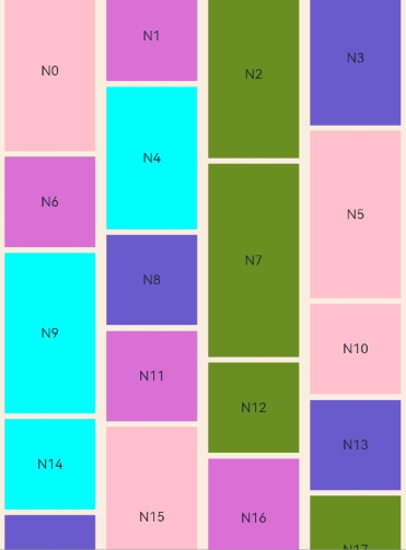
Example 2
Example of using auto-fill:
//index.ets
import { WaterFlowDataSource } from './WaterFlowDataSource'

@Entry
@Component
struct WaterFlowDemo {
  @State minSize: number = 80
  @State maxSize: number = 180
  @State colors: number[] = [0xFFC0CB, 0xDA70D6, 0x6B8E23, 0x6A5ACD, 0x00FFFF, 0x00FF7F]
  dataSource: WaterFlowDataSource = new WaterFlowDataSource()
  private itemWidthArray: number[] = []
  private itemHeightArray: number[] = []

  // Calculate the width and height of a <FlowItem>.
  getSize() {
    let ret = Math.floor(Math.random() * this.maxSize)
    return (ret > this.minSize ? ret : this.minSize)
  }

  // Set the width and height array of the <FlowItem>.
  setItemSizeArray() {
    for (let i = 0; i < 100; i++) {
      this.itemWidthArray.push(this.getSize())
      this.itemHeightArray.push(this.getSize())
    }
  }

  aboutToAppear() {
    this.setItemSizeArray()
  }

  build() {
    Column({ space: 2 }) {
      WaterFlow() {
        LazyForEach(this.dataSource, (item: number) => {
          FlowItem() {
            Column() {
              Text("N" + item).fontSize(12).height('16')
            }
          }
          .width('100%')
          .height(this.itemHeightArray[item % 100])
          .backgroundColor(this.colors[item % 5])
        }, (item: string) => item)
      }
      .columnsTemplate('repeat(auto-fill,80)')
      .columnsGap(10)
      .rowsGap(5)
      .padding({left:5})
      .backgroundColor(0xFAEEE0)
      .width('100%')
      .height('100%')
    }
  }
}