Foreground Blur
You can apply foreground blur effects to a component.
NOTE
This attribute is supported since API version 10. Updates will be marked with a superscript to indicate their earliest API version.
Attributes
| Name | Type | Description |
|---|---|---|
| foregroundBlurStyle | value:BlurStyle, options?:ForegroundBlurStyleOptions |
Foreground blur style applied to the component. value: settings of the foreground blur style, including the blur radius, mask color, mask opacity, saturation, and brightness. options: foreground blur options. This parameter is optional. |
ForegroundBlurStyleOptions
| Name | Type | Mandatory | Description |
|---|---|---|---|
| colorMode | ThemeColorMode | No | Color mode used for the foreground blur. Default value: ThemeColorMode.System |
| adaptiveColor | AdaptiveColor | No | Adaptive color mode. Default value: AdaptiveColor.Default |
| scale | number | No | Foreground blur scale. This API is a system API. Default value: 1.0 Value range: [0.0, 1.0] |
Example
Example 1
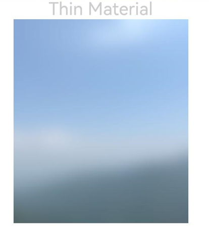
// xxx.ets
@Entry
@Component
struct ForegroundBlurStyleDemo {
  build() {
    Column() {
      Text('Thin Material').fontSize(30).fontColor(0xCCCCCC)
      Image($r('app.media.bg'))
        .width(300)
        .height(350)
        .foregroundBlurStyle(BlurStyle.Thin, { colorMode: ThemeColorMode.LIGHT, adaptiveColor: AdaptiveColor.DEFAULT, scale: 1.0 })
    }
    .height('100%')
    .width('100%')
  }
}