button
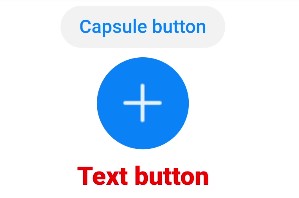
The <button> component includes capsule, circle, and text buttons.
NOTE
The APIs of this module are supported since API version 8. Updates will be marked with a superscript to indicate their earliest API version.
Child Components
Not supported
Attributes
In addition to the universal attributes, the following attributes are supported.
| Name | Type | Default Value | Mandatory | Description |
|---|---|---|---|---|
| type | string | capsule | No | Type of the Enter key on the soft keyboard. The value cannot be dynamically updated. If this attribute is not set, a capsule-like button is displayed. Unlike the capsule button, the capsule-like button allows its corners to be configured using border-radius. Available button types are as follows: - capsule: capsule button with fillets, background color, and text. - circle: circle button that can accommodate icons. - text: text button, which displays only text. |
| value | string | - | No | Text value of the button. This attribute is unavailable for circle buttons. |
| icon | string | - | No | Path of the button icon. The supported icon formats are JPG, PNG, and SVG. |
| placement | string | end | No | Position of the button icon in text. This attribute is valid only when type is not set. Available values are as follows: - start: The button icon is at the beginning of the text. - end: The button icon is at the end of the text. - top: The button icon is at the top of the text. - bottom: The button icon is at the bottom of the text. |
| waiting | boolean | false | No | Whether the button is in waiting state. The value true means that the button is in waiting state, and a loading animation is displayed on the left of the text. |
Events
The universal events are supported.
Styles
In addition to the universal styles, the following styles are supported.
| Name | Type | Default Value | Mandatory | Description |
|---|---|---|---|---|
| text-color | <color> | - | No | Text color of the button. |
| font-size | <length> | - | No | Font size of the button. |
| font-style | string | normal | No | Font style of the button. |
| font-weight | number | string | normal | No | Font weight of a button. For details, see the font-weight style of the <text> component. |
| font-family | <string> | sans-serif | No | Font family, in which fonts are separated by commas (,). Each font is set using a font name or font family name. The first font in the family or the specified custom font is used for the text. |
| icon-width | <length> | - | No | Width of the internal icon of a circle button. By default, the icon takes up the entire width of the button. This style must be set when the icon uses an SVG image. |
| icon-height | <length> | - | No | Height of the internal icon of a circle button. By default, the icon takes up the entire height of the button. This style must be set when the icon uses an SVG image. |
| radius | <length> | - | No | Radius of a circle button or fillet radius of a capsule button. For a circle button, this style takes precedence over width and height in the universal styles. |
NOTE
For capsule buttons, border-related styles are not supported.
For circle buttons, text-related styles are not supported.
For text buttons, the text size is automatically adaptive, and radius, width, and height cannot be set. The background-color style is not supported when the background is completely transparent.
Example
<!-- xxx.hml -->
<div class="div-button">
  <button class="button" type="capsule" value="Capsule button"></button>
  <button class="button circle" type="circle" icon="common/ic_add_default.png"></button>
  <button class="button text" type="text">Text button</button>
</div>
/* xxx.css */
.div-button {
  flex-direction: column;
  align-items: center;
}
.button {
  margin-top: 15px;
}
.circle {
  background-color: #007dff;
  radius: 72px;
  icon-width: 72px;
  icon-height: 72px;
}
.text {
  text-color: red;
  font-size: 40px;
  font-weight: 900;
  font-family: sans-serif;
  font-style: normal;
}
4 x 4 widget