Linear Layout (Row/Column)
Overview
Linear layout is the most frequently used layout in development, built with the <Row> and <Column> linear containers. The linear layout is the basis of other layouts. Its child elements are arranged in sequence linearly in the horizontal direction, as in a <Row> container, or vertical direction, as in a <Column> container.
Figure 1 Child element arrangement in a <Column> container
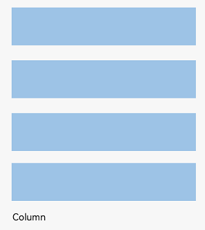
Figure 2 Child element arrangement in a <Row> container
Basic Concepts
-
Layout container: container component that is able to lay out other elements as its child elements. The layout container calculates the size of its child elements and arranges the layout.
-
Layout child element: element inside the layout container.
-
Main axis: axis along which child elements are laid out by default in the linear layout container. The main axis is horizontal for the <Row> container and vertical for the <Column> container.
-
Cross axis: axis that runs perpendicular to the main axis. The cross axis is vertical for the <Row> container and horizontal for the <Column> container.
-
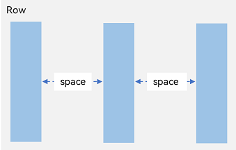
Spacing: distance between child elements.
Spacing of Child Elements in Arrangement Direction
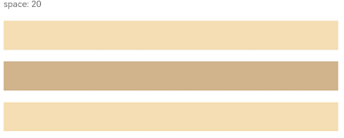
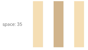
In the layout container, use the space attribute to equally space child elements in the arrangement direction.
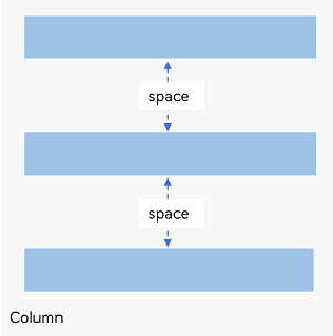
In <Column> Container
Figure 3 Layout child element spacing in the arrangement direction in the <Column> container
Column({ space: 20 }) {
  Text('space: 20').fontSize(15).fontColor(Color.Gray).width('90%')
  Row().width('90%').height(50).backgroundColor(0xF5DEB3)
  Row().width('90%').height(50).backgroundColor(0xD2B48C)
  Row().width('90%').height(50).backgroundColor(0xF5DEB3)
}.width('100%')
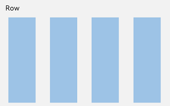
In <Row> Container
Figure 4 Layout child element spacing in the arrangement direction in the <Row> container
Row({ space: 35 }) {
  Text('space: 35').fontSize(15).fontColor(Color.Gray)
  Row().width('10%').height(150).backgroundColor(0xF5DEB3)
  Row().width('10%').height(150).backgroundColor(0xD2B48C)
  Row().width('10%').height(150).backgroundColor(0xF5DEB3)
}.width('90%')
Alignment of Child Elements Along Cross Axis
In the layout container, use the alignItems attribute to set the alignment mode of child elements along the cross axis. The alignment performance is consistent across screens of various sizes. The value is of the VerticalAlign Type type when the cross axis is in the vertical direction and the HorizontalAlign type when the cross axis is in the horizontal direction.
The layout container also provides the alignSelf attribute to control the alignment mode of a single child element along the cross axis. This attribute has a higher priority than the alignItems attribute. This means that, if alignSelf is set, it will overwrite the alignItems setting on the corresponding child element.
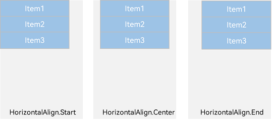
Horizontal Alignment of Child Elements in <Column> Container
Figure 5 Horizontal alignment of child elements in the <Column> container
-
HorizontalAlign.Start: Child elements are left aligned horizontally.
Column({}) {
  Column() {
  }.width('80%').height(50).backgroundColor(0xF5DEB3)

  Column() {
  }.width('80%').height(50).backgroundColor(0xD2B48C)

  Column() {
  }.width('80%').height(50).backgroundColor(0xF5DEB3)
}.width('100%').alignItems(HorizontalAlign.Start).backgroundColor('rgb(242,242,242)')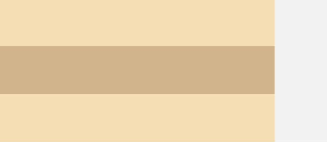
-
HorizontalAlign.Center: Child elements are center-aligned horizontally.
Column({}) {
  Column() {
  }.width('80%').height(50).backgroundColor(0xF5DEB3)

  Column() {
  }.width('80%').height(50).backgroundColor(0xD2B48C)

  Column() {
  }.width('80%').height(50).backgroundColor(0xF5DEB3)
}.width('100%').alignItems(HorizontalAlign.Center).backgroundColor('rgb(242,242,242)')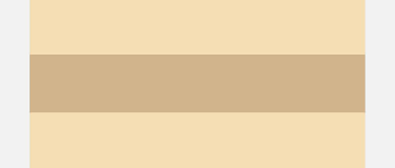
-
HorizontalAlign.End: Child elements are right-aligned horizontally.
Column({}) {
  Column() {
  }.width('80%').height(50).backgroundColor(0xF5DEB3)

  Column() {
  }.width('80%').height(50).backgroundColor(0xD2B48C)

  Column() {
  }.width('80%').height(50).backgroundColor(0xF5DEB3)
}.width('100%').alignItems(HorizontalAlign.End).backgroundColor('rgb(242,242,242)')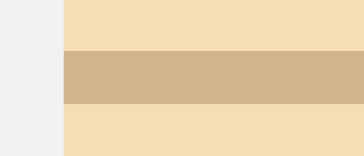
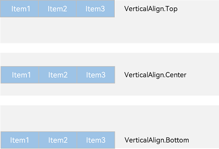
Vertical Alignment of Child Elements in <Row> Container
Figure 6 Vertical alignment of child elements in <Row> container
-
VerticalAlign.Top: Child elements are top-aligned vertically.
Row({}) {
  Column() {
  }.width('20%').height(30).backgroundColor(0xF5DEB3)

  Column() {
  }.width('20%').height(30).backgroundColor(0xD2B48C)

  Column() {
  }.width('20%').height(30).backgroundColor(0xF5DEB3)
}.width('100%').height(200).alignItems(VerticalAlign.Top).backgroundColor('rgb(242,242,242)')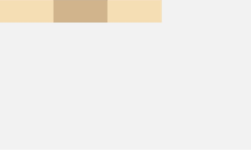
-
VerticalAlign.Center: Child elements are center-aligned vertically.
Row({}) {
  Column() {
  }.width('20%').height(30).backgroundColor(0xF5DEB3)

  Column() {
  }.width('20%').height(30).backgroundColor(0xD2B48C)

  Column() {
  }.width('20%').height(30).backgroundColor(0xF5DEB3)
}.width('100%').height(200).alignItems(VerticalAlign.Center).backgroundColor('rgb(242,242,242)')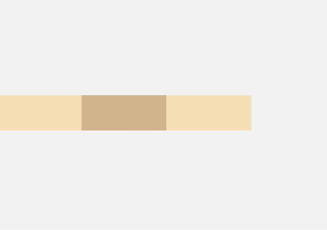
-
VerticalAlign.Bottom: Child elements are bottom-aligned vertically.
Row({}) {
  Column() {
  }.width('20%').height(30).backgroundColor(0xF5DEB3)

  Column() {
  }.width('20%').height(30).backgroundColor(0xD2B48C)

  Column() {
  }.width('20%').height(30).backgroundColor(0xF5DEB3)
}.width('100%').height(200).alignItems(VerticalAlign.Bottom).backgroundColor('rgb(242,242,242)')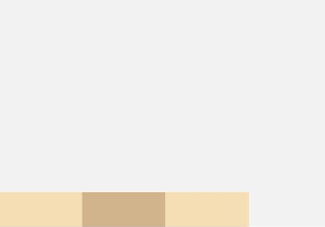
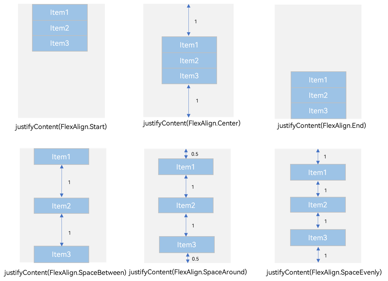
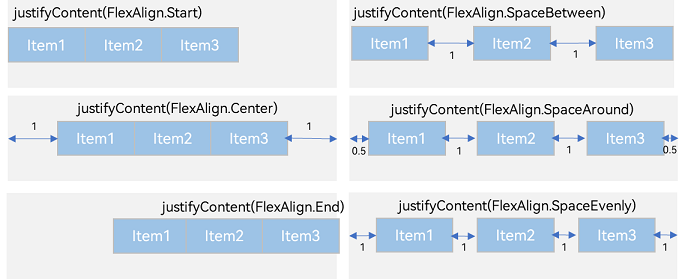
Arrangement of Child Elements Along Main Axis
In the layout container, you can use the justifyContent attribute to set the arrangement mode of child elements along the main axis. The arrangement may begin from the start point or end point of the main axis, or the space of the main axis can be evenly divided.
In <Column> Container
Figure 7 Vertical alignment of child elements in the <Column> container
-
justifyContent(FlexAlign.Start): The items are vertically aligned with each other toward the start edge of the container.
Column({}) {
  Column() {
  }.width('80%').height(50).backgroundColor(0xF5DEB3)

  Column() {
  }.width('80%').height(50).backgroundColor(0xD2B48C)

  Column() {
  }.width('80%').height(50).backgroundColor(0xF5DEB3)
}.width('100%').height(300).backgroundColor('rgb(242,242,242)').justifyContent(FlexAlign.Start)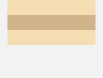
-
justifyContent(FlexAlign.Center): The elements are vertically aligned with each other toward the center of the container. The space between the first component and the start edge is the same as that between the last component and the end edge.
Column({}) {
  Column() {
  }.width('80%').height(50).backgroundColor(0xF5DEB3)

  Column() {
  }.width('80%').height(50).backgroundColor(0xD2B48C)

  Column() {
  }.width('80%').height(50).backgroundColor(0xF5DEB3)
}.width('100%').height(300).backgroundColor('rgb(242,242,242)').justifyContent(FlexAlign.Center)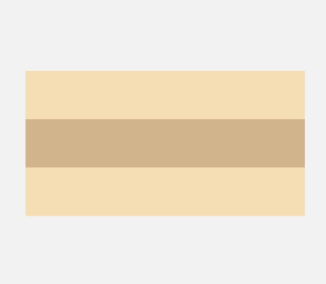
-
justifyContent(FlexAlign.End): The elements are vertically aligned with each other toward the end edge of the container.
Column({}) {
  Column() {
  }.width('80%').height(50).backgroundColor(0xF5DEB3)

  Column() {
  }.width('80%').height(50).backgroundColor(0xD2B48C)

  Column() {
  }.width('80%').height(50).backgroundColor(0xF5DEB3)
}.width('100%').height(300).backgroundColor('rgb(242,242,242)').justifyContent(FlexAlign.End)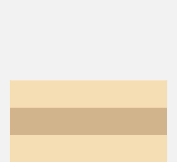
-
justifyContent(FlexAlign.SpaceBetween): The elements are evenly distributed vertically. The space between any two adjacent elements is the same. The first element is aligned with the start edge, the last element is aligned with the end edge, and the remaining elements are distributed so that the space between any two adjacent elements is the same.
Column({}) {
  Column() {
  }.width('80%').height(50).backgroundColor(0xF5DEB3)

  Column() {
  }.width('80%').height(50).backgroundColor(0xD2B48C)

  Column() {
  }.width('80%').height(50).backgroundColor(0xF5DEB3)
}.width('100%').height(300).backgroundColor('rgb(242,242,242)').justifyContent(FlexAlign.SpaceBetween)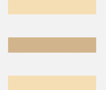
-
justifyContent(FlexAlign.SpaceAround): The elements are evenly distributed vertically. The space between any two adjacent elements is the same. The space between the first element and start edge, and that between the last element and end edge are both half the size of the space between two adjacent elements.
Column({}) {
  Column() {
  }.width('80%').height(50).backgroundColor(0xF5DEB3)

  Column() {
  }.width('80%').height(50).backgroundColor(0xD2B48C)

  Column() {
  }.width('80%').height(50).backgroundColor(0xF5DEB3)
}.width('100%').height(300).backgroundColor('rgb(242,242,242)').justifyContent(FlexAlign.SpaceAround)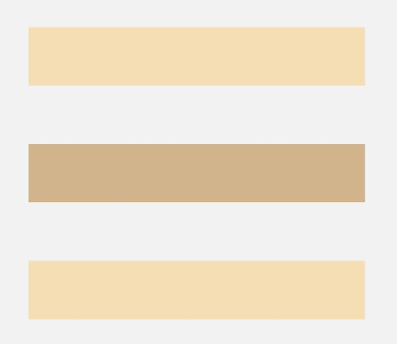
-
justifyContent(FlexAlign.SpaceEvenly): The elements are evenly distributed vertically. The space between the first element and start edge, the space between the last element and end edge, and the space between any two adjacent elements are the same.
Column({}) {
  Column() {
  }.width('80%').height(50).backgroundColor(0xF5DEB3)

  Column() {
  }.width('80%').height(50).backgroundColor(0xD2B48C)

  Column() {
  }.width('80%').height(50).backgroundColor(0xF5DEB3)
}.width('100%').height(300).backgroundColor('rgb(242,242,242)').justifyContent(FlexAlign.SpaceEvenly)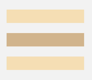
In <Row> Container
Figure 8 Horizontal alignment of child elements in the <Row> container
-
justifyContent(FlexAlign.Start): The items are horizontally aligned with each other toward the start edge of the container.
Row({}) {
  Column() {
  }.width('20%').height(30).backgroundColor(0xF5DEB3)

  Column() {
  }.width('20%').height(30).backgroundColor(0xD2B48C)

  Column() {
  }.width('20%').height(30).backgroundColor(0xF5DEB3)
}.width('100%').height(200).backgroundColor('rgb(242,242,242)').justifyContent(FlexAlign.Start)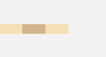
-
justifyContent(FlexAlign.Center): The elements are horizontally aligned with each other toward the center of the container. The space between the first component and the start edge is the same as that between the last component and the end edge.
Row({}) {
  Column() {
  }.width('20%').height(30).backgroundColor(0xF5DEB3)

  Column() {
  }.width('20%').height(30).backgroundColor(0xD2B48C)

  Column() {
  }.width('20%').height(30).backgroundColor(0xF5DEB3)
}.width('100%').height(200).backgroundColor('rgb(242,242,242)').justifyContent(FlexAlign.Center)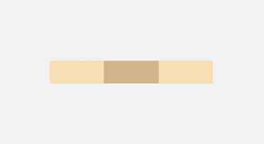
-
justifyContent(FlexAlign.End): The elements are horizontally aligned with each other toward the end edge of the container.
Row({}) {
  Column() {
  }.width('20%').height(30).backgroundColor(0xF5DEB3)

  Column() {
  }.width('20%').height(30).backgroundColor(0xD2B48C)

  Column() {
  }.width('20%').height(30).backgroundColor(0xF5DEB3)
}.width('100%').height(200).backgroundColor('rgb(242,242,242)').justifyContent(FlexAlign.End)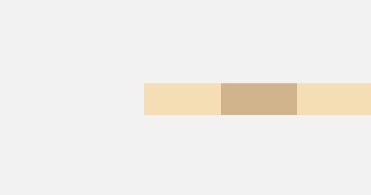
-
justifyContent(FlexAlign.SpaceBetween): The elements are evenly distributed horizontally. The space between any two adjacent elements is the same. The first element is aligned with the start edge, the last element is aligned with the end edge, and the remaining elements are distributed so that the space between any two adjacent elements is the same.
Row({}) {
  Column() {
  }.width('20%').height(30).backgroundColor(0xF5DEB3)

  Column() {
  }.width('20%').height(30).backgroundColor(0xD2B48C)

  Column() {
  }.width('20%').height(30).backgroundColor(0xF5DEB3)
}.width('100%').height(200).backgroundColor('rgb(242,242,242)').justifyContent(FlexAlign.SpaceBetween)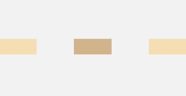
-
justifyContent(FlexAlign.SpaceAround): The elements are evenly distributed horizontally. The space between any two adjacent elements is the same. The space between the first element and start edge, and that between the last element and end edge are both half the size of the space between two adjacent elements.
Row({}) {
  Column() {
  }.width('20%').height(30).backgroundColor(0xF5DEB3)

  Column() {
  }.width('20%').height(30).backgroundColor(0xD2B48C)

  Column() {
  }.width('20%').height(30).backgroundColor(0xF5DEB3)
}.width('100%').height(200).backgroundColor('rgb(242,242,242)').justifyContent(FlexAlign.SpaceAround)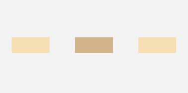
-
justifyContent(FlexAlign.SpaceEvenly): The elements are evenly distributed horizontally. The space between the first element and start edge, the space between the last element and end edge, and the space between any two adjacent elements are the same.
Row({}) {
  Column() {
  }.width('20%').height(30).backgroundColor(0xF5DEB3)

  Column() {
  }.width('20%').height(30).backgroundColor(0xD2B48C)

  Column() {
  }.width('20%').height(30).backgroundColor(0xF5DEB3)
}.width('100%').height(200).backgroundColor('rgb(242,242,242)').justifyContent(FlexAlign.SpaceEvenly)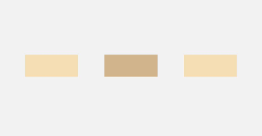
Adaptive Stretching
In linear layout, adaptive stretching is achieved by using the <Blank> component, which automatically fills the empty spaces in the container – <Row> or <Column> – along the main axis. Just add the width and height as a percentage, and then adaptive scaling will take effect once the screen width and height change.
@Entry
@Component
struct BlankExample {
  build() {
    Column() {
      Row() {
        Text('Bluetooth').fontSize(18)
        Blank()
        Toggle({ type: ToggleType.Switch, isOn: true })
      }.backgroundColor(0xFFFFFF).borderRadius(15).padding({ left: 12 }).width('100%')
    }.backgroundColor(0xEFEFEF).padding(20).width('100%')
  }
}
Figure 9 Portrait mode
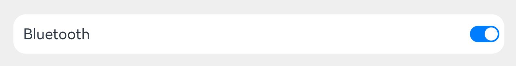
Figure 10 Landscape mode

Adaptive Scaling
Adaptive scaling means that the size of a child element is automatically adjusted according to a preset ratio to fit into the container across devices of various screen sizes. In linear layout, adaptive scaling can be achieved using either of the following methods:
-
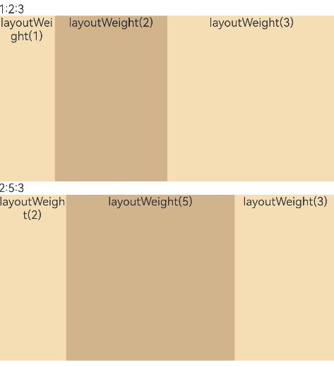
When the container size is determined, use layoutWeight to set the weight of a child element during layout. The container space is then allocated along the main axis among the element and sibling elements based on the set layout weight, ignoring the size settings of the elements themselves.
@Entry
@Component
struct layoutWeightExample {
  build() {
    Column() {
      Text('1:2:3').width('100%')
      Row() {
        Column() {
          Text('layoutWeight(1)')
            .textAlign(TextAlign.Center)
        }.layoutWeight(1).backgroundColor(0xF5DEB3).height('100%')

        Column() {
          Text('layoutWeight(2)')
            .textAlign(TextAlign.Center)
        }.layoutWeight(2).backgroundColor(0xD2B48C).height('100%')

        Column() {
          Text('layoutWeight(3)')
            .textAlign(TextAlign.Center)
        }.layoutWeight(3).backgroundColor(0xF5DEB3).height('100%')

      }.backgroundColor(0xffd306).height('30%')

      Text('2:5:3').width('100%')
      Row() {
        Column() {
          Text('layoutWeight(2)')
            .textAlign(TextAlign.Center)
        }.layoutWeight(2).backgroundColor(0xF5DEB3).height('100%')

        Column() {
          Text('layoutWeight(5)')
            .textAlign(TextAlign.Center)
        }.layoutWeight(5).backgroundColor(0xD2B48C).height('100%')

        Column() {
          Text('layoutWeight(3)')
            .textAlign(TextAlign.Center)
        }.layoutWeight(3).backgroundColor(0xF5DEB3).height('100%')
      }.backgroundColor(0xffd306).height('30%')
    }
  }
}
Figure 11 Landscape mode
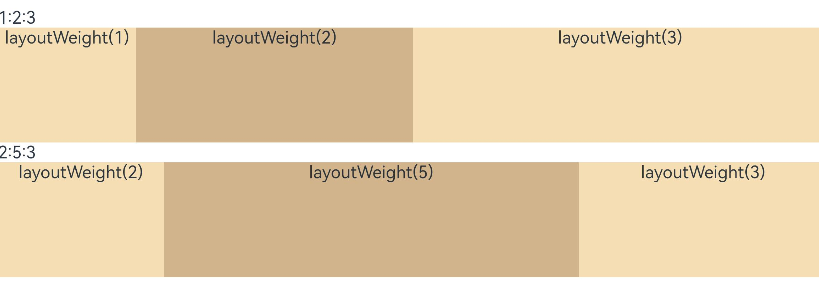
Figure 12 Portrait mode
-
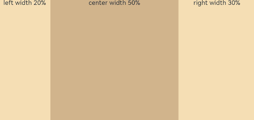
When the container size is determined, set the width of a child element in percentage. The container space is then allocated among the element and sibling elements based on the set percentage.
@Entry
@Component
struct WidthExample {
  build() {
    Column() {
      Row() {
        Column() {
          Text('left width 20%')
            .textAlign(TextAlign.Center)
        }.width('20%').backgroundColor(0xF5DEB3).height('100%')

        Column() {
          Text('center width 50%')
            .textAlign(TextAlign.Center)
        }.width('50%').backgroundColor(0xD2B48C).height('100%')

        Column() {
          Text('right width 30%')
            .textAlign(TextAlign.Center)
        }.width('30%').backgroundColor(0xF5DEB3).height('100%')
      }.backgroundColor(0xffd306).height('30%')
    }
  }
}
Figure 13 Landscape mode
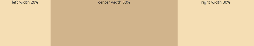
Figure 14 Portrait mode
Adaptive Extension
Adaptive extension allows users to drag the scrollbar to display the page content outside the screen. It is applicable to the scenario where the content extends beyond the viewport in linear layout. Below are the methods to implement adaptive extension in linear layout:
-
Add a scrollbar to a <List> component: If the list items cannot be fully displayed on one screen, you can place the child elements in different components and employ a scrollbar to display them. Use the scrollBar attribute to set the scrollbar status and the edgeEffect attribute to set the rebound effect when the scrollbar has reached the edge.
-
Use a <Scroll> component: When one screen is not able to accommodate the full content, you can wrap a <Scroll> component at the outer layer of the <Column> or <Row> component to implement a scrollable linear layout. Example of using a <Scroll> component in the vertical layout:
@Entry
@Component
struct ScrollExample {
  scroller: Scroller = new Scroller();
  private arr: number[] = [0, 1, 2, 3, 4, 5, 6, 7, 8, 9];

  build() {
    Scroll(this.scroller) {
      Column() {
        ForEach(this.arr, (item?:number|undefined) => {
          if(item){
            Text(item.toString())
            .width('90%')
            .height(150)
            .backgroundColor(0xFFFFFF)
            .borderRadius(15)
            .fontSize(16)
            .textAlign(TextAlign.Center)
            .margin({ top: 10 })
          }
        }, (item:number) => item.toString())
      }.width('100%')
    }
    .backgroundColor(0xDCDCDC)
    .scrollable(ScrollDirection.Vertical) // Vertical scrolling.
    .scrollBar(BarState.On) // The scrollbar is always displayed.
    .scrollBarColor(Color.Gray) // The scrollbar color is gray.
    .scrollBarWidth(10) // The scrollbar width is 10.
    .edgeEffect(EdgeEffect.Spring) // The spring effect is produced when the scrollbar has reached the edge.
  }
}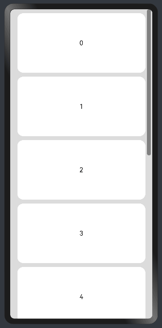
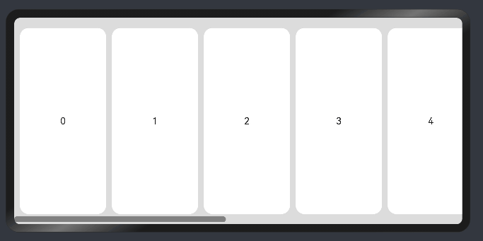
Example of using a <Scroll> component in the horizontal layout:
@Entry
@Component
struct ScrollExample {
  scroller: Scroller = new Scroller();
  private arr: number[] = [0, 1, 2, 3, 4, 5, 6, 7, 8, 9];

  build() {
    Scroll(this.scroller) {
      Row() {
        ForEach(this.arr, (item?:number|undefined) => {
          if(item){
            Text(item.toString())
            .height('90%')
            .width(150)
            .backgroundColor(0xFFFFFF)
            .borderRadius(15)
            .fontSize(16)
            .textAlign(TextAlign.Center)
            .margin({ left: 10 })
          }
        })
      }.height('100%')
    }
    .backgroundColor(0xDCDCDC)
    .scrollable(ScrollDirection.Horizontal) // Horizontal scrolling.
    .scrollBar(BarState.On) // The scrollbar is always displayed.
    .scrollBarColor(Color.Gray) // The scrollbar color is gray.
    .scrollBarWidth(10) // The scrollbar width is 10.
    .edgeEffect(EdgeEffect.Spring) // The spring effect is produced when the scrollbar has reached the edge.
  }
}