@ohos.arkui.advanced.TabTitleBar (Tab Title Bar)
The tab title bar is used to switch between tabs pages. It is applicable only to level-1 pages.
NOTE
This component is supported since API version 10. Updates will be marked with a superscript to indicate their earliest API version.
Modules to Import
import { TabTitleBar } from "@ohos.arkui.advanced.TabTitleBar"
Child Components
Not supported
Attributes
The universal attributes are not supported.
TabTitleBar
TabTitleBar({tabItems: Array<TabTitleBarTabItem>, menuItems?: Array<TabTitleBarMenuItem>, swiperContent: () => void})
Decorator: @Component
System capability: SystemCapability.ArkUI.ArkUI.Full
Parameters
| Name | Type | Mandatory | Decorator | Description |
|---|---|---|---|---|
| tabItems | Array<TabTitleBarTabItem> | Yes | - | List of tab items on the left of the title bar. |
| menuItems | Array<TabTitleBarMenuItem> | No | - | List of menu items on the right of the title bar. |
| swiperContent | () => void | Yes | @BuilderParam | Constructor for page content pertaining to the tab list. |
TabTitleBarMenuItem
| Name | Type | Mandatory | Description |
|---|---|---|---|
| value | ResourceStr | Yes | Icon. |
| isEnabled | boolean | No | Whether to enable the item. Default value: true The value true means to enable the item, and false means the opposite. |
| action | () => void | No | Action to perform. |
TabTitleBarTabItem
| Name | Type | Mandatory | Description |
|---|---|---|---|
| title | ResourceStr | Yes | Text of the tab. |
| icon | ResourceStr | No | Icon of the tab. |
Events
The universal events are not supported.
Example
import { TabTitleBar } from "@ohos.arkui.advanced.TabTitleBar"
import promptAction from '@ohos.promptAction'
class tabItem {
title: ResourceStr;
icon?: ResourceStr;
constructor(title: ResourceStr,icon?: ResourceStr) {
this.title = title
this.icon = icon
}
}
interface menuItem {
value: ResourceStr;
isEnabled?: boolean;
action?: () => void
}
@Entry
@Component
struct Index {
@Builder
componentBuilder() {
Text("#1ABC9C\nTURQUOISE")
.fontWeight(FontWeight.Bold)
.fontSize(14)
.width("100%")
.textAlign(TextAlign.Center)
.fontColor("#CCFFFFFF")
.backgroundColor("#1ABC9C")
Text("#16A085\nGREEN SEA")
.fontWeight(FontWeight.Bold)
.fontSize(14)
.width("100%")
.textAlign(TextAlign.Center)
.fontColor("#CCFFFFFF")
.backgroundColor("#16A085")
Text("#2ECC71\nEMERALD")
.fontWeight(FontWeight.Bold)
.fontSize(14)
.width("100%")
.textAlign(TextAlign.Center)
.fontColor("#CCFFFFFF")
.backgroundColor("#2ECC71")
Text("#27AE60\nNEPHRITIS")
.fontWeight(FontWeight.Bold)
.fontSize(14)
.width("100%")
.textAlign(TextAlign.Center)
.fontColor("#CCFFFFFF")
.backgroundColor("#27AE60")
Text("#3498DB\nPETER RIVER")
.fontWeight(FontWeight.Bold)
.fontSize(14)
.width("100%")
.textAlign(TextAlign.Center)
.fontColor("#CCFFFFFF")
.backgroundColor("#3498DB")
}
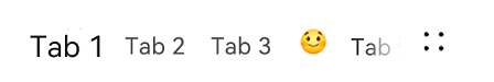
private readonly tabItems: Array<tabItem> = [new tabItem('Tab 1'),new tabItem('Tab 2'),new tabItem('Tab 3'),new tabItem("Happy",$r('app.media.emoji_happy')),new tabItem('Tab 4')]
private readonly menuItems: Array<menuItem> = [
{
value: $r('app.media.ic_public_reduce'),
isEnabled: true,
action: () => promptAction.showToast({ message: "on item click! index 0" })
},
{
value: $r('app.media.ic_public_edit'),
isEnabled: true,
action: () => promptAction.showToast({ message: "on item click! index 1" })
},
{
value: $r('app.media.ic_public_save'),
isEnabled: true,
action: () => promptAction.showToast({ message: "on item click! index 2" })
},
]
build() {
Row() {
Column() {
TabTitleBar({
swiperContent: this.componentBuilder,
tabItems: this.tabItems,
menuItems: this.menuItems,
})
}.width('100%')
}.height('100%')
}
}