Custom Components
The ArkUI that uses the JavaScript-based web-like development paradigm supports custom components for you to extend existing components. You can encapsulate custom private attributes and events into new components to reuse them multiple times in your project. This also improves code readability. The following is an example:
-
Building a custom component
<!-- comp.hml -->
 <div class="item">
   <text class="title-style">{{title}}</text>
   <text class="text-style" onclick="childClicked" focusable="true">Click to view the hidden text.</text>
   <text class="text-style" if="{{showObj}}">hello world</text>
 </div>
/* comp.css */ .item { width: 700px; flex-direction: column; height: 300px; align-items: center; margin-top: 100px; } .text-style { width: 100%; text-align: center; font-weight: 500; font-family: Courier; font-size: 36px; } .title-style { font-weight: 500; font-family: Courier; font-size: 50px; color: #483d8b; }// comp.js export default { props: { title: { default: 'title', }, showObject: {}, }, data() { return { showObj: this.showObject, }; }, childClicked () { this.$emit('eventType1', {text: 'Receive the parameters from the child component.'}); this.showObj = !this.showObj; }, } -
Introducing the custom component
<!-- xxx.hml -->
 <element name='comp' src='../../common/component/comp.hml'></element>
 <div class="container">
   <text>Parent component: {{text}}</text>
   <comp title="Custom component" show-object="{{isShow}}" @event-type1="textClicked"></comp>
 </div>
/* xxx.css */ .container { background-color: #f8f8ff; flex: 1; flex-direction: column; align-content: center; }// xxx.js export default { data: { text: 'Start' isShow: false, }, textClicked (e) { this.text = e.detail.text; }, }
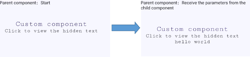
In this example, the parent component passes the customized attribute through title to the child component, and the child component receives the attribute value in props. The child component passes text to the parent through the bound event, and the passed value is obtained via e.detail. To successfully bind the child component event to the parent component, ensure that the event name meet the requirements for event binding. For details, see Basic Usage of Custom Components. The following figures show how the custom component works.
Figure 1 Running effect