Border
The border attributes are used to set border styles for components.
NOTE
The APIs of this module are supported since API version 7. Updates will be marked with a superscript to indicate their earliest API version.
The border of a component is displayed above the content of its child components since API version 9.
Attributes
| Name | Type | Description |
|---|---|---|
| border | { width?: Length | EdgeWidths9+, color?: ResourceColor | EdgeColors9+, radius?: Length | BorderRadiuses9+, style?: BorderStyle | EdgeStyles9+ } |
Unified border style. - width: border width. - color: border color. - radius: radius of the rounded corner of the border. - style: border style. Since API version 9, this API is supported in ArkTS widgets. NOTE The default value is 0, indicating that the border is not displayed. |
| borderStyle | BorderStyle | EdgeStyles9+ | Border style. Default value: BorderStyle.Solid Since API version 9, this API is supported in ArkTS widgets. |
| borderWidth | Length | EdgeWidths9+ | Border width. The percentage format is not supported. Since API version 9, this API is supported in ArkTS widgets. |
| borderColor | ResourceColor | EdgeColors9+ | Border color. Default value: Color.Black Since API version 9, this API is supported in ArkTS widgets. |
| borderRadius | Length | BorderRadiuses9+ | Border radius. The radius is restricted by the component size. The maximum value is half of the component width or height. The percentage format is not supported. Since API version 9, this API is supported in ArkTS widgets. |
EdgeWidths9+
To reference this object, at least one parameter must be passed.
| Name | Type | Mandatory | Description |
|---|---|---|---|
| left | Length | No | Width of the left border. |
| right | Length | No | Width of the right border. |
| top | Length | No | Width of the top border. |
| bottom | Length | No | Width of the bottom border. |
EdgeColors9+
To reference this object, at least one parameter must be passed.
| Name | Type | Mandatory | Description |
|---|---|---|---|
| left | ResourceColor | No | Color of the left border. |
| right | ResourceColor | No | Color of the right border. |
| top | ResourceColor | No | Color of the top border. |
| bottom | ResourceColor | No | Color of the bottom border. |
BorderRadiuses9+
To reference this object, at least one parameter must be passed.
| Name | Type | Mandatory | Description |
|---|---|---|---|
| topLeft | Length | No | Radius of the upper-left rounded corner. |
| topRight | Length | No | Radius of the upper-right rounded corner. |
| bottomLeft | Length | No | Radius of the lower-left rounded corner. |
| bottomRight | Length | No | Radius of the lower-right rounded corner. |
EdgeStyles9+
To reference this object, at least one parameter must be passed.
| Name | Type | Mandatory | Description |
|---|---|---|---|
| left | BorderStyle | No | Style of the left border. |
| right | BorderStyle | No | Style of the right border. |
| top | BorderStyle | No | Style of the top border. |
| bottom | BorderStyle | No | Style of the bottom border. |
Example
// xxx.ets
@Entry
@Component
struct BorderExample {
build() {
Column() {
Flex({ justifyContent: FlexAlign.SpaceAround, alignItems: ItemAlign.Center }) {
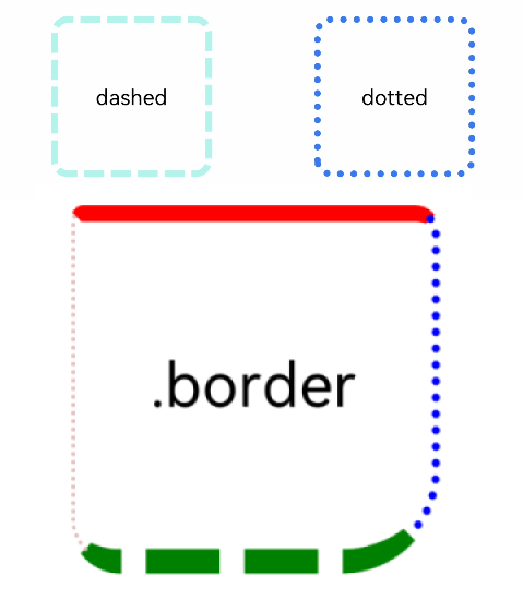
// Dashed border
Text('dashed')
.borderStyle(BorderStyle.Dashed).borderWidth(5).borderColor(0xAFEEEE).borderRadius(10)
.width(120).height(120).textAlign(TextAlign.Center).fontSize(16)
// Dotted border
Text('dotted')
.border({ width: 5, color: 0x317AF7, radius: 10, style: BorderStyle.Dotted })
.width(120).height(120).textAlign(TextAlign.Center).fontSize(16)
}.width('100%').height(150)
Text('.border')
.fontSize(50)
.width(300)
.height(300)
.border({
width: { left: 3, right: 6, top: 10, bottom: 15 },
color: { left: '#e3bbbb', right: Color.Blue, top: Color.Red, bottom: Color.Green },
radius: { topLeft: 10, topRight: 20, bottomLeft: 40, bottomRight: 80 },
style: {
left: BorderStyle.Dotted,
right: BorderStyle.Dotted,
top: BorderStyle.Solid,
bottom: BorderStyle.Dashed
}
}).textAlign(TextAlign.Center)
}
}
}