<swiper> Development
The <swiper> component is a sliding container used to switch between child components. For details, see swiper.
Creating a <swiper> Component
Create a <swiper> component in the .hml file under pages/index.
<!-- xxx.hml-->
<div class="container">
  <swiper>
    <div class="item" style="background-color: #bf45ea;">
      <text>item1</text>
    </div>
    <div class="item" style="background-color: #088684;">
      <text>item2</text>
    </div>
    <div class="item" style="background-color: #7786ee;">
      <text>item3</text>
    </div>
  </swiper>
</div>
/* xxx.css */
.container{
  width: 100%;
  height: 100%;
  flex-direction: column;
  background-color: #F1F3F5;
  align-items: center;
  justify-content: center;
  width: 100%;
}
swiper{
  height: 30%;
}
.item{
  width: 100%;
  height: 500px;
}
text{
  width: 100%;
  height: 100%;
  text-align: center;
  font-size: 50px;
  color: white;
}
NOTE
The <swiper> component supports child components except <list>.
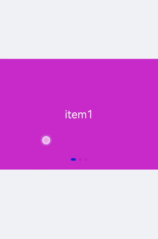
Adding Attributes
When loop is set to false, the autoplay attribute is added to the <swiper> component and the autoplay interval (interval) is set. The component automatically switches between child components and stops at the last one. Add the digital attribute to enable the digital navigation point and set scrolleffect to fade.
<!-- xxx.hml-->
<div class="container">
  <swiper index="1"  autoplay="true" interval="2000" indicator="true" digital="true" duration="500"
  scrolleffect="fade" loop="false">
    <div class="item" style="background-color: #bf45ea;">
      <text>item1</text>
    </div>
    <div class="item" style="background-color: #088684;">
      <text>item2</text>
    </div>
    <div class="item" style="background-color: #7786ee;">
      <text>item3</text>
    </div>
    <div class="item" style="background-color: #c88cee;">
      <text>item4</text>
    </div>
  </swiper>
</div>
/* xxx.css */
.container{
  width: 100%;
  height: 100%;
  flex-direction: column;
  background-color: #F1F3F5;
  align-items: center;
  justify-content: center;
}
swiper{
  height: 30%;
}
.item{
  width: 100%;
  height: 500px;
}
text{
  width: 100%;
  height: 100%;
  text-align: center;
  font-size: 50px;
  color: white;
}
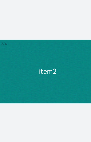
NOTE
The digital attribute takes effect only when the indicator attribute is set to true.
The loop attribute takes effect only when there are two or more than two child components of the <swiper> component.
The scrolleffect attribute takes effect only when the loop attribute value is set to false.
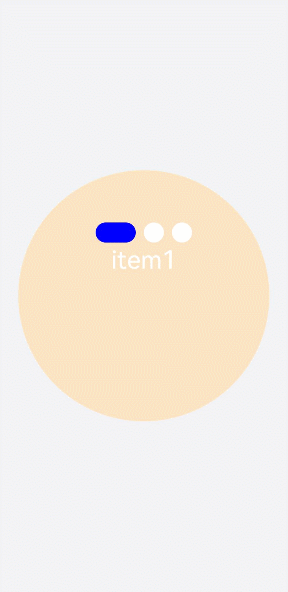
Setting Styles
Set the width and height of the <swiper> component, the indicator's size (indicator-size), color (indicator-color), relative position (indicator-top), and color when it is selected (indicator-selected-color).
<!-- xxx.hml-->
<div class="container">
    <swiper index="1" autoplay="true" interval="2000"  duration="500" >
        <div class="item" style="background-color: bisque;">
            <text>item1</text>
        </div>
        <div class="item" style="background-color: darkkhaki;">
            <text>item2</text>
        </div>
        <div class="item" style="background-color: cadetblue;">
            <text>item3</text>
        </div>
    </swiper>
</div>
/* xxx.css */
.container{
  width: 100%;
  height: 100%;
  flex-direction: column;
  background-color: #F1F3F5;
  align-items: center;
  justify-content: center;
}
swiper{
  width:  500px;
  height: 500px;
  border-radius: 250px;
  indicator-color: white;
  indicator-selected-color: blue;
  indicator-size: 40px;
  indicator-top: 100px;
  overflow: hidden ;
}
.item{
  width: 100%;
  height: 500px;
}
text{
  width: 100%;
  text-align: center;
  margin-top: 150px;
  font-size: 50px;
  color: white;
}
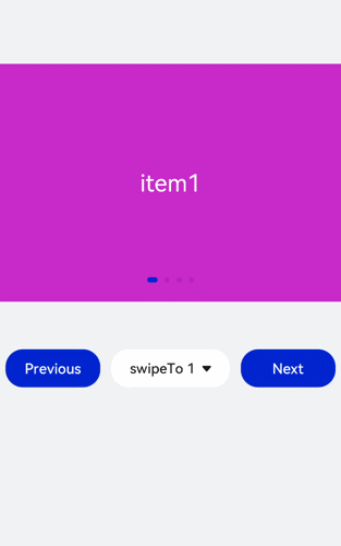
Binding Events
Create two <text> components and bind click events. Clicking the component will call showPrevious to display the previous child component or showNext to display the next child component. Add a <select> component. A change event is triggered when a user selects a value from the drop-down list box and the swipeTo method is called to go to the specified page. Bind the <swiper> component with the change event (triggered when the index of the currently displayed component changes) and the finish event (triggered when the switchover animation ends).
<!-- xxx.hml-->
<div class="container">
  <swiper interval="2000" onchange="change" loop="false" onanimationfinish="finish" id="swiper">
    <div class="item" style="background-color: #bf45ea">
      <text>item1</text>
    </div>
    <div class="item" style="background-color: #088684;">
      <text>item2</text>
    </div>
    <div class="item" style="background-color: #7786ee;">
      <text>item3</text>
    </div>
    <div class="item" style="background-color: #c88cee;">
      <text>item4</text>
    </div>
  </swiper>
  <div class="content">
      <button class="pnbtn" onclick="previous">Previous</button>
      <select onchange="selectChange">
          <option value="0">swipeTo 1</option>
          <option value="1">swipeTo 2</option>
          <option value="2">swipeTo 3</option>
          <option value="3">swipeTo 4</option>
      </select>
    <button class="pnbtn" onclick="next">Next</button>
  </div>
</div>
/* xxx.css */
.container{
  width: 100%;
  height: 100%;
  flex-direction: column;
  background-color: #F1F3F5;
  align-items: center;
  justify-content: center;
}
swiper{
  height: 30%;
}
.item{
  width: 100%;
  height: 500px;
}
text{
  width: 100%;
  height: 100%;
  text-align: center;
  font-size: 50px;
  color: white;
}
select{
  background-color: white;
  width: 250px;
  height: 80px;
}
.content{
  margin-top: 100px;
  justify-content: space-around;
}
.pnbtn{
  width: 200px;
  height: 80px;
  font-size: 30px;
}
// xxx.js
import promptAction from '@ohos.promptAction';
export default{
  change(e){
    promptAction.showToast({duration:2000,message:"current index:"+e.index});
  },
  finish(){
    promptAction.showToast({duration:2000,message:"The switchover ends"});
  },
  selectChange(e){
    this.$element('swiper').swipeTo({index: Number(e.newValue)});
  },
  previous(){
    this.$element('swiper').showPrevious();
  },
  next(){
    this.$element('swiper').showNext();
  }
}
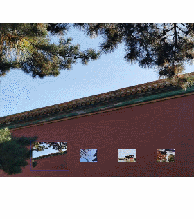
Example Scenario
Use the <swiper> component to create an image carousel and a thumbnail module at the bottom of the carousel. After a thumbnail is clicked, the swipeTo method is called to switch to the corresponding image.
<!-- xxx.hml-->
<div class="container">
  <swiper duration="500" indicator="false" id="swiper" onchange="change">
    <div class="item" for="item in list">
      <image src="{{item.src}}"></image>
    </div>
  </swiper>
  <div class="content">
    <div class="content_item {{index == $idx?'actived':''}}" for="item in list" onclick="imageTo({{$idx}})">
      <image src="{{item.src}}"></image>
    </div>
  </div>
</div>
/* xxx.css */
.container{
  flex-direction: column;
  background-color: #F1F3F5;
  align-items: center;
  justify-content: center;
  width: 100%;
}
swiper{
  width: 100%;
  height: 500px;
}
.item{
  width: 100%;
  height: 500px;
}
.content{
  margin-top: -120px;
  width: 70%;
  display: flex;
  justify-content: space-around;
  height: 100px;
}
.content_item{
  padding: 5px;
  transform: scale(0.5);
}
.actived{
  transform: scale(1);
  border: 1px solid #b20937ea;
}
// xxx.js
import promptAction from '@ohos.promptAction';
export default {
  data:{
    index: 0,
    list:[
      {src: 'common/images/1.png'},
      {src: 'common/images/2.png'},
      {src: 'common/images/3.png'},
      {src: 'common/images/4.png'},]
    },
  imageTo(index){
    this.index = index;
    this.$element('swiper').swipeTo({index: index});
  },
  change(e){
    this.index = e.index;
  }
}