Foreground Color
The foreground color attributes set the foreground color of a component.
NOTE
The initial APIs of this module are supported since API version 10. Newly added APIs will be marked with a superscript to indicate their earliest API version.
Attributes
| Name | Type | Description |
|---|---|---|
| foregroundColor | ResourceColor | ColoringStrategy10+ | Foreground color. The value can be a specific color or a coloring strategy. |
Example
Example 1
// xxx.ets
@Entry
@Component
struct ForegroundColorExample {
build() {
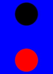
Column({ space: 100 }) {
// Draw a circle with a diameter of 150 and the default fill color black.
Circle({ width: 150, height: 200 })
// Draw a circle with a diameter of 150.
Circle({ width: 150, height: 200 }).foregroundColor(Color.Red)
}.width('100%').backgroundColor(Color.Blue)
}
}
Example 2
// xxx.ets
@Entry
@Component
struct ColoringStrategyExample {
  build() {
    Column({ space: 100 }) {
      // Draw a circle with a diameter of 150 and the default fill color black.
      Circle({ width: 150, height: 200 })
      // Draw a circle with a diameter of 150 and set its foreground color to the inverse of the component background color.
      Circle({ width: 150, height: 200 })
        .backgroundColor(Color.Black)
        .foregroundColor(ColoringStrategy.INVERT)
    }.width('100%')
  }
}

Example 3
// xxx.ets
@Entry
@Component
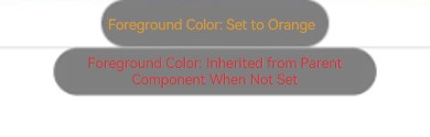
struct foregroundColorInherit {
build() {
Column() {
Button('Foreground Color: Set to Orange').fontSize(20).foregroundColor(Color.Orange).backgroundColor(Color.Gray)
Divider()
Button ('Foreground Color: Inherited from Parent Component When Not Set').fontSize(20).backgroundColor(Color.Gray)
}.foregroundColor(Color.Red)
}
}