Row
The <Row> component lays out child components horizontally.
NOTE
This component is supported since API version 7. Updates will be marked with a superscript to indicate their earliest API version.
Child Components
Supported
APIs
Row(value?:{space?: number | string })
Since API version 9, this API is supported in ArkTS widgets.
Parameters
| Name | Type | Mandatory | Description |
|---|---|---|---|
| space | number | string | No | Horizontal spacing between two adjacent child components. Since API version 9, this parameter does not take effect when it is set to a negative number or when justifyContent is set to FlexAlign.SpaceBetween, FlexAlign.SpaceAround or FlexAlign.SpaceEvenly. Default value: 0, in vp NOTE The value can be a number greater than or equal to 0 or a string that can be converted to a number. |
Attributes
| Name | Type | Description |
|---|---|---|
| alignItems | VerticalAlign | Alignment mode of child components in the vertical direction. Default value: VerticalAlign.Center Since API version 9, this API is supported in ArkTS widgets. |
| justifyContent8+ | FlexAlign | Alignment mode of the child components in the horizontal direction. Default value: FlexAlign.Start Since API version 9, this API is supported in ArkTS widgets. |
NOTE
During row layout, child components do not shrink if flexShrink is not set for them. In this case, the total size of the child components on the main axis can exceed the size of the container on the main axis.
Example
// xxx.ets
@Entry
@Component
struct RowExample {
build() {
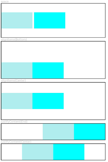
Column({ space: 5 }) {
// Set the horizontal spacing between two adjacent child components to 5.
Text('space').width('90%')
Row({ space: 5 }) {
Row().width('30%').height(50).backgroundColor(0xAFEEEE)
Row().width('30%').height(50).backgroundColor(0x00FFFF)
}.width('90%').height(107).border({ width: 1 })
// Set the alignment mode of the child components in the vertical direction.
Text('alignItems(Bottom)').width('90%')
Row() {
Row().width('30%').height(50).backgroundColor(0xAFEEEE)
Row().width('30%').height(50).backgroundColor(0x00FFFF)
}.width('90%').alignItems(VerticalAlign.Bottom).height('15%').border({ width: 1 })
Text('alignItems(Center)').width('90%')
Row() {
Row().width('30%').height(50).backgroundColor(0xAFEEEE)
Row().width('30%').height(50).backgroundColor(0x00FFFF)
}.width('90%').alignItems(VerticalAlign.Center).height('15%').border({ width: 1 })
// Set the alignment mode of the child components in the horizontal direction.
Text('justifyContent(End)').width('90%')
Row() {
Row().width('30%').height(50).backgroundColor(0xAFEEEE)
Row().width('30%').height(50).backgroundColor(0x00FFFF)
}.width('90%').border({ width: 1 }).justifyContent(FlexAlign.End)
Text('justifyContent(Center)').width('90%')
Row() {
Row().width('30%').height(50).backgroundColor(0xAFEEEE)
Row().width('30%').height(50).backgroundColor(0x00FFFF)
}.width('90%').border({ width: 1 }).justifyContent(FlexAlign.Center)
}.width('100%')
}
}