ImageSpan
<ImageSpan> is a child component of the <Text> component and is used to display inline images.
NOTE
This component is supported since API version 10. Updates will be marked with a superscript to indicate their earliest API version.
Child Components
Not supported
APIs
ImageSpan(value: ResourceStr | PixelMap)
Parameters
| Name | Type | Mandatory | Description |
|---|---|---|---|
| value | ResourceStr | PixelMap | Yes | Image source. Both local and online images are supported. When using an image referenced using a relative path, for example, ImageSpan("common/test.jpg"), the <ImageSpan> component cannot be called across bundles or modules. Therefore, you are advised to use $r to reference image resources that need to be used globally. - The following image formats are supported: PNG, JPG, BMP, SVG, GIF. - Base64 strings are supported. The value format is data:image/[png|jpeg|bmp|webp];base64,[base64 data], where [base64 data] is a Base64 string. - Strings with the file:///data/storage prefix are supported, which are used to read image resources in the files folder in the installation directory of the application. Ensure that the application has the read permission to the files in the specified path. |
Attributes
The universal attribute methods can be used to set the size, background, and border.
| Name | Type | Description |
|---|---|---|
| verticalAlign | ImageSpanAlignment | Alignment mode of the image with the text. Default value: ImageSpanAlignment.BOTTOM |
| objectFit | ImageFit | Image scale type. Default value: ImageFit.Cover |
ImageSpanAlignment
| Name | Description |
|---|---|
| TOP | The image is top aligned with the text. |
| CENTER | The image is centered aligned with the text. |
| BOTTOM | The image is bottom aligned with the text. |
| BASELINE | The image is bottom aligned with the text baseline. |
Events
Among all the universal events, only the click event is supported.
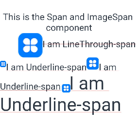
Example
// xxx.ets
@Entry
@Component
struct SpanExample {
  build() {
    Flex({ direction: FlexDirection.Column, alignItems: ItemAlign.Start}) {
      Text() {
        Span('This is the Span and ImageSpan component').fontSize(25).textCase(TextCase.Normal)
          .decoration({ type: TextDecorationType.None, color: Color.Pink })
      }.width('100%').textAlign(TextAlign.Center)
      Text() {
        ImageSpan($r('app.media.icon'))
          .width('200px')
          .height('200px')
          .objectFit(ImageFit.Fill)
          .verticalAlign(ImageSpanAlignment.CENTER)
        Span('I am LineThrough-span')
          .decoration({ type: TextDecorationType.LineThrough, color: Color.Red }).fontSize(25)
        ImageSpan($r('app.media.icon'))
          .width('50px')
          .height('50px')
          .verticalAlign(ImageSpanAlignment.TOP)
        Span('I am Underline-span')
          .decoration({ type: TextDecorationType.Underline, color: Color.Red }).fontSize(25)
        ImageSpan($r('app.media.icon'))
          .size({width:'100px', height:'100px'})
          .verticalAlign(ImageSpanAlignment.BASELINE)
        Span('I am Underline-span')
          .decoration({ type: TextDecorationType.Underline, color: Color.Red }).fontSize(25)
        ImageSpan($r('app.media.icon'))
          .width('70px')
          .height('70px')
          .verticalAlign(ImageSpanAlignment.BOTTOM)
        Span('I am Underline-span')
          .decoration({ type: TextDecorationType.Underline, color: Color.Red }).fontSize(50)
      }
      .width('100%')
      .textIndent(50)
    }.width('100%').height('100%').padding({ left: 0, right: 0, top: 0 })
  }
}