badge
The <badge> component is used to mark new events that require user attention in your application.
NOTE
The APIs of this module are supported since API version 8. Updates will be marked with a superscript to indicate their earliest API version.
Child Components
This component supports only one child component.
attributes
In addition to the universal attributes, the following attributes are supported.
| Name | Type | Default Value | Mandatory | Description |
|---|---|---|---|---|
| placement | string | rightTop | No | Position of a number or dot badge. Available values are as follows: right: on the right border of the component. - rightTop: in the upper right corner of the component border. - left: on the left border of the component. |
| count | number | 0 | No | Number of notifications displayed via the badge. The default value is 0. If the number of notifications is greater than 0, the badge changes from a dot to the number. If this attribute is not set or the value is less than or equal to 0, the badge is a dot. When the count value is greater than the maxcount value, maxcount**+** is displayed. The largest integer value supported for count is 2147483647. |
| visible | boolean | false | No | Whether to display the badge. The value true means that the badge shows up when a new notification is received. To use a number badge, set the count attribute. |
| maxcount | number | 99 | No | Maximum number of notifications. When the number of new notifications exceeds the value of this attribute, maxcount**+** is displayed, for example, 99+. Note: The maximum integer value is 2147483647. |
| config | BadgeConfig | - | No | Configuration of the badge. |
| label | string | - | No | Text of the new notification displayed via the badge. When this attribute is set, attributes count and maxcount do not take effect. |
BadgeConfig
| Name | Type | Default Value | Mandatory | Description |
|---|---|---|---|---|
| badgeColor | <color> | #fa2a2d | No | Background color of the badge. |
| textColor | <color> | #ffffff | No | Text color of the number badge. |
| textSize | <length> | 10px | No | Text size of the number badge. |
| badgeSize | <length> | 6px | No | Size of the dot badge. |
Styles
The universal styles are supported.
Events
The universal events are supported.
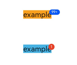
Example
 <!-- xxx.hml -->
 <div class="container">
   <badge class="badge" config="{{badgeconfig}}" visible="true" count="100" maxcount="99">
     <text class="text1">example</text>
   </badge>
   <badge class="badge" visible="true" count="1">
     <text class="text2">example</text>
   </badge>
 </div>
 /* xxx.css */
 .container {
   flex-direction: column;
   width: 100%;
   align-items: center;
 }

 .badge {
   width: 80px;
   height: 60px;
   margin-top: 30px;
 }

 .text1 {
   background-color: #f9a01e;
   font-size: 19fp;
 }

 .text2 {
   background-color: #46b1e3;
   font-size: 19fp;
 }
 {
   "data":{
     "badgeconfig":{
       "badgeColor":"#0a59f7",
       "textColor":"#ffffff",
       "textSize":"9px",
       "badgeSize": "14px"
     }
   }
 }