Transformation
Transformation attributes allow you to rotate, translate, scale, or transform a component.
NOTE
The APIs of this module are supported since API version 7. Updates will be marked with a superscript to indicate their earliest API version.
Attributes
| Name | Type | Description |
|---|---|---|
| rotate | { x?: number, y?: number, z?: number, angle: number | string, centerX?: number | string, centerY?: number | string centerZ10+?: number perspective10+?: number } |
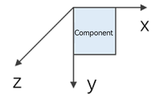
How the component rotates in the coordinate system (as shown below) with the upper left corner of the component as the coordinate origin. (x, y, z) specifies a vector as the axis of rotation. - angle: rotation angle. A positive angle indicates a clockwise rotation, and a negative angle indicates a counterclockwise rotation. The value can be of the string type, for example, '90deg'. - centerX and centerY are used to set the center of rotation. - centerZ: z-axis anchor point, that is, the z-component of the 3D rotation center point. - perspective: distance from the user to the z=0 plane. The axis and center of rotation are set based on the coordinate system, which remains where it is when the component is moved. Default value: { x: 0, y: 0, z: 0, centerX: '50%', centerY: '50%' centerZ: 0, perspective: 0 }  Since API version 9, this API is supported in ArkTS widgets. Since API version 10, CenterZ and perspective are supported in ArkTS widgets. |
| translate | { x?: number | string, y?: number | string, z? : number | string } |
How the component is translated in the coordinate system (as shown below) with the upper left corner of the component as the coordinate origin. Values of x, y, and z indicate the translation distance along the respective axis. A positive value indicates a forward movement towards the respective axis, and a negative value indicates a backward movement towards the respective axis. The translation distance can be a number or a string (for example, '10px' or '10%'). Default value: { x: 0, y: 0, z: 0 }  Since API version 9, this API is supported in ArkTS widgets. |
| scale | { x?: number, y?: number, z?: number, centerX?: number | string, centerY?: number | string } |
Scale ratio along the x-, y-, and z-axis. The default value is 1. centerX and centerY are used to set the scale center point. Default value: { x: 1, y: 1, z: 1, centerX:'50%', centerY:'50%' } Since API version 9, this API is supported in ArkTS widgets. |
| transform | Matrix4Transit | Transformation matrix of the component. |
NOTE
If the rotate and scale attributes are both set for a component, the values of centerX and centerY conflict. In this case, the one that is set later in time prevails.
Example
// xxx.ets
import matrix4 from '@ohos.matrix4'

@Entry
@Component
struct TransformExample {
  build() {
    Column() {
      Text('rotate').width('90%').fontColor(0xCCCCCC).padding(15).fontSize(14)
      Row()
        .rotate({
          x: 0,
          y: 0,
          z: 1,
          centerX: '50%',
          centerY: '50%',
          angle: 300
        }) // The component rotates around the center point of the rotation axis (0,0,1) clockwise by 300 degrees.
        .width(100).height(100).backgroundColor(0xAFEEEE)

      Text('translate').width('90%').fontColor(0xCCCCCC).padding(10).fontSize(14)
      Row()
        .translate({ x: 100, y: 10 }) // The component translates by 100 along the x-axis and by 10 along the y-axis.
        .width(100).height(100).backgroundColor(0xAFEEEE).margin({ bottom: 10 })

      Text('scale').width('90%').fontColor(0xCCCCCC).padding(15).fontSize(14)
      Row()
        .scale({ x: 2, y: 0.5}) // The height and width are doubled. The z-axis has no effect in 2D mode.
        .width(100).height(100).backgroundColor(0xAFEEEE)

      Text('Matrix4').width('90%').fontColor(0xCCCCCC).padding(15).fontSize(14)
      Row()
        .width(100).height(100).backgroundColor(0xAFEEEE)
        .transform(matrix4.identity().translate({ x: 50, y: 50 }).scale({ x: 1.5, y: 1 }).rotate({
          x: 0,
          y: 0,
          z: 1,
          angle: 60
        }))
    }.width('100%').margin({ top: 5 })
  }
}