stateStyles: Polymorphic Style
Unlike @Styles and @Extend, which are used to reuse styles only on static pages, stateStyles enables you to set state-specific styles.
Overview
stateStyles is an attribute method that sets the style based on the internal state of a component. It is similar to a CSS pseudo-class, with different syntax. ArkUI provides the following states:
-
focused
-
normal
-
pressed
-
disabled
-
selected10+
Application Scenarios
Common Scenarios
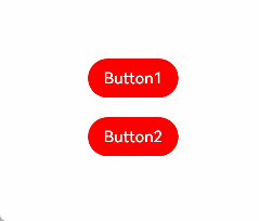
This example shows the most basic application scenario of stateStyles. Button1 is the first component and Button2 the second component. When either of these components is pressed, the black style specified for pressed takes effect. When the Tab key is pressed for sequential navigation, Button1 obtains focus first and is displayed in the pink style specified for focus. When Button 2 is focused, it is displayed in the pink style specified for focus, and Button1 changes to the red style specified for normal.
@Entry
@Component
struct StateStylesSample {
  build() {
    Column() {
      Button('Button1')
        .stateStyles({
          focused: {
            .backgroundColor(Color.Pink)
          },
          pressed: {
            .backgroundColor(Color.Black)
          },
          normal: {
            .backgroundColor(Color.Red)
          }
        })
        .margin(20)
      Button('Button2')
        .stateStyles({
          focused: {
            .backgroundColor(Color.Pink)
          },
          pressed: {
            .backgroundColor(Color.Black)
          },
          normal: {
            .backgroundColor(Color.Red)
          }
        })
    }.margin('30%')
  }
}
Figure 1 Focused and pressed states
Combined Use of @Styles and stateStyles
The following example uses @Styles to specify different states of stateStyles.
@Entry
@Component
struct MyComponent {
  @Styles normalStyle() {
    .backgroundColor(Color.Gray)
  }

  @Styles pressedStyle() {
    .backgroundColor(Color.Red)
  }

  build() {
    Column() {
      Text('Text1')
        .fontSize(50)
        .fontColor(Color.White)
        .stateStyles({
          normal: this.normalStyle,
          pressed: this.pressedStyle,
        })
    }
  }
}
Figure 2 Normal and pressed states

Using Regular Variables and State Variables in stateStyles
stateStyles can use this to bind regular variables and state variables in a component.
@Entry
@Component
struct CompWithInlineStateStyles {
  @State focusedColor: Color = Color.Red;
  normalColor: Color = Color.Green

  build() {
    Column() {
      Button('clickMe').height(100).width(100)
        .stateStyles({
          normal: {
            .backgroundColor(this.normalColor)
          },
          focused: {
            .backgroundColor(this.focusedColor)
          }
        })
        .onClick(() => {
          this.focusedColor = Color.Pink
        })
        .margin('30%')
    }
  }
}
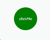
By default, the button is displayed in green in the normal state. When you press the Tab key for the first time, the button is focused and displayed in the red style specified for focus. After a click event occurs and you press the Tab key again, the button is focused and changes to the pink style.
Figure 3 Change of the styles in focused state by a click