Title Bar
The title bar is used to display the name and operation entry of a screen.
How to Use
-
Use the title bar mainly on a tool screen or content-oriented screen.
-
Place the title bar on the top of the screen. You do not need to highlight the title if the function or content needs to be highlighted.
Regular Title Bars
-
A regular title bar is used when the title does not need to be highlighted.
-
The title bar may have icons that show common actions, usually on the right side. Users can touch an icon to perform a particular action.
-
Title bars are needed on all screens, except for immersive screens.
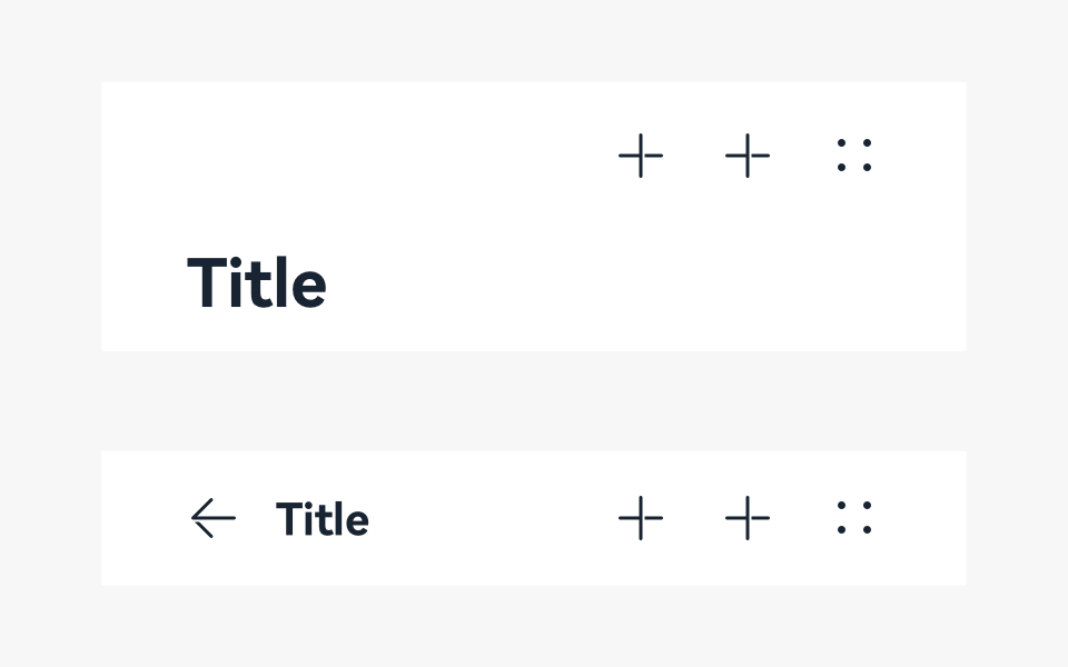
Title Bars on Non-level-1 Screens
-
The title of a non-level-1 screen is the name of the screen.
-
Place a maximum of three icons on the right. Alternatively, you can choose not to place any icon.
-
The main title and subtitle are optional. In the case of a two-line title, the title of the second line provides auxiliary description for the title of the first line.
-
[Not recommended] If there are multiple views but all other views except the default view are seldom used, you can use the drop-down menu title. However, this practice hides the content in the drop-down menu title and reduces their usage. Therefore, it is not recommended.
Writing Instructions
-
Keep the text on a title bar short and clear.
-
Keep the title consistent with the entry name of the previous screen.
-
Use noun phrases without punctuations.
Resources
For details about the development guide related to the title bar, see Navigation.