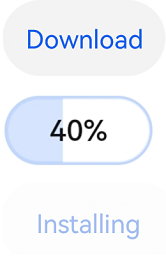
@ohos.arkui.advanced.ProgressButton (Download Button with Progress Indicator)
The download button with progress indicator is a component that shows the download progress.
NOTE
This component is supported since API version 10. Updates will be marked with a superscript to indicate their earliest API version.
Modules to Import
import { ProgressButton } from '@ohos.arkui.advanced.ProgressButton'
Attributes
The universal attributes are supported.
ProgressButton
ProgressButton({progress: number, content: string, progressButtonWidth?: Length, clickCallback: () => void, enable: boolean})
Decorator: @Component
System capability: SystemCapability.ArkUI.ArkUI.Full
Parameters
| Name | Type | Mandatory | Decorator | Description |
|---|---|---|---|---|
| progress | number | Yes | @Prop | Current download progress. |
| content | string | Yes | @Prop | Button text. |
| progressButtonWidth | Length | No | - | Width of the button. Default value: 44 |
| clickCallback | () => void | Yes | - | Callback invoked when the button is clicked. |
| enable | boolean | Yes | @Prop | Whether the button can be clicked. true: The button can be clicked. Ifalse: The button cannot be clicked. |
Events
The universal events are supported.
Example
import { ProgressButton } from '@ohos.arkui.advanced.ProgressButton'
@Entry
@Component
struct Index {
  @State halfProgress: number = 0
  @State smallProgress: number = 0
  @State bigProgress: number = 0
  @State textState1: string = ''
  @State isRunning1: boolean = false
  @State enableState1: boolean = true
  @State progressState: Visibility = Visibility.None
  @State ButtonState: Visibility = Visibility.Visible
  @State buttonText: string = 'Download'
  @State buttonEnable: boolean = true
  @State isEnd: boolean = false
  build() {
    Column({space: 20}) {
      Text ('Download button with progress indicator')
      Button(this.buttonText)
        .fontSize($r('sys.float.ohos_id_text_size_button3'))
        .fontWeight(FontWeight.Medium)
        .fontColor($r('sys.color.ohos_id_color_emphasize'))
        .padding({left: 8, right: 8})
        .opacity(this.buttonEnable? 1: 0.4)
        .enabled(this.buttonEnable)
        .height(28)
        .borderRadius(14)
        .width(60)
        .backgroundColor($r("sys.color.ohos_id_color_button_normal"))
        .onClick(() => {
          if(!this.isEnd) {
            this.buttonText = 'Pending'
            let timer1 = setInterval(() => {
              this.progressState = Visibility.Visible
              this.ButtonState = Visibility.None
              clearInterval(timer1)
              this.isRunning1 = true
              let timer = setInterval(() => {
                if (this.isRunning1) {
                  if (this.halfProgress === 100) {
                    this.isEnd = true
                  } else {
                    this.halfProgress++
                    if (this.halfProgress === 100) {
                      this.textState1 = 'Installing'
                      this.enableState1 = false
                      this.ButtonState = Visibility.Visible
                      this.progressState = Visibility.None
                      this.buttonEnable = false
                      this.buttonText = 'Installing'
                      let timer2 = setInterval(() => {
                        this.buttonText = 'Open'
                        this.buttonEnable = true
                        this.isEnd = true
                        clearInterval(timer2)
                      }, 2000)
                    }
                    console.info('x progress++ = ' + this.halfProgress)
                  }
                } else {
                  console.info('x isRunning = ' + false)
                  clearInterval(timer)
                }
              }, 100)
            }, 2000)
          }
        }).visibility(this.ButtonState)
      ProgressButton({
        progress: this.halfProgress,
        progressButtonWidth: "60",
        content: this.textState1,
        enable: this.enableState1,

        clickCallback: () => {
          if (this.isRunning1 && this.halfProgress < 100) {
            this.textState1 = 'Continue'
          }
          this.isRunning1 = !this.isRunning1
          let timer = setInterval(() => {

            if (this.isRunning1) {
              if (this.halfProgress === 100) {
              } else {
                this.halfProgress++
                if (this.halfProgress === 100) {
                  this.textState1 = 'Installing'
                  this.enableState1 = false
                  this.ButtonState = Visibility.Visible
                  this.progressState = Visibility.None
                  this.buttonEnable = false
                  this.buttonText = 'Installing'
                  let timer2 = setInterval(() => {
                    this.buttonText = 'Open'
                    this.buttonEnable = true
                    this.isEnd = true
                    clearInterval(timer2)
                  },2000)
                }
                console.info('x progress++ = ' + this.halfProgress)
              }
            } else {
              console.info('x isRunning = ' + false)
              clearInterval(timer)
            }
          }, 100)
        }
      }).visibility(this.progressState)
    }.alignItems(HorizontalAlign.Center).width('100%')
  }
}