Text Input (TextInput/TextArea)
The <TextInput> and <TextArea> components are input components typically used to accept input from the user, such as comments, chat messages, and table content. They can be used in combination with other components to meet more diversified purposes, for example, login and registration. For details, see TextInput and TextArea.
Creating a Text Box
The <TextInput> component provides single-line text input, while the <TextArea> component provides multi-line text input. To create these components, use the following APIs:
TextInput(value?:{placeholder?: ResourceStr, text?: ResourceStr, controller?: TextInputController})
TextArea(value?:{placeholder?: ResourceStr, text?: ResourceStr, controller?: TextAreaController})
-
Single-line text box
TextInput()
-
Multi-line text box
TextArea()
The <TextArea> component automatically wraps text so that each line does not have more than the width of the component.
TextArea({text:"I am TextArea I am TextArea I am TextArea"}).width(300)
Setting the Input Box Type
The <TextInput> component comes in nine types. You can specify its type by setting the type parameter to any of the following: Normal, Password, Email, Number, PhoneNumber, USER_NAME, NEW_PASSWORD, NUMBER_PASSWORD, SCREEN_LOCK_PASSWORD, and NUMBER_DECIMAL.
-
Normal type (default type)
TextInput()
  .type(InputType.Normal)
-
Password type
TextInput()
  .type(InputType.Password)
Setting Styles
-
Set the placeholder text displayed when there is no input. TextInput({placeholder:'I am placeholder text'})
TextInput({placeholder:'I am placeholder text'})
-
Set the current text input.
TextInput({placeholder:'I am placeholder text',text:'I am current text input'})
-
Use backgroundColor to set the background color of the text box.
TextInput({placeholder:'I am placeholder text',text:'I am current text input'})
  .backgroundColor(Color.Pink)
More styles can be implemented by leveraging the universal attributes.
Adding Events
You can add the onChange event for the text box to obtain its content changes. You can also add the universal events to implement user interactions.
TextInput()
  .onChange((value: string) => {
    console.info(value);
  })
  .onFocus(() => {
    console.info ('Get Focus');
  })
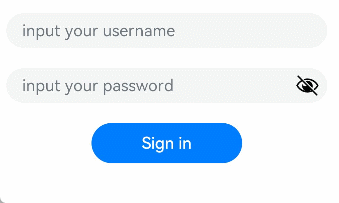
Example Scenario
In this example, the text box is used to submit forms on the user login or registration page.
@Entry
@Component
struct TextInputSample {
  build() {
    Column() {
      TextInput({ placeholder: 'input your username' }).margin({ top: 20 })
        .onSubmit((EnterKeyType)=>{
          console.info(EnterKeyType+'Enter key type')
        })
      TextInput({ placeholder: 'input your password' }).type(InputType.Password).margin({ top: 20 })
        .onSubmit((EnterKeyType)=>{
          console.info(EnterKeyType+'Enter key type')
        })
      Button('Sign in').width(150).margin({ top: 20 })
    }.padding(20)
  }
}