GridItem
The <GridItem> component provides a single item in a grid.
NOTE
- This component is supported since API version 7. Updates will be marked with a superscript to indicate their earliest API version.
- This component can be used only as a child of <Grid>.
Child Components
This component can contain a single child component.
APIs
GridItem()
Attributes
| Name | Type | Description |
|---|---|---|
| rowStart | number | Start row number of the component. |
| rowEnd | number | End row number of the component. |
| columnStart | number | Start column number of the component. |
| columnEnd | number | End column number of the component. |
| forceRebuild(deprecated) | boolean | Whether to re-create the component when it is being built. This API is deprecated since API version 9. Whether to re-create the component is automatically determined based on the component attributes and child component changes. No manual configuration is required. Default value: false |
| selectable8+ | boolean | Whether the grid item is selectable by the mouse. > NOTE > This attribute takes effect only when mouse frame selection is enabled for the parent <Grid> container. Default value: true |
| selected10+ | boolean | Whether the grid item is selected. This attribute supports $$ for two-way binding of variables. NOTE This attribute must be used before the style for the selected state is set. Default value: false |
NOTE
Rules for setting rowStart, rowEnd, columnStart, and columnEnd:
The valid value range of rowStart and rowEnd is 0 to the total number of rows minus 1. The valid value range of columnStart and columnEnd is 0 to the total number of columns minus 1.
If rowStart, rowEnd, columnStart, or columnEnd is set, the grid item occupies the specified number of rows (rowEnd - rowStart + 1) or columns (columnEnd - columnStart + 1).
Settings outside of the valid ranges do not take effect.
In the grid that has both columnTemplate and rowTemplate set, grid items that have rowStart/rowEnd or columnStart/columnEnd set are laid out in a row-by-row then column-by-column manner.
In the grid that has only columnTemplate set, grid items that have columnStart/columnEnd set are laid out in the specific columns. If there are already grid items in those columns, the grid items will be laid out in another row.
In the grid that has only rowTemplate set, grid items that have rowStart/rowEnd set are laid out in the specific rows. If there are already grid items in those rows, the grid items will be laid out in another column.
In the grid that has only columnTemplate set, grid items whose row or column number settings are invalid are laid out in a row-by-row then column-by-column manner.
In the grid that has neither columnTemplate nor rowTemplate set, the row and column number attributes do not work.
Events
| Name | Description |
|---|---|
| onSelect(event: (isSelected: boolean) => void)8+ | Triggered when the selected state of the grid item changes. isSelected: returns true if the grid item is being selected by the mouse; returns false otherwise. |
Example
// xxx.ets
@Entry
@Component
struct GridItemExample {
@State numbers: string[] = ["0", "1", "2", "3", "4", "5", "6", "7", "8", "9", "10", "11", "12", "13", "14", "15"]
build() {
Column() {
Grid() {
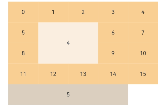
GridItem() {
Text('4')
.fontSize(16)
.backgroundColor(0xFAEEE0)
.width('100%')
.height('100%')
.textAlign(TextAlign.Center)
}.rowStart(1).rowEnd(2).columnStart(1).columnEnd(2) // Set valid row and column numbers.
ForEach(this.numbers, (item: string) => {
GridItem() {
Text(item)
.fontSize(16)
.backgroundColor(0xF9CF93)
.width('100%')
.height('100%')
.textAlign(TextAlign.Center)
}
}, (item: string) => item)
GridItem() {
Text('5')
.fontSize(16)
.backgroundColor(0xDBD0C0)
.width('100%')
.height('100%')
.textAlign(TextAlign.Center)
}.columnStart(1).columnEnd(4) // Set only the column numbers. The layout does not start from the first column.
}
.columnsTemplate('1fr 1fr 1fr 1fr 1fr')
.rowsTemplate('1fr 1fr 1fr 1fr 1fr')
.width('90%').height(300)
}.width('100%').margin({ top: 5 })
}
}