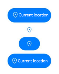
LocationButton
The <LocationButton> security component allows you to obtain temporary precise location permission from the user by their touching the button, eliminating the need for a permission request dialog box.
NOTE
This component is supported since API version 10. Updates will be marked with a superscript to indicate their earliest API version.
Child Components
Not supported
APIs
LocationButton
LocationButton()
Creates a Location button with an icon, text, and background.
LocationButton
LocationButton(option:{icon?: LocationIconStyle, text?: LocationDescription, buttonType?: ButtonType})
Creates a Location button that contains the specified elements.
Parameters
| Name | Type | Mandatory | Description |
|---|---|---|---|
| icon | LocationIconStyle | No | Icon style of the Location button. If this parameter is not specified, no icon is contained. Either icon or text, or both, must be set. |
| text | LocationDescription | No | Text on the Location button. If this parameter is not specified, no text is contained. Either icon or text, or both, must be set. |
| buttonType | ButtonType | No | Background style of the Location button. If this parameter is not specified, there is no background. |
LocationIconStyle
| Name | Value | Description |
|---|---|---|
| FULL_FILLED | 0 | Filled style icon. |
| LINES | 1 | Line style icon. |
LocationDescription
| Name | Value | Description |
|---|---|---|
| CURRENT_LOCATION | 0 | The text on the Location button is Current location. |
| ADD_LOCATION | 1 | The text on the Location button is Add location. |
| SELECT_LOCATION | 2 | The text on the Location button is Select location. |
| SHARE_LOCATION | 3 | The text on the Location button is Share location. |
| SEND_LOCATION | 4 | The text on the Location button is Send location. |
| LOCATING | 5 | The text on the Location button is Locate. |
| LOCATION | 6 | The text on the Location button is Location. |
| SEND_CURRENT_LOCATION | 7 | The text on the Location button is Send current location. |
| RELOCATION | 8 | The text on the Location button is Relocate. |
| PUNCH_IN | 9 | The text on the Location button is Punch in. |
| CURRENT_POSITION | 10 | The text on the Location button is Current position. |
LocationButtonOnClickResult
| Name | Value | Description |
|---|---|---|
| SUCCESS | 0 | The Location button is touched successfully. |
| TEMPORARY_AUTHORIZATION_FAILED | 1 | Temporary authorization fails after the Location button is touched. |
Attributes
This component can only inherit the universal attributes of security components
Events
Only the following events are supported.
| Name | Description |
|---|---|
| onClick(event: (event: ClickEvent, result: LocationButtonOnClickResult) => void) | Triggered when the component is touched. result: authorization result. event: For details, see ClickEvent. |
Example
// xxx.ets
@Entry
@Component
struct Index {
  build() {
    Row() {
      Column({space:10}) {
        // Create a default Location button with an icon, text, and background.
        LocationButton().onClick((event: ClickEvent, result: LocationButtonOnClickResult)=>{
          console.info("result " + result)
        })
        // Whether an element is contained depends on whether the parameter corresponding to the element is specified.
        LocationButton({icon:LocationIconStyle.LINES})
        // Create a Location button with only an icon and background.
        LocationButton({icon:LocationIconStyle.LINES, buttonType:ButtonType.Capsule})
        // Create a Location button with an icon, text, and background.
        LocationButton({icon:LocationIconStyle.LINES, text:LocationDescription.CURRENT_LOCATION, buttonType:ButtonType.Capsule})
      }.width('100%')
    }.height('100%')
  }
}
