Badge
The <Badge> component is a container that can be attached to another component for tagging.
NOTE
This component is supported since API version 7. Updates will be marked with a superscript to indicate their earliest API version.
Child Components
This component supports only one child component.
NOTE
Built-in components and custom components are allowed, with support for (if/else, ForEach, and LazyForEach) rendering control.
APIs
Badge
Badge(value: BadgeParamWithNumber)
Creates a badge.
Since API version 9, this API is supported in ArkTS widgets.
Parameters
| Name | Type | Mandatory | Description |
|---|---|---|---|
| value | BadgeParamWithNumber | Yes | Parameter of the numbered badge. |
BadgeParamWithNumber
| Name | Type | Mandatory | Description |
|---|---|---|---|
| count | number | Yes | Number of notifications. NOTE If the value is less than or equal to 0, no badge is displayed. Value range: [-2147483648, 2147483647] If the value is out of the range, 4294967296 is added or subtracted so that the value is within the range. If the value is not an integer, it is rounded off to the nearest integer. For example, 5.5 is rounded off to 5. |
| position | BadgePosition|Position10+ | No | Position to display the badge relative to the parent component. Default value: BadgePosition.RightTop NOTE This parameter cannot be set in percentage. If it is set to an invalid value, the default value (0,0) will be used. |
| maxCount | number | No | Maximum number of notifications. When the maximum number is reached, only maxCount+ is displayed. Default value: 99 Value range: [-2147483648, 2147483647] If the value is out of the range, 4294967296 is added or subtracted so that the value is within the range. If the value is not an integer, it is rounded off to the nearest integer. For example, 5.5 is rounded off to 5. |
| style | BadgeStyle | Yes | Style of the badge, including the font color, font size, badge color, and badge size. |
Badge
Badge(value: BadgeParamWithString)
Creates a badge based on the given string.
Since API version 9, this API is supported in ArkTS widgets.
Parameters
| Name | Type | Mandatory | Description |
|---|---|---|---|
| value | BadgeParamWithString | Yes | Parameter of the string-type badge. |
BadgeParamWithString
| Name | Type | Mandatory | Default Value | Description |
|---|---|---|---|---|
| value | string | Yes | - | Prompt content. |
| position | BadgePosition|Position10+ | No | BadgePosition.RightTop | Position to display the badge relative to the parent component. |
| style | BadgeStyle | Yes | - | Style of the badge, including the font color, font size, badge color, and badge size. |
BadgePosition
Since API version 9, this API is supported in ArkTS widgets.
| Name | Value | Description |
|---|---|---|
| RightTop | 0 | The badge is displayed in the upper right corner of the parent component. |
| Right | 1 | The badge is vertically centered on the right of the parent component. |
| Left | 2 | The badge is vertically centered on the left of the parent component. |
BadgeStyle
Since API version 9, this API is supported in ArkTS widgets.
| Name | Type | Mandatory | Description |
|---|---|---|---|
| color | ResourceColor | No | Font color. Default value: Color.White |
| fontSize | number | string | No | Font size. Default value: 10 Unit: vp NOTE This parameter cannot be set in percentage. |
| badgeSize | number | string | No | Badge size. Default value: 16 Unit: vp NOTE This parameter cannot be set in percentage. If it is set to an invalid value, the default value is used. |
| badgeColor | ResourceColor | No | Badge color. Default value: Color.Red |
| fontWeight10+ | number |FontWeight | string | No | Font weight of the text. Default value: FontWeight.Normal NOTE This parameter cannot be set in percentage. |
| borderColor10+ | ResourceColor | No | Border color of the background. |
| borderWidth10+ | Length | No | Border width of the background. Default value: 1 Unit: vp NOTE This parameter cannot be set in percentage. |
Attributes
The universal attributes are supported.
Events
The universal events are supported.
Example
// xxx.ets
@Entry
@Component
struct BadgeExample {
@Builder tabBuilder(index: number) {
Column() {
if (index === 2) {
Badge({
value: '',
style: { badgeSize: 6, badgeColor: '#FA2A2D' }
}) {
Image('/common/public_icon_off.svg')
.width(24)
.height(24)
}
.width(24)
.height(24)
.margin({ bottom: 4 })
} else {
Image('/common/public_icon_off.svg')
.width(24)
.height(24)
.margin({ bottom: 4 })
}
Text('Tab')
.fontColor('#182431')
.fontSize(10)
.fontWeight(500)
.lineHeight(14)
}.width('100%').height('100%').justifyContent(FlexAlign.Center)
}
@Builder itemBuilder(value: string) {
Row() {
Image('common/public_icon.svg').width(32).height(32).opacity(0.6)
Text(value)
.width(177)
.height(21)
.margin({ left: 15, right: 76 })
.textAlign(TextAlign.Start)
.fontColor('#182431')
.fontWeight(500)
.fontSize(16)
.opacity(0.9)
Image('common/public_icon_arrow_right.svg').width(12).height(24).opacity(0.6)
}.width('100%').padding({ left: 12, right: 12 }).height(56)
}
build() {
Column() {
Text('dotsBadge').fontSize(18).fontColor('#182431').fontWeight(500).margin(24)
Tabs() {
TabContent()
.tabBar(this.tabBuilder(0))
TabContent()
.tabBar(this.tabBuilder(1))
TabContent()
.tabBar(this.tabBuilder(2))
TabContent()
.tabBar(this.tabBuilder(3))
}
.width(360)
.height(56)
.backgroundColor('#F1F3F5')
Column() {
Text('stringBadge').fontSize(18).fontColor('#182431').fontWeight(500).margin(24)
List({ space: 12 }) {
ListItem() {
Text('list1').fontSize(14).fontColor('#182431').margin({ left: 12 })
}
.width('100%')
.height(56)
.backgroundColor('#FFFFFF')
.borderRadius(24)
.align(Alignment.Start)
ListItem() {
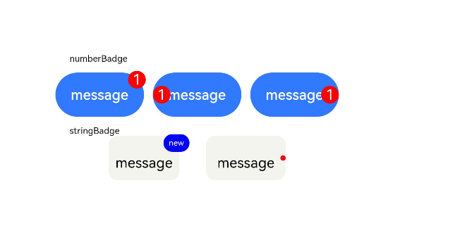
Badge({
value: 'New',
position: BadgePosition.Right,
style: { badgeSize: 16, badgeColor: '#FA2A2D' }
}) {
Text('list2').width(27).height(19).fontSize(14).fontColor('#182431')
}.width(49.5).height(19)
.margin({ left: 12 })
}
.width('100%')
.height(56)
.backgroundColor('#FFFFFF')
.borderRadius(24)
.align(Alignment.Start)
}.width(336)
Text('numberBadge').fontSize(18).fontColor('#182431').fontWeight(500).margin(24)
List() {
ListItem() {
this.itemBuilder('list1')
}
ListItem() {
Row() {
Image('common/public_icon.svg').width(32).height(32).opacity(0.6)
Badge({
count: 1,
position: BadgePosition.Right,
style: { badgeSize: 16, badgeColor: '#FA2A2D' }
}) {
Text('list2')
.width(177)
.height(21)
.textAlign(TextAlign.Start)
.fontColor('#182431')
.fontWeight(500)
.fontSize(16)
.opacity(0.9)
}.width(240).height(21).margin({ left: 15, right: 11 })
Image('common/public_icon_arrow_right.svg').width(12).height(24).opacity(0.6)
}.width('100%').padding({ left: 12, right: 12 }).height(56)
}
ListItem() {
this.itemBuilder('list3')
}
ListItem() {
this.itemBuilder('list4')
}
}
.width(336)
.height(232)
.backgroundColor('#FFFFFF')
.borderRadius(24)
.padding({ top: 4, bottom: 4 })
.divider({ strokeWidth: 0.5, color: 'rgba(0,0,0,0.1)', startMargin: 60, endMargin: 12 })
}.width('100%').backgroundColor('#F1F3F5').padding({ bottom: 12 })
}.width('100%')
}
}