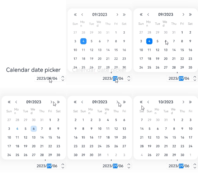
CalendarPicker
The <CalendarPicker> component provides a drop-down calendar for users to select a date.
NOTE
This component is supported since API version 10. Updates will be marked with a superscript to indicate their earliest API version.
Child Components
Not supported
APIs
CalendarPicker(options?: CalendarOptions)
Creates a calendar picker.
System capability: SystemCapability.ArkUI.ArkUI.Full
Parameters
| Name | Type | Mandatory | Description |
|---|---|---|---|
| options | CalendarOptions | No | Parameters of the calendar picker. |
Attributes
In addition to the universal attributes, the following attributes are supported.
| Name | Type | Description |
|---|---|---|
| edgeAlign | alignType: CalendarAlign, offset?: Offset | How the picker is aligned with the entry component. - alignType: alignment type. Default value: CalendarAlign.END - offset: offset of the picker relative to the entry component after alignment based on the specified alignment type. Default value: {dx: 0, dy: 0}. |
| textStyle | PickerTextStyle | Font color, font size, and font width in the entry area. |
Events
In addition to the universal events, the following events are supported.
| Name | Description |
|---|---|
| onChange(callback: (value: Date) => void) | Triggered when a date is selected. value: selected date value |
CalendarOptions
| Name | Type | Mandatory | Description |
|---|---|---|---|
| hintRadius | number | Resource | No | Style of the background of the selected state. Default value: The background is a circle. NOTE If the value is 0, the background is a rectangle with square corners. If the value is in the 0–16 range, the background is a rectangle with rounded corners. If the value is equal to or greater than 16, the background is a circle. |
| selected | Date | No | Date of the selected item. If the value is not set or does not comply with the date format specifications, the default value will be used. Default value: current system date |
CalendarAlign
Since API version 9, this API is supported in ArkTS widgets.
| Name | Description |
|---|---|
| START | The picker is left aligned with the entry component. |
| CENTER | The picker is center aligned with the entry component. |
| END | The picker is right aligned with the entry component. |
Example
// xxx.ets
@Entry
@Component
struct CalendarPickerExample {
  private selectedDate: Date = new Date()
  build() {
    Column() {
      Text('Calendar date picker').fontSize(30)
      Column() {
        CalendarPicker({ hintRadius: 10, selected: this.selectedDate })
          .edgeAlign(CalendarAlign.END)
          .textStyle({ color: "#ff182431", font: { size: 20, weight: FontWeight.Normal } })
          .margin(10)
          .onChange((value) => {
            console.info("CalendarPicker onChange:" + JSON.stringify(value))
          })
      }.alignItems(HorizontalAlign.End).width("100%")
    }.width('100%').margin({top:350})
  }
}
