progress
The <Progress> component is used to provide a progress bar that displays the progress of content loading or an operation.
NOTE
This component is supported since API version 4. Updates will be marked with a superscript to indicate their earliest API version.
Child Components
Not supported
Attributes
| Name | Type | Default Value | Mandatory | Description |
|---|---|---|---|---|
| type | string | horizontal | No | Type of the progress bar, which cannot be changed dynamically. Available values are as follows: - horizontal: linear progress bar. - arc: arc progress bar. |
| id | string | - | No | Unique ID of the component. |
| style | string | - | No | Style declaration of the component. |
| class | string | - | No | Style class of the component, which is used to refer to a style table. |
| ref | string | - | No | Reference information of child elements, which is registered with the parent component on $refs. |
Different types of progress bars support different attributes.
- When type is set to horizontal, the following attributes are supported.
| Name | Type | Default Value | Mandatory | Description |
|---|---|---|---|---|
| percent | number | 0 | No | Current progress. The value ranges from 0 to 100. |
- When type is set to arc, the following attributes are supported.
| Name | Type | Default Value | Mandatory | Description |
|---|---|---|---|---|
| percent | number | 0 | No | Current progress. The value ranges from 0 to 100. |
Events
| Name | Parameter | Description |
|---|---|---|
| click | - | Triggered when the component is clicked. |
| longpress | - | Triggered when the component is long pressed. |
| swipe5+ | SwipeEvent | Triggered when a user quickly swipes on the component. |
Styles
- When type is set to horizontal, the following styles are supported.
| Name | Type | Default Value | Mandatory | Description |
|---|---|---|---|---|
| color | <color> | #6b9ac7 | No | Color of the progress bar. |
| stroke-width | <length> | 321-4 | 45+px | No | Stroke width of the progress bar. |
- When type is set to arc, the following styles are supported.
| Name | Type | Default Value | Mandatory | Description |
|---|---|---|---|---|
| color | <color> | - | No | Color of the arc progress bar. |
| background-color | <color> | - | No | Background color of the arc progress bar. |
| stroke-width | <length> | - | No | Width of the arc progress bar. A larger width value means that the progress bar is closer to the center of the circle. The width is always within the radius range. |
| start-angle | <deg> | 240 | No | Start angle of the arc progress bar, which starts from the direction of zero o'clock. The value ranges from 0 to 360 degrees (clockwise). |
| total-angle | <deg> | 240 | No | Total length of the arc progress bar. The value ranges from –360 to 360. A negative number indicates anticlockwise. |
| center-x | <length> | - | No | Center of the arc progress bar (with the upper left corner of this widget as the coordinate origin). This style must be used together with center-y and radius. |
| center-y | <length> | - | No | Center of the arc progress bar (with the upper left corner of this widget as the coordinate origin). This style must be used together with center-x and radius. |
| radius | <length> | - | No | Radius of the arc progress bar. This style must be used together with center-x and center-y. |
In addition to the preceding styles, the following styles are supported.
| Name | Type | Default Value | Mandatory | Description |
|---|---|---|---|---|
| width | <length> | <percentage>5+ | - | No | Component width. If this attribute is not set, the default value 0 is used. |
| height | <length> | <percentage>5+ | - | No | Component height. If this attribute is not set, the default value 0 is used. |
| padding | <length> | 0 | No | Shorthand attribute to set the padding for all sides. The attribute can have one to four values: - If you set only one value, it specifies the padding for all the four sides. - If you set two values, the first value specifies the top and bottom padding, and the second value specifies the left and right padding. - If you set three values, the first value specifies the top padding, the second value specifies the left and right padding, and the third value specifies the bottom padding. - If you set four values, they respectively specify the padding for top, right, bottom, and left sides (in clockwise order). |
| padding-[left|top|right|bottom] | <length> | 0 | No | Left, top, right, and bottom padding. |
| margin | <length> | <percentage>5+ | 0 | No | Shorthand attribute to set the margin for all sides. The attribute can have one to four values: - If you set only one value, it specifies the margin for all the four sides. - If you set two values, the first value specifies the top and bottom margins, and the second value specifies the left and right margins. - If you set three values, the first value specifies the top margin, the second value specifies the left and right margins, and the third value specifies the bottom margin. - If you set four values, they respectively specify the margin for top, right, bottom, and left sides (in clockwise order). |
| margin-[left|top|right|bottom] | <length> | <percentage>5+ | 0 | No | Left, top, right, and bottom margins. |
| border-width | <length> | 0 | No | Shorthand attribute to set the margin for all sides. |
| border-color | <color> | black | No | Shorthand attribute to set the color for all borders. |
| border-radius | <length> | - | No | Radius of round-corner borders. |
| display | string | flex | No | How and whether to display the box containing an element. Available values are as follows: - flex: flexible layout - none: not rendered |
| [left|top] | <length> | <percentage>6+ | - | No | Edge of the element. - left: left edge position of the element. This attribute defines the offset between the left edge of the margin area of a positioned element and left edge of its containing block. - top: top edge position of the element. This attribute defines the offset between the top edge of a positioned element and that of a block included in the element. |
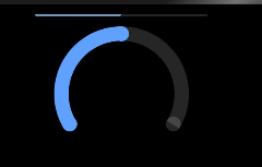
Example
<!-- xxx.hml -->
<div class="container">
  <progress type="horizontal" percent="{{horizontalVal}}" style="height: 10%;width: 40%;" onclick = "changeHorizontal"></progress>
  <progress type="arc" class="min-progress" percent="{{arcVal}}" on:click="changeArc"></progress>
</div>
/* xxx.css */
.container {
  flex-direction: column;
  height: 100%;
  width: 100%;
  align-items: center;
}
.min-progress {
  width: 300px;
  height: 300px;
}
// xxx.js
export default {
  data: {
    arcVal: 0,
    horizontalVal: 0
  },
  changeArc() {
    this.arcVal+= 10;
  },
  changeHorizontal() {
    this.horizontalVal+= 10;
  }
}