Custom Dialog Box (CustomDialog)
A custom dialog box is a dialog box you customize by using APIs of the CustomDialogController class. It can be used for user interactions, showing an ad, prize, alert, software update message, and more. For details, see Custom Dialog Box.
Creating a Custom Dialog Box
-
Use the @CustomDialog decorator to create a custom dialog box.
-
Set the content for the @CustomDialog decorated dialog box.
@CustomDialog struct CustomDialogExample { controller: CustomDialogController = new CustomDialogController({ builder: CustomDialogExample({}), }) build() { Column() { Text ('I am content') .fontSize(20) .margin({ top: 10, bottom: 10 }) } } } -
Create a builder that is bound to the decorator.
@Entry @Component struct CustomDialogUser { dialogController: CustomDialogController = new CustomDialogController({ builder: CustomDialogExample(), }) } -
Click the component bound to the onClick event to display the dialog box.
@Entry
@Component
struct CustomDialogUser {
  dialogController: CustomDialogController = new CustomDialogController({
    builder: CustomDialogExample(),
  })

  build() {
    Column() {
      Button('click me')
        .onClick(() => {
          this.dialogController.open()
        })
    }.width('100%').margin({ top: 5 })
  }
}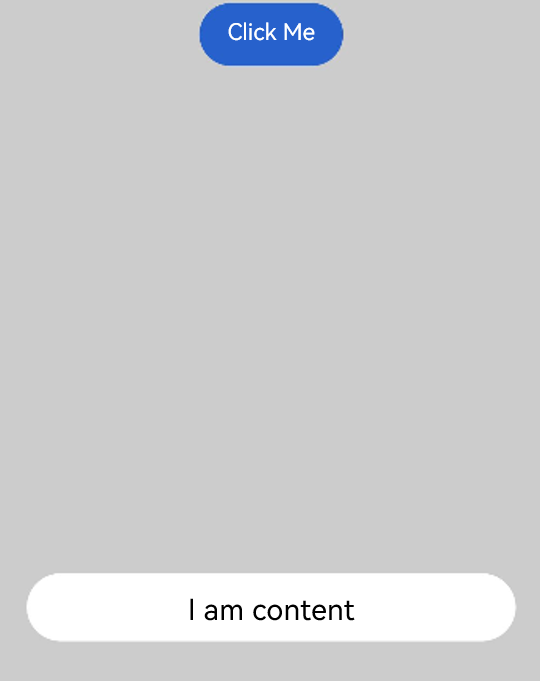
Interaction with Custom Dialog Box
Custom dialog boxes can be used for data interactions to complete a series of response operations.
-
Add buttons in the @CustomDialog decorator structure and add data functions.
@CustomDialog struct CustomDialogExample { cancel?: () => void confirm?: () => void controller: CustomDialogController build() { Column() { Text('I am content') .fontSize(20).margin({ top: 10, bottom: 10 }) Flex({ justifyContent: FlexAlign.SpaceAround }) { Button('cancel') .onClick(() => { this.controller.close() if (this.cancel) { this.cancel() } }).backgroundColor(0xffffff).fontColor(Color.Black) Button('confirm') .onClick(() => { this.controller.close() if (this.confirm) { this.confirm() } }).backgroundColor(0xffffff).fontColor(Color.Red) }.margin({ bottom: 10 }) } } } -
Receive the page in the builder and create corresponding function operations.
@Entry
@Component
struct CustomDialogUser {
  dialogController: CustomDialogController = new CustomDialogController({
    builder: CustomDialogExample({
      cancel: ()=> { this.onCancel() },
      confirm: ()=> { this.onAccept() },
    }),
  })

  onCancel() {
    console.info('Callback when the first button is clicked')
  }

  onAccept() {
    console.info('Callback when the second button is clicked')
  }

  build() {
    Column() {
      Button('click me')
        .onClick(() => {
          this.dialogController.open()
        })
    }.width('100%').margin({ top: 5 })
  }
}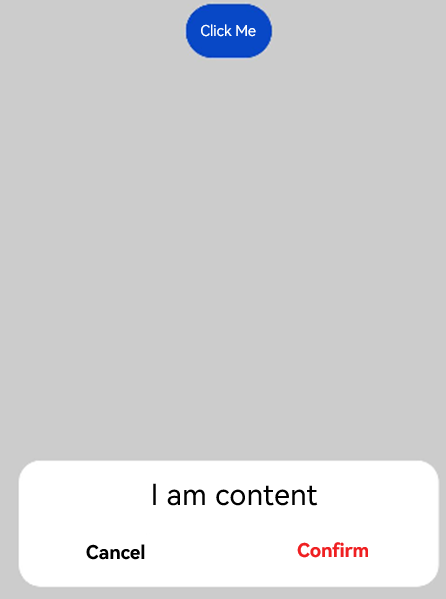
Defining the Custom Dialog Box Animation
You can define the custom dialog box animation, including its duration and speed, through openAnimation.
@CustomDialog
struct CustomDialogExample {
  controller?: CustomDialogController

  build() {
    Column() {
      Text('Whether to change a text?').fontSize(16).margin({ bottom: 10 })
    }
  }
}

@Entry
@Component
struct CustomDialogUser {
  @State textValue: string = ''
  @State inputValue: string = 'click me'
  dialogController: CustomDialogController | null = new CustomDialogController({
    builder: CustomDialogExample(),
    openAnimation: {
      duration: 1200,
      curve: Curve.Friction,
      delay: 500,
      playMode: PlayMode.Alternate,
      onFinish: () => {
        console.info('play end')
      }
    },
    autoCancel: true,
    alignment: DialogAlignment.Bottom,
    offset: { dx: 0, dy: -20 },
    gridCount: 4,
    customStyle: false,
    backgroundColor: 0xd9ffffff,
    cornerRadius: 10,
  })

  // Set dialogController to null when the custom component is about to be destroyed.
  aboutToDisappear() {
    this.dialogController = null // Set dialogController to null.
  }

  build() {
    Column() {
      Button(this.inputValue)
        .onClick(() => {
          if (this.dialogController != null) {
            this.dialogController.open()
          }
        }).backgroundColor(0x317aff)
    }.width('100%').margin({ top: 5 })
  }
}
Example
@CustomDialog
struct CustomDialogExample {
  cancel?: () => void
  confirm?: () => void
  controller: CustomDialogController

  build() {
    Column() {
      Text('I am content') .fontSize(20).margin({ top: 10, bottom: 10 })
      Flex({ justifyContent: FlexAlign.SpaceAround }) {
        Button('cancel')
          .onClick(() => {
            this.controller.close()
            if (this.cancel) {
              this.cancel()
            }
          }).backgroundColor(0xffffff).fontColor(Color.Black)
        Button('confirm')
          .onClick(() => {
            this.controller.close()
            if (this.confirm) {
              this.confirm()
            }
          }).backgroundColor(0xffffff).fontColor(Color.Red)
      }.margin({ bottom: 10 })
    }
  }
}

@Entry
@Component
struct CustomDialogUser {
  dialogController: CustomDialogController = new CustomDialogController({
    builder: CustomDialogExample({
      cancel: ()=> { this.onCancel() },
      confirm: ()=> { this.onAccept() },
    }),
  })

  onCancel() {
    console.info('Callback when the first button is clicked')
  }

  onAccept() {
    console.info('Callback when the second button is clicked')
  }

  build() {
    Column() {
      Button('click me')
        .onClick(() => {
          this.dialogController.open()
        })
    }.width('100%').margin({ top: 5 })
  }
}