Click Event
A click event is triggered when a component is clicked.
NOTE
The APIs of this module are supported since API version 7. Updates will be marked with a superscript to indicate their earliest API version.
Events
| Name | Bubbling Supported | Description |
|---|---|---|
| onClick(event: (event: ClickEvent) => void) | No | Called when a click event occurs. For details about event, see ClickEvent. Since API version 9, this API is supported in ArkTS widgets. |
ClickEvent
Since API version 9, this API is supported in ArkTS widgets.
| Name | Type | Description |
|---|---|---|
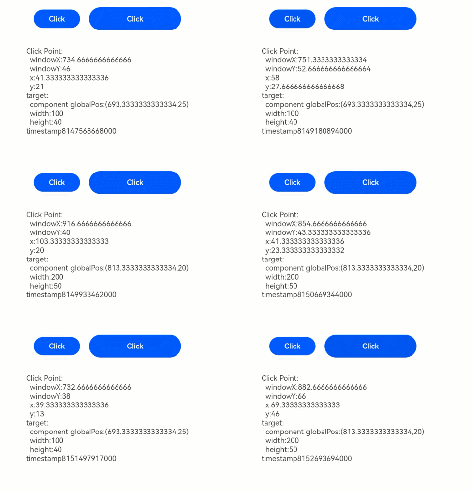
| x | number | X coordinate of the click relative to the upper left corner of the component being clicked. Unit: vp |
| y | number | Y coordinate of the click relative to the upper left corner of the component being clicked. Unit: vp |
| timestamp8+ | number | Timestamp of the event. It is the interval between the time when the event is triggered and the time when the system starts. Unit: ns |
| target8+ | EventTarget | Display area of the object that triggers the event. |
| source8+ | SourceType | Event input device. |
| windowX10+ | number | X coordinate of the click relative to the upper left corner of the application window. Unit: vp |
| windowY10+ | number | Y coordinate of the click relative to the upper left corner of the application window. Unit: vp |
| displayX10+ | number | X coordinate of the click relative to the upper left corner of the application screen. Unit: vp |
| displayY10+ | number | Y coordinate of the click relative to the upper left corner of the application screen. Unit: vp |
| screenX(deprecated) | number | X coordinate of the click relative to the upper left corner of the application window. This API is deprecated since API version 10. You are advised to use windowX instead. |
| screenY(deprecated) | number | Y coordinate of the click relative to the upper left corner of the application window. This API is deprecated since API version 10. You are advised to use windowY instead. |
EventTarget8+
Since API version 9, this API is supported in ArkTS widgets.
| Name | Type | Description |
|---|---|---|
| area | Area | Area information of the target element. |
Example
// xxx.ets
@Entry
@Component
struct ClickExample {
  @State text: string = ''

  build() {
    Column() {
      Row({ space: 20 }) {
        Button('Click').width(100).height(40)
          .onClick((event?: ClickEvent) => {
            if(event){
              this.text = 'Click Point:' + '\n  windowX:' + event.windowX + '\n  windowY:' + event.windowY
              + '\n  x:' + event.x + '\n  y:' + event.y + '\ntarget:' + '\n  component globalPos:('
              + event.target.area.globalPosition.x + ',' + event.target.area.globalPosition.y + ')\n  width:'
              + event.target.area.width + '\n  height:' + event.target.area.height + '\ntimestamp' + event.timestamp;
            }
          })
        Button('Click').width(200).height(50)
          .onClick((event?: ClickEvent) => {
            if(event){
              this.text = 'Click Point:' + '\n  windowX:' + event.windowX + '\n  windowY:' + event.windowY
              + '\n  x:' + event.x + '\n  y:' + event.y + '\ntarget:' + '\n  component globalPos:('
              + event.target.area.globalPosition.x + ',' + event.target.area.globalPosition.y + ')\n  width:'
              + event.target.area.width + '\n  height:' + event.target.area.height + '\ntimestamp' + event.timestamp;
            }
          })
      }.margin(20)

      Text(this.text).margin(15)
    }.width('100%')
  }
}
