FormComponent
The FormComponent is used to display widgets.
NOTE
- This component is supported since API version 7. Newly added APIs will be marked with a superscript to indicate their earliest API version.
- This component is intended for the widget host. For details about the widget provider, see JS Service Widget UI Components.
- To use this component, you must have the system signature.
- The APIs provided by this component are system APIs.
Required Permissions
ohos.permission.REQUIRE_FORM
Child Components
Not supported
APIs
FormComponent(value: { id: number; name: string; bundle: string; ability: string; module: string; dimension?: FormDimension; temporary?: boolean })
Creates a FormComponent instance to display the provided widget.
Parameters
| Name | Type | Mandatory | Description |
|---|---|---|---|
| id | number | Yes | Widget ID. Set this parameter to 0 for a new widget. NOTE Different widget hosts cannot use the same ID. If a widget host uses the same ID for two widgets, the one added later is displayed. |
| name | string | Yes | Widget name. |
| bundle | string | Yes | Bundle name of the widget. |
| ability | string | Yes | Ability name of the widget. |
| module | string | Yes | Module name of the widget. |
| dimension | FormDimension | No | Dimensions of the widget. The widgets in the 2 x 2, 4 x 4, and 4 x 2 dimensions are supported. Default value: Dimension_2_2 |
| temporary | boolean | No | Whether the widget is a temporary one. |
FormDimension
| Name | Description |
|---|---|
| Dimension_1_2 | 1 x 2 widget. |
| Dimension_2_2 | 2 x 2 widget. |
| Dimension_2_4 | 2 x 4 widget. |
| Dimension_4_4 | 4 x 4 widget. |
| Dimension_2_19+ | 2 x 1 widget. |
Attributes
| Name | Type | Mandatory | Description |
|---|---|---|---|
| size | { width?: number, height?: number } |
Yes | Size of the widget. |
| moduleName | string | Yes | Module name of the widget. |
| dimension | FormDimension | No | Dimensions of the widget. The widgets in the 2 x 2, 4 x 4, and 4 x 2 dimensions are supported. Default value: Dimension_2_2 |
| allowUpdate | boolean | No | Whether to allow the widget to update. Default value: true |
| visibility | Visibility | No | Whether the widget is visible. Default value: Visible |
Events
| Name | Description |
|---|---|
| onAcquired(callback: (info: { id: number }) => void) | Triggered when a widget is obtained. This API returns the ID of the obtained widget. |
| onError(callback: (info: { errcode: number, msg: string }) => void) | Triggered when an error occurs during component loading. errcode: error code. msg: error information. For details, see Form Error Codes. |
| onRouter(callback: (info: any) => void) | Triggered when routing occurs for the widget. This API returns information in routerEvent. |
| onUninstall(callback: (info: { id: number }) => void) | Triggered when a widget is uninstalled. This API returns the ID of the uninstalled widget. |
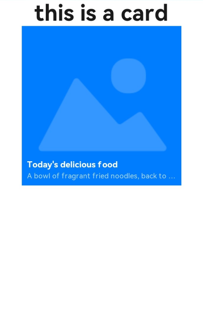
Example
//card.ets
@Entry
@Component
struct CardExample {
   @State formId:number = 0;
  build() {
    Column() {
      Text('this is a card')
        .fontSize(50)
        .fontWeight(FontWeight.Bold)
      FormComponent({
        id:this.formId,
        name:"Form1",
        bundle:"com.example.cardexample",
        ability:"FormAbility",
        module:"entry",
        dimension:FormDimension.Dimension_2_2,
        temporary:false
      })
        .allowUpdate(true)
        .size({width:360,height:360})
        .visibility(Visibility.Visible)
        .onAcquired((form)=>{
          console.log(`form info : ${JSON.stringify(form)}`);
          this.formId = form.id;
        })
        .onError((err)=>{
          console.log(`fail to add form, err: ${JSON.stringify(err)}`);
        })

    }
    .width('100%')
    .height('100%')
  }
}
