Creating a Custom Component
In ArkUI, components are what's displayed on the UI. They can be classified as built-in components – those directly provided by the ArkUI framework, and custom components – those defined by developers. Defining the entire application UI with just built-in components would lead to a monolithic design, low code maintainability, and poor execution performance. A good UI is the result of a well-thought-out development process, with such factors as code reusability, separation of service logic from the UI, and version evolution carefully considered. Creating custom components that encapsulate the UI and some business logic is a critical step in this process.
The custom component has the following features:
-
Combinable: allows you to combine built-in components and other components, as well as their attributes and methods.
-
Reusable: can be reused by other components and used as different instances in different parent components or containers.
-
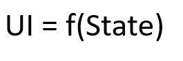
Data-driven update: holds some state and triggers UI re-rendering with the change of state variables.
Basic Usage of Custom Components
The following example shows the basic usage of a custom component.
@Component
struct HelloComponent {
  @State message: string = 'Hello, World!';

  build() {
    // The HelloComponent custom component combines the <Row> and <Text> built-in components.
    Row() {
      Text(this.message)
        .onClick(() => {
          // The change of the state variable message drives the UI to be re-rendered. As a result, the text changes from "Hello, World!" to "Hello, ArkUI!".
          this.message = 'Hello, ArkUI!';
        })
    }
  }
}
NOTE
To reference the custom component in another file, use the keyword export to export the component and then use import to import it to the target file.
Multiple HelloComponent instances can be created in the build() function of other custom components. In this way, HelloComponent is reused by those custom components.
class HelloComponentParam {
  message: string = ""
}

@Entry
@Component
struct ParentComponent {
  param: HelloComponentParam = {
    message: 'Hello, World!'
  }

  build() {
    Column() {
      Text('ArkUI message')
      HelloComponent(this.param);
      Divider()
      HelloComponent(this.param);
    }
  }
}
To fully understand the preceding example, a knowledge of the following concepts is essential:
Basic Structure of a Custom Component
-
struct: The definition of a custom component must start with the @Component struct followed by the component name, and then component body enclosed by curly brackets {....}. No inheritance is allowed. You can omit the new operator when instantiating a struct.
NOTE
The name or its class or function name of a custom component must be different from that of any built-in components.
-
@Component: The @Component decorator can decorate only the structs declared by the struct keyword. After being decorated by @Component, a struct has the componentization capability. It must implement the build function to describe the UI. Each struct can be decorated by only one @Component.
NOTE
Since API version 9, this decorator is supported in ArkTS widgets.
Since API version 11, @Component can accept an optional parameter of the Boolean type.
@Component struct MyComponent { }freezeWhenInactive11+
Describes component freezing options.
| Name | Type | Mandatory | Description |
|---|---|---|---|
| freezeWhenInactive | bool | No | Whether to enable component freezing. |
@Component({ freezeWhenInactive: true })
struct MyComponent {
}
-
build(): The build() function is used to define the declarative UI description of a custom component. Every custom component must define a build() function.
@Component struct MyComponent { build() { } } -
@Entry: A custom component decorated with @Entry is used as the default entry component of the page. Only one component can be decorated with @Entry in a single source file. The @Entry decorator accepts an optional parameter of type LocalStorage.
NOTE
Since API version 9, this decorator is supported in ArkTS widgets.
Since API version 10, the @Entry decorator accepts an optional parameter of type LocalStorage or type EntryOptions.
@Entry @Component struct MyComponent { }EntryOptions10+
Describes the named route options.
| Name | Type | Mandatory | Description |
|---|---|---|---|
| routeName | string | No | Name of the target named route. |
| storage | LocalStorage | No | Storage of the page-level UI state. |
@Entry({ routeName : 'myPage' })
@Component
struct MyComponent {
}
-
@Reusable: Custom components decorated by @Reusable can be reused.
NOTE
Since API version 10, this decorator is supported in ArkTS widgets.
@Reusable
@Component
struct MyComponent {
}
Member Functions/Variables
In addition to the mandatory build() function, a custom component may implement other member functions with the following restrictions:
- Access to the member functions is private. Avoid declaring the member functions as static functions.
A custom component can also implement member variables with the following restrictions:
-
Access to the member variables is private. Avoid declaring the member variables as static variables.
-
Local initialization is optional for some member variables and mandatory for others. For details about whether local initialization or initialization from the parent component is required, see State Management.
Rules for Custom Component Parameters
As can be learnt from preceding examples, a custom component can be created from a build method. During the creation, the custom component's parameters are initialized based on the decorator rules.
@Component
struct MyComponent {
  private countDownFrom: number = 0;
  private color: Color = Color.Blue;

  build() {
  }
}

@Entry
@Component
struct ParentComponent {
  private someColor: Color = Color.Pink;

  build() {
    Column() {
      // Create an instance of MyComponent and initialize its countDownFrom variable with the value 10 and its color variable with the value this.someColor.
      MyComponent({ countDownFrom: 10, color: this.someColor })
    }
  }
}
build() Function
Whatever declared in the build() function are called UI descriptions. UI descriptions must comply with the following rules:
-
For an @Entry decorated custom component, exactly one root component is required under the build() function. This root component must be a container component. ForEach is not allowed at the top level. For an @Component decorated custom component, exactly one root component is required under the build() function. This root component is not necessarily a container component. ForEach is not allowed at the top level.
@Entry @Component struct MyComponent { build() { // Exactly one root component is required, and it must be a container component. Row() { ChildComponent() } } } @Component struct ChildComponent { build() { // Exactly one root component is required, and it is not necessarily a container component. Image('test.jpg') } } -
Local variable declaration is not allowed. The following example should be avoided:
build() { // Avoid: declaring a local variable. let a: number = 1; } -
console.info can be used in the UI description only when it is in a method or function. The following example should be avoided:
build() { // Avoid: using console.info directly in UI description. console.info('print debug log'); } -
Creation of a local scope is not allowed. The following example should be avoided:
build() { // Avoid: creating a local scope. { ... } } -
Only methods decorated by @Builder can be called. The parameters of built-in components can be the return values of TS methods.
@Component struct ParentComponent { doSomeCalculations() { } calcTextValue(): string { return 'Hello World'; } @Builder doSomeRender() { Text(`Hello World`) } build() { Column() { // Avoid: calling a method not decorated by @Builder. this.doSomeCalculations(); // Prefer: Call an @Builder decorated method. this.doSomeRender(); // Prefer: Pass the return value of a TS method as the parameter. Text(this.calcTextValue()) } } } -
The switch syntax is not allowed. Use if instead. The following example should be avoided:
build() { Column() { // Avoid: using the switch syntax. switch (expression) { case 1: Text('...') break; case 2: Image('...') break; default: Text('...') break; } } } -
Expressions are not allowed. The following example should be avoided:
build() { Column() { // Avoid: expressions. (this.aVar > 10) ? Text('...') : Image('...') } } -
Directly changing a state variable is not allowed. The following example should be avoided:
@Component
struct CompA {
  @State col1: Color = Color.Yellow;
  @State col2: Color = Color.Green;
  @State count: number = 1;
  build() {
    Column() {
      // Avoid: directly changing the value of count in the <Text> component.
      Text(`${this.count++}`)
        .width(50)
        .height(50)
        .fontColor(this.col1)
        .onClick(() => {
          this.col2 = Color.Red;
        })
      Button("change col1").onClick(() =>{
        this.col1 = Color.Pink;
      })
    }
    .backgroundColor(this.col2)
  }
}
In ArkUI state management, UI re-render is driven by state.
Therefore, do not change any state variable in the build() or @Builder decorated method of a custom component. Otherwise, loop rendering may result. Depending on the update mode (full update or minimum update), Text('${this.count++}') imposes different effects:
- Full update: ArkUI may fall into an infinite re-rendering loop because each rendering of the Text component changes the application state and causes a new round of re-renders. When this.col2 is changed, the entire build function is executed. As a result, the text bound to Text(${this.count++}) is also changed. Each time Text(${this.count++}) is re-rendered, the this.count state variable is updated, and a new round of build execution follows, resulting in an infinite loop.
- Minimum update: When this.col2 is changed, only the Column component is updated, and the Text component remains unchanged. When this.col1 is changed, the entire Text component is updated and all of its attribute functions are executed. As a result, the value of ${this.count++} in the Text component is changed. Currently, the UI is updated by component. If an attribute of a component changes, the entire component is updated. Therefore, the overall update link is as follows: this.col1 = Color.Pink - > Text component re-render - > this.count++ - > Text component re-render. It should be noted that this way of writing causes the Text component to be rendered twice during the initial render, which affects the performance.
The behavior of changing the application state in the build function may be more covert than that in the preceding example. The following are some examples:
-
Changing the state variable within the @Builder, @Extend, or @Styles decorated method
-
Changing the application state variable in the function called during parameter calculation, for example, Text('${this.calcLabel()}')
-
Modifying the current array: In the following code snippet, sort() changes the array this.arr, and the subsequent filter method returns a new array.
// Avoid the usage below.
@State arr : Array<...> = [ ... ];
ForEach(this.arr.sort().filter(...),
  item => {
  ...
})
// Prefer: Call filter before sort() to return a new array. In this way, sort() does not change this.arr.
ForEach(this.arr.filter(...).sort(),
  item => {
  ...
})
Universal Style of a Custom Component
The universal style of a custom component is configured by invoking chainable attribute methods.
@Component
struct MyComponent2 {
  build() {
    Button(`Hello World`)
  }
}

@Entry
@Component
struct MyComponent {
  build() {
    Row() {
      MyComponent2()
        .width(200)
        .height(300)
        .backgroundColor(Color.Red)
    }
  }
}
NOTE
When ArkUI sets styles for custom components, an invisible container component is set for MyComponent2. These styles are set on the container component instead of the <Button> component of MyComponent2. As seen from the rendering result, the red background color is not directly applied to the button. Instead, it is applied to the container component that is invisible to users where the button is located.