Overlay
You can set overlay text for a component.
NOTE
The APIs of this module are supported since API version 7. Updates will be marked with a superscript to indicate their earliest API version.
overlay
overlay(value: string | CustomBuilder, options?: { align?: Alignment; offset?: { x?: number; y?: number } })
Applies an overlay of mask text or a custom component to the component.
Widget capability: Since API version 9, this feature is supported in ArkTS widgets.
System capability: SystemCapability.ArkUI.ArkUI.Full
Parameters
| Name | Type | Mandatory | Description |
|---|---|---|---|
| value | string | CustomBuilder10+ | Yes | Mask text content or custom component constructor. NOTE When the overlay is a custom component, it cannot obtain focus through sequential keyboard navigation. |
| options | { align?: Alignment, offset?: {x?: number, y?: number} } |
No | Position of the overlay. - align: position of the overlay relative to the component. - offset: offset of the overlay relative to the upper left corner of itself. By default, the overlay is in the upper left corner of the component. NOTE If both align and offset are set, the overlay is first positioned relative to the component, and then offset relative to the upper left corner of itself. |
Example
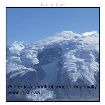
Example 1
// xxx.ets
@Entry
@Component
struct OverlayExample {
  build() {
    Column() {
      Column() {
        Text('floating layer')
          .fontSize(12).fontColor(0xCCCCCC).maxLines(1)
        Column() {
          Image($r('app.media.img'))
            .width(240).height(240)
            .overlay("Winter is a beautiful season, especially when it snows.", {
              align: Alignment.Bottom,
              offset: { x: 0, y: -15 }
            })
        }.border({ color: Color.Black, width: 2 })
      }.width('100%')
    }.padding({ top: 20 })
  }
}
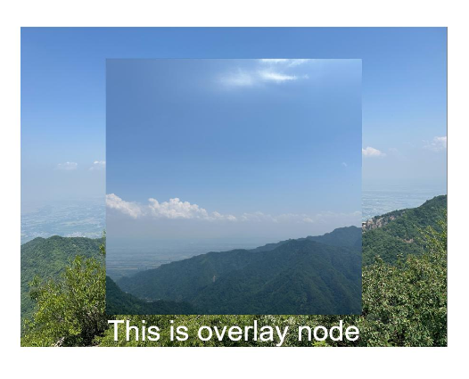
Example 2
// xxx.ets
@Entry
@Component
struct OverlayExample {
  @Builder OverlayNode() {
    Column() {
      Image($r('app.media.img1'))
      Text("This is overlayNode").fontSize(20).fontColor(Color.White)
    }.width(180).height(180).alignItems(HorizontalAlign.Center)
  }

  build() {
    Column() {
      Image($r('app.media.img2'))
        .overlay(this.OverlayNode(), { align: Alignment.Center })
        .objectFit(ImageFit.Contain)
    }.width('100%')
    .border({ color: Color.Black, width: 2 }).padding(20)
  }
}