Outline
You can set outline attributes for components.
NOTE
This feature is supported since API version 11. Updates will be marked with a superscript to indicate their earliest API version.
outline
outline(value: OutlineOptions)
Sets the outline attributes in one declaration.
Widget capability: Since API version 11, this feature is supported in ArkTS widgets.
System capability: SystemCapability.ArkUI.ArkUI.Full
Parameters
| Name | Type | Mandatory | Description |
|---|---|---|---|
| value | OutlineOptions | Yes | Outline attributes. |
outlineStyle
outlineStyle(value: OutlineStyle | EdgeOutlineStyles)
Sets the style of the outline.
Widget capability: Since API version 11, this feature is supported in ArkTS widgets.
System capability: SystemCapability.ArkUI.ArkUI.Full
Parameters
| Name | Type | Mandatory | Description |
|---|---|---|---|
| value | OutlineStyle | EdgeOutlineStyles | Yes | Outline style. Default value: OutlineStyle.SOLID |
outlineWidth
outlineWidth(value: Dimension | EdgeOutlineWidths)
Sets the thickness of the outline.
Widget capability: Since API version 11, this feature is supported in ArkTS widgets.
System capability: SystemCapability.ArkUI.ArkUI.Full
Parameters
| Name | Type | Mandatory | Description |
|---|---|---|---|
| value | Dimension | EdgeOutlineWidths | Yes | Outline thickness. This parameter cannot be set in percentage. Default value: 0. |
outlineColor
outlineColor(value: ResourceColor | EdgeColors)
Sets the color of the outline.
Widget capability: Since API version 11, this feature is supported in ArkTS widgets.
System capability: SystemCapability.ArkUI.ArkUI.Full
Parameters
| Name | Type | Mandatory | Description |
|---|---|---|---|
| value | ResourceColor | EdgeColors | Yes | Outline color. Default value: Color.Black |
outlineRadius
outlineRadius(value: Dimension | OutlineRadiuses)
Sets the rounded corner radius of the outline.
Widget capability: Since API version 11, this feature is supported in ArkTS widgets.
System capability: SystemCapability.ArkUI.ArkUI.Full
Parameters
| Name | Type | Mandatory | Description |
|---|---|---|---|
| value | Dimension | OutlineRadiuses | Yes | Rounded corner radius of the outline. This parameter cannot be set in percentage. Default value: 0 Maximum effective value: Component width/2 + outlineWidth or component height/2 + outlineWidth |
OutlineOptions
| Name | Type | Mandatory | Description |
|---|---|---|---|
| width | Dimension | EdgeOutlineWidths | No | Outline thickness. This parameter cannot be set in percentage. Default value: 0 |
| color | ResourceColor | EdgeColors | No | Outline color. Default value: Color.Black |
| radius | Dimension | OutlineRadiuses | No | Rounded corner radius of the outline. This parameter cannot be set in percentage. Default value: 0 Maximum effective value: Component width/2 + outlineWidth or component height/2 + outlineWidth |
| style | OutlineStyle | EdgeOutlineStyles | No | Outline style. Default value: OutlineStyle.SOLID |
EdgeOutlineWidths
To reference this object, at least one parameter must be passed.
| Name | Type | Mandatory | Description |
|---|---|---|---|
| left | Dimension | No | Thickness of the left outline. |
| right | Dimension | No | Thickness of the right outline. |
| top | Dimension | No | Thickness of the top outline. |
| bottom | Dimension | No | Thickness of the bottom outline. |
EdgeColors
To reference this object, at least one parameter must be passed.
| Name | Type | Mandatory | Description |
|---|---|---|---|
| left | ResourceColor | No | Color of the left outline. |
| right | ResourceColor | No | Color of the right outline. |
| top | ResourceColor | No | Color of the top outline. |
| bottom | ResourceColor | No | Color of the bottom outline. |
OutlineRadiuses
To reference this object, at least one parameter must be passed.
| Name | Type | Mandatory | Description |
|---|---|---|---|
| topLeft | Dimension | No | Radius of the upper-left rounded corner. |
| topRight | Dimension | No | Radius of the upper-right rounded corner. |
| bottomLeft | Dimension | No | Radius of the lower-left rounded corner. |
| bottomRight | Dimension | No | Radius of the lower-right rounded corner. |
EdgeOutlineStyles
To reference this object, at least one parameter must be passed.
| Name | Type | Mandatory | Description |
|---|---|---|---|
| left | OutlineStyle | No | Style of the left outline. |
| right | OutlineStyle | No | Style of the right outline. |
| top | OutlineStyle | No | Style of the top outline. |
| bottom | OutlineStyle | No | Style of the bottom outline. |
Example
// xxx.ets
@Entry
@Component
struct OutlineExample {
build() {
Column() {
Flex({ justifyContent: FlexAlign.SpaceAround, alignItems: ItemAlign.Center }) {
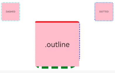
// Dashed line
Text('DASHED')
.backgroundColor(Color.Pink)
.outlineStyle(OutlineStyle.DASHED).outlineWidth(5).outlineColor(0xAFEEEE).outlineRadius(10)
.width(120).height(120).textAlign(TextAlign.Center).fontSize(16)
// Dotted line
Text('DOTTED')
.backgroundColor(Color.Pink)
.outline({ width: 5, color: 0x317AF7, radius: 10, style: OutlineStyle.DOTTED })
.width(120).height(120).textAlign(TextAlign.Center).fontSize(16)
}.width('100%').height(150)
Text('.outline')
.backgroundColor(Color.Pink)
.fontSize(50)
.width(300)
.height(300)
.outline({
width: { left: 3, right: 6, top: 10, bottom: 15 },
color: { left: '#e3bbbb', right: Color.Blue, top: Color.Red, bottom: Color.Green },
radius: { topLeft: 10, topRight: 20, bottomLeft: 40, bottomRight: 80 },
style: {
left: OutlineStyle.DOTTED,
right: OutlineStyle.DOTTED,
top: OutlineStyle.SOLID,
bottom: OutlineStyle.DASHED
}
}).textAlign(TextAlign.Center)
}
}
}