TimePicker
The <TimePicker> component allows users to select a time (with the hour and minute) from the given range.
NOTE
This component is supported since API version 8. Updates will be marked with a superscript to indicate their earliest API version.
Child Components
Not supported
APIs
TimePicker(options?: TimePickerOptions)
Creates a time picker, which is in 24-hour format by default.
System capability: SystemCapability.ArkUI.ArkUI.Full
Parameters
| Name | Type | Mandatory | Description |
|---|---|---|---|
| options | TimePickerOptions | No | Parameters of the time picker. |
TimePickerOptions
| Name | Type | Mandatory | Description |
|---|---|---|---|
| selected | Date | No | Time of the selected item. Default value: current system time Since API version 10, this parameter supports $$ for two-way binding of variables. |
| format11+ | TimePickerFormat | No | Time format. |
TimePickerFormat
| Name | Description |
|---|---|
| HOUR_MINUTE | Display hours and minutes. |
| HOUR_MINUTE_SECOND | Display hours, minutes, and seconds. |
Attributes
In addition to the universal attributes, the following attributes are supported.
| Name | Type | Description |
|---|---|---|
| useMilitaryTime | boolean | Whether the display time is in 24-hour format. Default value: false NOTE When in the 12-hour format, the AM/PM zone does not change depending on the hour portion. |
| disappearTextStyle10+ | PickerTextStyle | Font color, font size, and font width for the top and bottom items. Default value: { color: '#ff182431', font: { size: '14fp', weight: FontWeight.Regular } } |
| textStyle10+ | PickerTextStyle | Font color, font size, and font width of all items except the top, bottom, and selected items. Default value: { color: '#ff182431', font: { size: '16fp', weight: FontWeight.Regular } } |
| selectedTextStyle10+ | PickerTextStyle | Font color, font size, and font width of the selected item. Default value: { color: '#ff007dff', font: { size: '20vp', weight: FontWeight.Medium } } |
| loop11+ | boolean | Whether to enable loop mode. Default value: true The value true means to enable loop mode, and false means the opposite. |
Events
In addition to the universal events, the following events are supported.
| Name | Description |
|---|---|
| onChange(callback: (value: TimePickerResult ) => void) | Triggered when a time is selected. |
TimePickerResult
Describes a time in 24-hour format.
| Name | Type | Description |
|---|---|---|
| hour | number | Hour portion of the selected time. Value range: [0-23] |
| minute | number | Minute portion of the selected time. Value range: [0-59] |
| second11+ | number | Second portion of the selected time. Value range: [0-59] |
Example
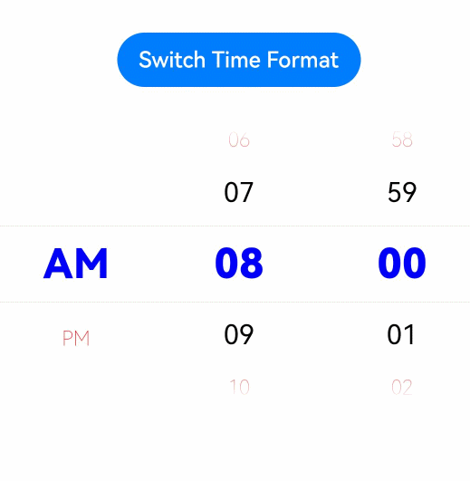
// xxx.ets
@Entry
@Component
struct TimePickerExample {
  @State isMilitaryTime: boolean = false
  private selectedTime: Date = new Date('2022-07-22T08:00:00')

  build() {
    Column() {
      Button ('Switch Time Format')
        .margin(30)
        .onClick(() => {
          this.isMilitaryTime = !this.isMilitaryTime
        })
      TimePicker({
        selected: this.selectedTime,
      })
        .useMilitaryTime(this.isMilitaryTime)
        .onChange((value: TimePickerResult) => {
          if(value.hour) {
            this.selectedTime.setHours(value.hour, value.minute)
            console.info('select current date is: ' + JSON.stringify(value))
          }
        })
        .disappearTextStyle({color: Color.Red, font: {size: 15, weight: FontWeight.Lighter}})
        .textStyle({color: Color.Black, font: {size: 20, weight: FontWeight.Normal}})
        .selectedTextStyle({color: Color.Blue, font: {size: 30, weight: FontWeight.Bolder}})
    }.width('100%')
  }
}