Circle
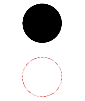
The <Circle> component is used to draw a circle.
NOTE
This component is supported since API version 7. Updates will be marked with a superscript to indicate their earliest API version.
Child Components
Not supported
APIs
Circle(options?: {width?: string | number, height?: string | number})
Since API version 9, this API is supported in ArkTS widgets.
Parameters
| Name | Type | Mandatory | Description |
|---|---|---|---|
| width | string | number | No | Width of the circle. Default value: 0 NOTE An invalid value is handled as the default value. |
| height | string | number | No | Height of the circle. Default value: 0 NOTE An invalid value is handled as the default value. |
Attributes
In addition to the universal attributes, the following attributes are supported.
| Name | Type | Default Value | Description |
|---|---|---|---|
| fill | ResourceColor | Color.Black | Color of the fill area. Since API version 9, this API is supported in ArkTS widgets. NOTE An invalid value is handled as the default value. |
| fillOpacity | number | string | Resource | 1 | Opacity of the fill area. The value range is [0.0, 1.0]. A value less than 0.0 evaluates to the value 0.0. A value greater than 1.0 evaluates to the value 1.0. Any other value evaluates to the value 1.0. Since API version 9, this API is supported in ArkTS widgets. |
| stroke | ResourceColor | - | Stroke color. If this attribute is not set, the component does not have any stroke. Since API version 9, this API is supported in ArkTS widgets. NOTE If the value is invalid, no stroke will be drawn. |
| strokeDashArray | Array<any> | [] | Stroke dashes. Since API version 9, this API is supported in ArkTS widgets. NOTE An invalid value is handled as the default value. |
| strokeDashOffset | number | string | 0 | Offset of the start point for drawing the stroke. Since API version 9, this API is supported in ArkTS widgets. NOTE An invalid value is handled as the default value. |
| strokeLineCap | LineCapStyle | LineCapStyle.Butt | Cap style of the stroke. Since API version 9, this API is supported in ArkTS widgets. |
| strokeLineJoin | LineJoinStyle | LineJoinStyle.Miter | Join style of the stroke. Since API version 9, this API is supported in ArkTS widgets. NOTE This attribute does not work for the <circle> component, which does not have corners. |
| strokeMiterLimit | number | string | 4 | Limit on the ratio of the miter length to the value of strokeWidth used to draw a miter join. Since API version 9, this API is supported in ArkTS widgets. NOTE This attribute does not take effect for the <Circle> component, because it does not have a miter join. |
| strokeOpacity | number | string | Resource | 1 | Stroke opacity. Default value: 1 Since API version 9, this API is supported in ArkTS widgets. NOTE The value range is [0.0, 1.0]. A value less than 0.0 evaluates to the value 0.0. A value greater than 1.0 evaluates to the value 1.0. Any other value evaluates to the value 1.0. |
| strokeWidth | Length | 1 | Stroke width. Since API version 9, this API is supported in ArkTS widgets. NOTE If of the string type, this parameter cannot be set in percentage. A percentage is processed as 1px. |
| antiAlias | boolean | true | Whether anti-aliasing is enabled. Since API version 9, this API is supported in ArkTS widgets. |
Example
// xxx.ets
@Entry
@Component
struct CircleExample {
  build() {
    Column({ space: 10 }) {
      // Draw a circle whose diameter is 150.
      Circle({ width: 150, height: 150 })
      // Draw a circle whose diameter is 150 and stroke color is red. (If the width and height values are different, the smaller value will be used as the diameter.)
      Circle()
        .width(150)
        .height(200)
        .fillOpacity(0)
        .strokeWidth(3)
        .stroke(Color.Red)
        .strokeDashArray([1, 2])
    }.width('100%')
  }
}
