焦点事件
焦点事件指页面焦点在可获焦组件间移动时触发的事件,组件可使用焦点事件来处理相关逻辑。
说明:
onFocus
onFocus(event: () => void)
当前组件获取焦点时触发的回调。
系统能力: SystemCapability.ArkUI.ArkUI.Full
onBlur
onBlur(event:() => void)
当前组件失去焦点时触发的回调。
系统能力: SystemCapability.ArkUI.ArkUI.Full
示例
// xxx.ets
@Entry
@Component
struct FocusEventExample {
@State oneButtonColor: string = '#FFC0CB'
@State twoButtonColor: string = '#87CEFA'
@State threeButtonColor: string = '#90EE90'
build() {
Column({ space: 20 }) {
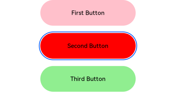
// 通过外接键盘的上下键可以让焦点在三个按钮间移动,按钮获焦时颜色变化,失焦时变回原背景色
Button('First Button')
.backgroundColor(this.oneButtonColor)
.width(260)
.height(70)
.fontColor(Color.Black)
.focusable(true)
.onFocus(() => {
this.oneButtonColor = '#FF0000'
})
.onBlur(() => {
this.oneButtonColor = '#FFC0CB'
})
Button('Second Button')
.backgroundColor(this.twoButtonColor)
.width(260)
.height(70)
.fontColor(Color.Black)
.focusable(true)
.onFocus(() => {
this.twoButtonColor = '#FF0000'
})
.onBlur(() => {
this.twoButtonColor = '#87CEFA'
})
Button('Third Button')
.backgroundColor(this.threeButtonColor)
.width(260)
.height(70)
.fontColor(Color.Black)
.focusable(true)
.onFocus(() => {
this.threeButtonColor = '#FF0000'
})
.onBlur(() => {
this.threeButtonColor = '#90EE90'
})
}.width('100%').margin({ top: 20 })
}
}