Toggle
The <Toggle> component provides a clickable element in the check box, button, or switch type.
NOTE
This component is supported since API version 8. Updates will be marked with a superscript to indicate their earliest API version.
Child Components
This component can contain child components only when ToggleType is set to Button.
APIs
Toggle(options: { type: ToggleType, isOn?: boolean })
Since API version 9, this API is supported in ArkTS widgets.
Parameters
| Name | Type | Mandatory | Description |
|---|---|---|---|
| type | ToggleType | Yes | Type of the toggle. |
| isOn | boolean | No | Whether the toggle is turned on. The value true means that the toggle is turned on, and false means the opposite. Default value: false Since API version 10, this parameter supports $$ for two-way binding of variables. |
ToggleType
Since API version 9, this API is supported in ArkTS widgets.
| Name | Description |
|---|---|
| Checkbox | Check box type. NOTE Since API version 11, the default style of the check box is changed from rounded square to circle. The default value of the universal attribute margin is as follows: { top: '14px', right: '14px', bottom: '14px', left: '14px' } |
| Button | Button type. The set string, if any, will be displayed inside the button. |
| Switch | Switch type. NOTE The default value of the universal attribute margin is as follows: { top: '6px', right: '14px', bottom: '6px', left: '14px' } |
Attributes
In addition to the universal attributes, the following attributes are supported.
| Name | Parameter | Description |
|---|---|---|
| selectedColor | ResourceColor | Background color of the component when it is turned on. Since API version 9, this API is supported in ArkTS widgets. |
| switchPointColor | ResourceColor | Color of the circular slider when the component is of the Switch type. NOTE This attribute is valid only when type is set to ToggleType.Switch. Since API version 9, this API is supported in ArkTS widgets. |
Events
In addition to the universal events, the following events are supported.
| Name | Description |
|---|---|
| onChange(callback: (isOn: boolean) => void) | Triggered when the toggle status changes. Since API version 9, this API is supported in ArkTS widgets. NOTE If isOn is true, it indicates that the toggle changes from off to on. If isOn is false, it indicates that the toggle changes from on to off. |
Example
// xxx.ets
@Entry
@Component
struct ToggleExample {
build() {
Column({ space: 10 }) {
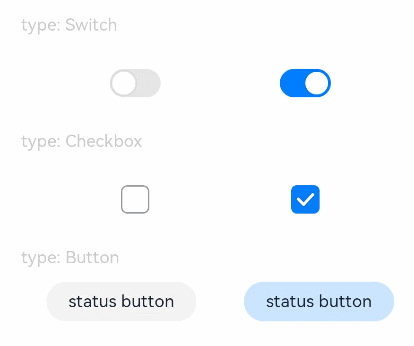
Text('type: Switch').fontSize(12).fontColor(0xcccccc).width('90%')
Flex({ justifyContent: FlexAlign.SpaceEvenly, alignItems: ItemAlign.Center }) {
Toggle({ type: ToggleType.Switch, isOn: false })
.selectedColor('#007DFF')
.switchPointColor('#FFFFFF')
.onChange((isOn: boolean) => {
console.info('Component status:' + isOn)
})
Toggle({ type: ToggleType.Switch, isOn: true })
.selectedColor('#007DFF')
.switchPointColor('#FFFFFF')
.onChange((isOn: boolean) => {
console.info('Component status:' + isOn)
})
}
Text('type: Checkbox').fontSize(12).fontColor(0xcccccc).width('90%')
Flex({ justifyContent: FlexAlign.SpaceEvenly, alignItems: ItemAlign.Center }) {
Toggle({ type: ToggleType.Checkbox, isOn: false })
.size({ width: 20, height: 20 })
.selectedColor('#007DFF')
.onChange((isOn: boolean) => {
console.info('Component status:' + isOn)
})
Toggle({ type: ToggleType.Checkbox, isOn: true })
.size({ width: 20, height: 20 })
.selectedColor('#007DFF')
.onChange((isOn: boolean) => {
console.info('Component status:' + isOn)
})
}
Text('type: Button').fontSize(12).fontColor(0xcccccc).width('90%')
Flex({ justifyContent: FlexAlign.SpaceEvenly, alignItems: ItemAlign.Center }) {
Toggle({ type: ToggleType.Button, isOn: false }) {
Text('status button').fontColor('#182431').fontSize(12)
}.width(106)
.selectedColor('rgba(0,125,255,0.20)')
.onChange((isOn: boolean) => {
console.info('Component status:' + isOn)
})
Toggle({ type: ToggleType.Button, isOn: true }) {
Text('status button').fontColor('#182431').fontSize(12)
}.width(106)
.selectedColor('rgba(0,125,255,0.20)')
.onChange((isOn: boolean) => {
console.info('Component status:' + isOn)
})
}
}.width('100%').padding(24)
}
}