Span
作为Text、ContainerSpan组件的子组件,用于显示行内文本的组件。
说明:
该组件从API Version 7开始支持。后续版本如有新增内容,则采用上角标单独标记该内容的起始版本。
该组件从API Version 10开始支持继承父组件Text的属性,即如果子组件未设置属性且父组件设置属性,则继承父组件设置的属性。支持继承的属性仅包括:fontColor、fontSize、fontStyle、fontWeight、decoration、letterSpacing、textCase、fontfamily、textShadow。
子组件
无
接口
Span(value: string | Resource)
从API version 9开始,该接口支持在ArkTS卡片中使用。
参数:
| 参数名 | 参数类型 | 必填 | 参数描述 |
|---|---|---|---|
| value | string | Resource | 是 | 文本内容。 |
属性
通用属性方法仅支持文本通用。
| 名称 | 参数类型 | 描述 |
|---|---|---|
| decoration | { type: TextDecorationType, color?: ResourceColor } |
设置文本装饰线样式及其颜色。 默认值:{ type: TextDecorationType.None color:Color.Black } 从API version 9开始,该接口支持在ArkTS卡片中使用。 |
| letterSpacing | number | string | 设置文本字符间距。取值小于0,字符聚集重叠,取值大于0且随着数值变大,字符间距越来越大,稀疏分布。 从API version 9开始,该接口支持在ArkTS卡片中使用。 |
| textCase | TextCase | 设置文本大小写。 默认值:TextCase.Normal 从API version 9开始,该接口支持在ArkTS卡片中使用。 |
| lineHeight10+ | Length | 设置文本行高。 |
| font10+ | Font | 设置文本样式。包括字体大小、字体粗细、字体族和字体风格。 |
| textShadow11+ | ShadowOptions | Array<ShadowOptions> | 设置文字阴影效果。该接口支持以数组形式入参,实现多重文字阴影。 说明: 不支持fill字段, 不支持智能取色模式。 |
| textBackgroundStyle11+ | TextBackgroundStyle | 设置背景样式。 默认值: { color: Color.Transparent, radius: 0 } 说明: 作为ContainerSpan的子组件时可以继承它的此属性值,优先使用其自身的此属性。 |
事件
通用事件仅支持点击事件。
说明:
由于Span组件无尺寸信息,因此点击事件返回的ClickEvent对象的target属性无效。
示例
示例1
// xxx.ets
@Entry
@Component
struct SpanExample {
build() {
Flex({ direction: FlexDirection.Column, alignItems: ItemAlign.Start, justifyContent: FlexAlign.SpaceBetween }) {
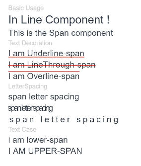
Text('Basic Usage').fontSize(9).fontColor(0xCCCCCC)
Text() {
Span('In Line')
Span(' Component')
Span(' !')
}
Text() {
Span('This is the Span component').fontSize(12).textCase(TextCase.Normal)
.decoration({ type: TextDecorationType.None, color: Color.Red })
}
// 文本横线添加
Text('Text Decoration').fontSize(9).fontColor(0xCCCCCC)
Text() {
Span('I am Underline-span').decoration({ type: TextDecorationType.Underline, color: Color.Red }).fontSize(12)
}
Text() {
Span('I am LineThrough-span')
.decoration({ type: TextDecorationType.LineThrough, color: Color.Red })
.fontSize(12)
}
Text() {
Span('I am Overline-span').decoration({ type: TextDecorationType.Overline, color: Color.Red }).fontSize(12)
}
// 文本字符间距
Text('LetterSpacing').fontSize(9).fontColor(0xCCCCCC)
Text() {
Span('span letter spacing')
.letterSpacing(0)
.fontSize(12)
}
Text() {
Span('span letter spacing')
.letterSpacing(-2)
.fontSize(12)
}
Text() {
Span('span letter spacing')
.letterSpacing(3)
.fontSize(12)
}
// 文本大小写展示设置
Text('Text Case').fontSize(9).fontColor(0xCCCCCC)
Text() {
Span('I am Lower-span').fontSize(12)
.textCase(TextCase.LowerCase)
.decoration({ type: TextDecorationType.None })
}
Text() {
Span('I am Upper-span').fontSize(12)
.textCase(TextCase.UpperCase)
.decoration({ type: TextDecorationType.None })
}
}.width('100%').height(250).padding({ left: 35, right: 35, top: 35 })
}
}
示例2
@Entry
@Component
struct TextSpanExample {
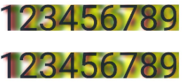
@State textShadows : ShadowOptions | Array<ShadowOptions> = [{ radius: 10, color: Color.Red, offsetX: 10, offsetY: 0 },{ radius: 10, color: Color.Black, offsetX: 20, offsetY: 0 },
{ radius: 10, color: Color.Brown, offsetX: 30, offsetY: 0 },{ radius: 10, color: Color.Green, offsetX: 40, offsetY: 0 },
{ radius: 10, color: Color.Yellow, offsetX: 100, offsetY: 0 }]
build() {
Column({ space: 8 }) {
Text() {
Span('123456789').fontSize(50).textShadow(this.textShadows)
}
Text() {
Span('123456789') // span can inherit text shadow & font size from outer text
}.fontSize(50).textShadow(this.textShadows)
}
}
}
示例3
// xxx.ets
@Component
@Entry
struct Index {
build() {
Column() {
Text() {
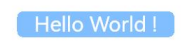
Span(' Hello World ! ')
.fontSize('20fp')
.textBackgroundStyle({color: "#7F007DFF", radius: "5vp"})
.fontColor(Color.White)
}
}.width('100%').margin({bottom: '5vp'}).alignItems(HorizontalAlign.Center)
}
}