Page and Custom Component Lifecycle
Before we dive into the page and custom component lifecycle, it would be helpful to learn the relationship between custom components and pages.
-
Custom component: @Component decorated UI unit, which can combine multiple built-in components for component reusability and invoke component lifecycle callbacks.
-
Page: UI page of an application. A page can consist of one or more custom components. A custom component decorated with @Entry is used as the entry component of the page. Exactly one component is decorated with @Entry in a single source file. Only components decorated by @Entry can invoke the lifecycle callbacks of a page.
The following lifecycle callbacks are provided for a page, that is, a custom component decorated with @Entry:
-
onPageShow: Invoked each time the page is displayed, for example, during page redirection or when the application is switched to the foreground.
-
onPageHide: Invoked each time the page is hidden, for example, during page redirection or when the application is switched to the background.
-
onBackPress: Invoked when the user clicks the Back button.
The following lifecycle callbacks are provided for a custom component decorated with @Component:
-
aboutToAppear: Invoked when the custom component is about to appear. Specifically, it is invoked after a new instance of the custom component is created and before its build function is executed.
-
aboutToDisappear: Invoked when the custom component is about to be destroyed. Do not change state variables in the aboutToDisappear function as doing this can cause unexpected errors. For example, the modification of the @Link decorated variable may cause unstable application running.
The following figure shows the lifecycle of a component (page) decorated with @Entry.
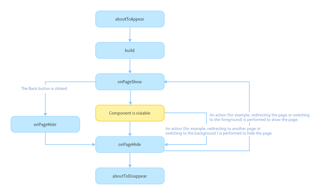
Based on the preceding figure, let's look into the creation, re-rendering, and deletion of a custom component.
Custom Component Creation and Rendering
-
Custom component creation: An instance of a custom component is created by the ArkUI framework.
-
Initialization of custom component member variables: The member variables are initialized with locally defined defaults or component constructor parameters. The initialization happens in the document order, which is the order in which the member variables are defined.
-
If defined, the component's aboutToAppear callback is invoked.
-
On initial render, the build function of the built-in component is executed for rendering. If the child component is a custom component, the rendering creates an instance of the child component. While executing the build function, the framework observes read access on each state variable and then constructs two mapping tables:
- State variable -> UI component (including ForEach and if)
- UI component -> Update function for this component, which is a lambda. As a subset of the build function, the lambda creates one UI component and executes its attribute methods.
build() {
  ...
  this.observeComponentCreation(() => {
    Button.create();
  })

  this.observeComponentCreation(() => {
    Text.create();
  })
  ...
}
When the application is started in the background, because the application process is not destroyed, only the onPageShow callback is invoked.
Custom Component Re-rendering
Re-rending of a custom component is triggered when its state variable is changed by an event handle (for example, when the click event is triggered) or by an update to the associated attribute in LocalStorage or AppStorage.
-
The framework observes the state variable change and marks the component for re-rendering.
-
Using the mapping tables – created in step 4 of the custom component creation and rendering process, the framework knows which UI components are managed by the state variable and which update functions are used for these UI components. With this knowledge, the framework executes only the update functions of these UI components.
Custom Component Deletion
A custom component is deleted when the branch of the if statement or the number of arrays in ForEach changes.
-
Before the component is deleted, the aboutToDisappear callback is invoked to mark the component for deletion. The component deletion mechanism of ArkUI is as follows: (1) The backend component is directly removed from the component tree and destroyed; (2) The reference to the destroyed component is released from the frontend components; (3) The JS Engine garbage collects the destroyed component.
-
The custom component and all its variables are deleted. Any variables linked to this component, such as @Link, @Prop, or @StorageLink decorated variables, are unregistered from their synchronization sources.
Use of async await is not recommended inside the aboutToDisappear callback. In case of an asynchronous operation (a promise or a callback) being started from the aboutToDisappear callback, the custom component will remain in the Promise closure until the function is executed, which prevents the component from being garbage collected.
The following example shows when the lifecycle callbacks are invoked:
// Index.ets
import router from '@ohos.router';

@Entry
@Component
struct MyComponent {
  @State showChild: boolean = true;
  @State btnColor:string = "#FF007DFF"

  // Only components decorated by @Entry can call the lifecycle callbacks of a page.
  onPageShow() {
    console.info('Index onPageShow');
  }
  // Only components decorated by @Entry can call the lifecycle callbacks of a page.
  onPageHide() {
    console.info('Index onPageHide');
  }

  // Only components decorated by @Entry can call the lifecycle callbacks of a page.
  onBackPress() {
    console.info('Index onBackPress');
    this.btnColor ="#FFEE0606"
    return true // The value true means that the page executes its own return logic instead of the , and false (default) means that the default return logic is used.
  }

  // Component lifecycle
  aboutToAppear() {
    console.info('MyComponent aboutToAppear');
  }

  // Component lifecycle
  aboutToDisappear() {
    console.info('MyComponent aboutToDisappear');
  }

  build() {
    Column() {
      // When this.showChild is true, create the Child child component and invoke Child aboutToAppear.
      if (this.showChild) {
        Child()
      }
      // When this.showChild is false, delete the Child child component and invoke Child aboutToDisappear.
      Button('delete Child')
      .margin(20)
      .backgroundColor(this.btnColor)
      .onClick(() => {
        this.showChild = false;
      })
      // Push to the page and execute onPageHide.
      Button('push to next page')
        .onClick(() => {
          router.pushUrl({ url: 'pages/page' });
        })
    }

  }
}

@Component
struct Child {
  @State title: string = 'Hello World';
  // Component lifecycle
  aboutToDisappear() {
    console.info('[lifeCycle] Child aboutToDisappear')
  }
  // Component lifecycle
  aboutToAppear() {
    console.info('[lifeCycle] Child aboutToAppear')
  }

  build() {
    Text(this.title).fontSize(50).margin(20).onClick(() => {
      this.title = 'Hello ArkUI';
    })
  }
}
// page.ets
@Entry
@Component
struct page {
  @State textColor: Color = Color.Black;
  @State num: number = 0

  onPageShow() {
    this.num = 5
  }

  onPageHide() {
    console.log("page onPageHide");
  }

  onBackPress() {// If the value is not set, false is used.
    this.textColor = Color.Grey
    this.num = 0
  }

  aboutToAppear() {
    this.textColor = Color.Blue
  }

  build() {
    Column() {
      Text (`num: ${this.num}`)
        .fontSize(30)
        .fontWeight(FontWeight.Bold)
        .fontColor(this.textColor)
        .margin(20)
        .onClick(() => {
          this.num += 5
        })
    }
    .width('100%')
  }
}
In the preceding example, the Index page contains two custom components. One is MyComponent decorated with @Entry, which is also the entry component (root node) of the page. The other is Child, which is a child component of MyComponent. Only components decorated by @Entry can call the page lifecycle callbacks. Therefore, the lifecycle callbacks of the Index page – onPageShow, onPageHide, and onBackPress, are declared in MyComponent. In MyComponent and its child components, component lifecycle callbacks – aboutToAppear and aboutToDisappear – are also declared.
-
The initialization process of application cold start is as follows: MyComponent aboutToAppear -> MyComponent build -> Child aboutToAppear -> Child build -> Child build execution completed -> MyComponent build execution completed -> Index onPageShow
-
When delete Child is clicked, the value of this.showChild linked to if changes to false. As a result, the Child component is deleted, and the Child aboutToDisappear callback is invoked.
-
When push to next page is clicked, the router.pushUrl API is called to jump to the next page. As a result, the Index page is hidden, and the Index onPageHide callback is invoked. As the called API is router.pushUrl, which results in the Index page being hidden, but not destroyed, only the onPageHide callback is invoked. After a new page is displayed, the process of initializing the lifecycle of the new page is executed.
-
If router.replaceUrl is called, the Index page is destroyed. In this case, the execution of lifecycle callbacks changes to: Index onPageHide -> MyComponent aboutToDisappear -> Child aboutToDisappear. As aforementioned, a component is destroyed by directly removing it from the component tree. Therefore, aboutToDisappear of the parent component is called first, followed by aboutToDisappear of the child component, and then the process of initializing the lifecycle of the new page is executed.
-
When the Back button is clicked, the Index onBackPress callback is invoked, and the current Index page is destroyed.
-
When the application is minimized or switched to the background, the Index onPageHide callback is invoked. As the current Index page is not destroyed, aboutToDisappear of the component is not executed. When the application returns to the foreground, the Index onPageShow callback is invoked.
-
When the application exits, the following callbacks are executed in order: Index onPageHide -> MyComponent aboutToDisappear -> Child aboutToDisappear.