Transformation
Transformation attributes allow you to rotate, translate, scale, or transform a component.
NOTE
The APIs of this module are supported since API version 7. Updates will be marked with a superscript to indicate their earliest API version.
rotate
rotate(value: RotateOptions)
Rotates the component.
Widget capability: Since API version 9, this feature is supported in ArkTS widgets.
System capability: SystemCapability.ArkUI.ArkUI.Full
Parameters
| Name | Type | Mandatory | Description |
|---|---|---|---|
| value | RotateOptions | Yes | How the component rotates in the coordinate system (as shown below) with the upper left corner of the component as the coordinate origin. (x, y, z) specifies a vector as the axis of rotation. The axis and center of rotation are set based on the coordinate system, which remains where it is when the component is moved. Default value: { x: 0, y: 0, z: 0, centerX: '50%', centerY: '50%' centerZ: 0, perspective: 0 } 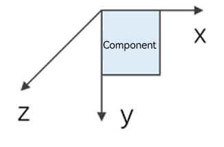 Since API version 10, CenterZ and perspective are supported in ArkTS widgets. |
translate
translate(value: TranslateOptions)
Translates the component.
Widget capability: Since API version 9, this feature is supported in ArkTS widgets.
System capability: SystemCapability.ArkUI.ArkUI.Full
Parameters
| Name | Type | Mandatory | Description |
|---|---|---|---|
| value | TranslateOptions | Yes | How the component is translated in the coordinate system (as shown below) with the upper left corner of the component as the coordinate origin. Values of x, y, and z indicate the translation distance along the respective axis. A positive value indicates a forward movement towards the respective axis, and a negative value indicates a backward movement towards the respective axis. The translation distance can be a number or a string (for example, '10px' or '10%'). Default value: { x: 0, y: 0, z: 0 } |
scale
scale(value: ScaleOptions)
Scales the component.
Widget capability: Since API version 9, this feature is supported in ArkTS widgets.
System capability: SystemCapability.ArkUI.ArkUI.Full
Parameters
| Name | Type | Mandatory | Description |
|---|---|---|---|
| value | ScaleOptions | Yes | Scale ratio along the x-, y-, and z-axis. The default value is 1. centerX and centerY are used to set the scale center point. Default value: { x: 1, y: 1, z: 1, centerX:'50%', centerY:'50%' } |
transform
transform(value: Matrix4Transit)
Rotates the component.
System capability: SystemCapability.ArkUI.ArkUI.Full
Parameters
| Name | Type | Mandatory | Description |
|---|---|---|---|
| value | Matrix4Transit | Yes | Transformation matrix of the component. |
RotateOptions
Since API version 9, this API is supported in ArkTS widgets.
| Name | Type | Mandatory | Description |
|---|---|---|---|
| x | number | No | X coordinate of the rotation axis vector. |
| y | number | No | Y coordinate of the rotation axis vector. |
| z | number | No | Z coordinate of the rotation axis vector. |
| angle | number | string | Yes | Angle to rotate. A positive angle indicates a clockwise rotation, and a negative angle indicates a counterclockwise rotation. The value can be of the string type, for example, '90deg'. |
| centerX | number | string | No | X coordinate of the center point. |
| centerY | number | string | No | Y coordinate of the center point. |
| centerZ10+ | number | No | Z-axis anchor, that is, the z-component of the 3D rotation center point. |
| perspective10+ | number | No | Distance from the user to the z=0 plane. The axis and center of rotation are set based on the coordinate system, which remains where it is when the component is moved. |
TranslateOptions
Since API version 9, this API is supported in ArkTS widgets.
| Name | Type | Mandatory | Description |
|---|---|---|---|
| x | number | string | No | Translation distance along the x-axis. |
| y | number | string | No | Translation distance along the y-axis. |
| z | number | string | No | Translation distance along the z-axis. |
ScaleOptions
Since API version 9, this API is supported in ArkTS widgets.
| Name | Type | Mandatory | Description |
|---|---|---|---|
| x | number | No | Scale ratio along the x-axis. x > 1: The component is scaled up along the x-axis. 0 < x < 1: The component is scaled down along the x-axis. x < 0: The component is scaled in the reverse direction of the x-axis. |
| y | number | No | Scale ratio along the y-axis. y > 1: The component is scaled up along the y-axis. 0 < y < 1: The component is scaled down along the y-axis. y < 0: The component is scaled in the reverse direction of the y-axis. |
| z | number | No | Scale ratio along the z-axis. z > 1: The component is scaled up along the z-axis. 0 < z < 1: The component is scaled down along the z-axis. z < 0: The component is scaled in the reverse direction of the z-axis. |
| centerX | number | string | No | X coordinate of the center point. |
| centerY | number | string | No | Y coordinate of the center point. |
NOTE
If the rotate and scale attributes are both set for a component, the values of centerX and centerY conflict. In this case, the one that is set later in time prevails.
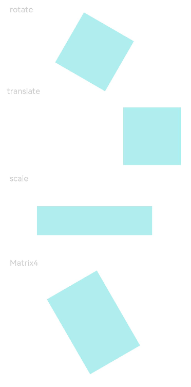
Example
// xxx.ets
import matrix4 from '@ohos.matrix4'

@Entry
@Component
struct TransformExample {
  build() {
    Column() {
      Text('rotate').width('90%').fontColor(0xCCCCCC).padding(15).fontSize(14)
      Row()
        .rotate({
          x: 0,
          y: 0,
          z: 1,
          centerX: '50%',
          centerY: '50%',
          angle: 300
        }) // The component rotates around the center point of the rotation axis (0,0,1) clockwise by 300 degrees.
        .width(100).height(100).backgroundColor(0xAFEEEE)

      Text('translate').width('90%').fontColor(0xCCCCCC).padding(10).fontSize(14)
      Row()
        .translate({ x: 100, y: 10 }) // The component translates by 100 along the x-axis and by 10 along the y-axis.
        .width(100).height(100).backgroundColor(0xAFEEEE).margin({ bottom: 10 })

      Text('scale').width('90%').fontColor(0xCCCCCC).padding(15).fontSize(14)
      Row()
        .scale({ x: 2, y: 0.5}) // The height and width are doubled. The z-axis has no effect in 2D mode.
        .width(100).height(100).backgroundColor(0xAFEEEE)

      Text('Matrix4').width('90%').fontColor(0xCCCCCC).padding(15).fontSize(14)
      Row()
        .width(100).height(100).backgroundColor(0xAFEEEE)
        .transform(matrix4.identity().translate({ x: 50, y: 50 }).scale({ x: 1.5, y: 1 }).rotate({
          x: 0,
          y: 0,
          z: 1,
          angle: 60
        }))
    }.width('100%').margin({ top: 5 })
  }
}