警告弹窗 (AlertDialog)
显示警告弹窗组件,可设置文本内容与响应回调。
说明:
从API Version 7开始支持。后续版本如有新增内容,则采用上角标单独标记该内容的起始版本。
本模块功能依赖UI的执行上下文,不可在UI上下文不明确的地方使用,参见UIContext说明。
从API version 10开始,可以通过使用UIContext中的showAlertDialog来明确UI的执行上下文。
AlertDialog.show
static show(value: AlertDialogParamWithConfirm | AlertDialogParamWithButtons | AlertDialogParamWithOptions)
定义警告弹窗并弹出。
系统能力: SystemCapability.ArkUI.ArkUI.Full
参数:
| 参数名 | 类型 | 必填 | 描述 |
|---|---|---|---|
| value | AlertDialogParamWithConfirm | AlertDialogParamWithButtons | AlertDialogParamWithOptions10+ | 是 | 定义并显示AlertDialog组件。 |
AlertDialogParam对象说明
| 名称 | 类型 | 必填 | 描述 |
|---|---|---|---|
| title | ResourceStr | 否 | 弹窗标题。 |
| subtitle10+ | ResourceStr | 否 | 弹窗副标题。 |
| message | ResourceStr | 是 | 弹窗内容。 |
| autoCancel | boolean | 否 | 点击遮障层时,是否关闭弹窗,true表示关闭弹窗。false表示不关闭弹窗。 默认值:true |
| cancel | () => void | 否 | 点击遮障层关闭dialog时的回调。 |
| alignment | DialogAlignment | 否 | 弹窗在竖直方向上的对齐方式。 默认值:DialogAlignment.Default |
| offset | Offset | 否 | 弹窗相对alignment所在位置的偏移量。 默认值:{ dx: 0 , dy: 0 } |
| gridCount | number | 否 | 弹窗容器宽度所占用栅格数。 默认值:4 |
| maskRect10+ | Rectangle | 否 | 弹窗遮蔽层区域,在遮蔽层区域内的事件不透传,在遮蔽层区域外的事件透传。 默认值:{ x: 0, y: 0, width: '100%', height: '100%' } 说明: showInSubWindow为true时,maskRect不生效。 |
| showInSubWindow11+ | boolean | 否 | 某弹框需要显示在主窗口之外时,是否在子窗口显示此弹窗。 默认值:false,弹窗显示在应用内,而非独立子窗口。 说明:showInSubWindow为true的弹窗无法触发显示另一个showInSubWindow为true的弹窗。 |
| isModal11+ | boolean | 否 | 弹窗是否为模态窗口,模态窗口有蒙层,非模态窗口无蒙层。 默认值:true,此时弹窗有蒙层。 |
| backgroundColor11+ | ResourceColor | 否 | 弹窗背板颜色。 默认值:Color.Transparent |
| backgroundBlurStyle11+ | BlurStyle | 否 | 弹窗背板模糊材质。 默认值:BlurStyle.COMPONENT_ULTRA_THICK |
AlertDialogParamWithConfirm对象说明
继承自AlertDialogParam。
| 参数名 | 参数类型 | 必填 | 参数描述 |
|---|---|---|---|
| confirm | { enabled10+?: boolean, defaultFocus10+?: boolean, style10+?: DialogButtonStyle, value: ResourceStr, fontColor?: ResourceColor, backgroundColor?: ResourceColor, action: () => void } |
否 | 确认Button的使能状态、默认焦点、按钮风格、文本内容、文本色、按钮背景色和点击回调。 enabled:点击Button是否响应,true表示Button可以响应,false表示Button不可以响应。 默认值:true defaultFocus:设置Button是否是默认焦点,true表示Button是默认焦点,false表示Button不是默认焦点。 默认值:false style:设置Button的风格样式。 默认值:DialogButtonStyle.DEFAULT。 value:Button文本内容。 fontColor:Button文本颜色。 backgroundColor:Button背景颜色。 action: Button选中时的回调。 |
confirm参数优先级:fontColor、backgroundColor > style > defaultFocus
| backgroundColor | fontColor | style | defaultFocus | 效果 |
|---|---|---|---|---|
| 绿底 | 红字 | - | - | 绿底红字 |
| 绿底 | - | DialogButtonStyle.HIGHLIGHT | - | 绿底白字 |
| 绿底 | - | DialogButtonStyle.DEFAULT | - | 绿底蓝字 |
| 绿底 | - | - | TRUE | 绿底白字 |
| 绿底 | - | - | FALSE/- | 绿底蓝字 |
| - | 红字 | DialogButtonStyle.HIGHLIGHT | - | 蓝底红字 |
| - | 红字 | DialogButtonStyle.DEFAULT | - | 白底红字 |
| - | 红字 | - | TRUE | 蓝底红字 |
| - | 红字 | - | FALSE/- | 白底红字 |
| - | - | DialogButtonStyle.HIGHLIGHT | - | 蓝底白字 |
| - | - | DialogButtonStyle.DEFAULT | - | 白底蓝字 |
| - | - | - | TRUE | 蓝底白字 |
| - | - | - | FALSE/- | 白底蓝字 |
AlertDialogParamWithButtons对象说明
继承自AlertDialogParam。
| 参数名 | 参数类型 | 必填 | 参数描述 |
|---|---|---|---|
| primaryButton | { enabled10+?: boolean, defaultFocus10+?: boolean, style10+?: DialogButtonStyle, value: ResourceStr, fontColor?: ResourceColor, backgroundColor?: ResourceColor, action: () => void; } |
否 | 确认Button的使能状态、默认焦点、按钮风格、文本内容、文本色、按钮背景色和点击回调。 enabled:点击Button是否响应。 默认值:true defaultFocus:设置Button是否是默认焦点。 默认值:false style:设置Button的风格样式。 默认值:DialogButtonStyle.DEFAULT。 value:Button文本内容。 fontColor:Button文本颜色。 backgroundColor:Button背景颜色。 action: Button选中时的回调。 |
| secondaryButton | { enabled10+?: boolean, defaultFocus10+?: boolean, style10+?: DialogButtonStyle, value: ResourceStr, fontColor?: ResourceColor, backgroundColor?: ResourceColor, action: () => void; } |
否 | 确认Button的使能状态、默认焦点、按钮风格、文本内容、文本色、按钮背景色和点击回调。 enabled:点击Button是否响应。 默认值:true。 defaultFocus:设置Button是否是默认焦点。 默认值:false。 style:设置Button的风格样式。 默认值:DialogButtonStyle.DEFAULT。 value:Button文本内容。 fontColor:Button文本颜色。 backgroundColor:Button背景颜色。 action: Button选中时的回调。 |
AlertDialogParamWithOptions10+对象说明
继承自AlertDialogParam。
| 参数名 | 参数类型 | 必填 | 参数描述 |
|---|---|---|---|
| buttons10+ | Array<AlertDialogButtonOptions> | 是 | 弹窗容器中的多个按钮。 |
| buttonDirection10+ | DialogButtonDirection | 否 | 按钮排布方向默认值为DialogButtonDirection.AUTO,建议3个以上按钮使用Auto模式(两个以上按钮会切换为纵向模式,通常能显示更多按钮),非Auto模式下,3个以上按钮可能会显示不全,超出显示范围的按钮会被截断。 |
AlertDialogButtonOptions10+对象说明
| 参数名 | 参数类型 | 必填 | 参数描述 |
|---|---|---|---|
| enabled | boolean | 否 | 点击Button是否响应,默认值true。 |
| defaultFocus | boolean | 否 | 设置Button是否是默认焦点,默认值false。 |
| style | DialogButtonStyle | 否 | 设置Button的风格样式,默认值DialogButtonStyle.DEFAULT。 |
| value | ResourceStr | 是 | Button的文本内容,若值为null,则该按钮不显示。 |
| fontColor | ResourceColor | 否 | Button的文本颜色。 |
| backgroundColor | ResourceColor | 否 | Button背景颜色。 |
| action | () => void | 是 | Button选中时的回调。 |
DialogButtonDirection10+枚举说明
| 名称 | 描述 |
|---|---|
| AUTO | 两个及以下按钮水平排布,两个以上为竖直排布。 |
| HORIZONTAL | 按钮水平布局。 |
| VERTICAL | 按钮竖直布局。 |
DialogAlignment枚举说明
| 名称 | 描述 |
|---|---|
| Top | 垂直顶部对齐。 |
| Center | 垂直居中对齐。 |
| Bottom | 垂直底部对齐。 |
| Default | 默认对齐。 |
| TopStart8+ | 左上对齐。 |
| TopEnd8+ | 右上对齐。 |
| CenterStart8+ | 左中对齐。 |
| CenterEnd8+ | 右中对齐。 |
| BottomStart8+ | 左下对齐。 |
| BottomEnd8+ | 右下对齐。 |
Rectangle8+类型说明
Rectangle是各种Dialog中maskRect参数的类型。
| 名称 | 类型 | 必填 | 描述 |
|---|---|---|---|
| x | Length | 否 | 弹窗遮蔽层区域相对于窗口左上角的x轴坐标。 默认值:0vp |
| y | Length | 否 | 弹窗遮蔽层区域相对于窗口左上角的y轴坐标。 默认值:0vp |
| width | Length | 否 | 弹窗遮蔽层区域的宽度。 默认值:'100%' |
| height | Length | 否 | 弹窗遮蔽层区域的高度。 默认值:'100%' |
说明:
x和y可以设置正负值百分比。当x设置为'100%'时表示遮蔽层区域往右偏移窗口本身宽度大小,当x设置为'-100%'时表示遮蔽层区域往左偏移窗口本身宽度大小。当y设置为'100%'时表示遮蔽层区域往下偏移窗口本身高度大小,当y设置为'-100%'时表示遮蔽层区域往上偏移窗口本身高度大小。
width和height只能设置正值,支持百分比,如果设置为负值,那么该值将被重置为默认值。
百分比相对于窗口自身宽高进行计算。
DialogButtonStyle10+枚举说明
| 名称 | 描述 |
|---|---|
| DEFAULT | 白底蓝字(深色主题:白底=黑底)。 |
| HIGHLIGHT | 蓝底白字。 |
示例
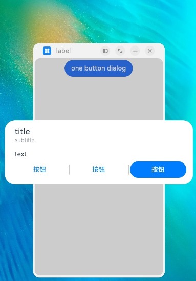
示例1
// xxx.ets
@Entry
@Component
struct AlertDialogExample {
build() {
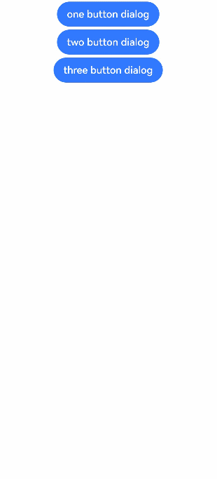
Column({ space: 5 }) {
Button('one button dialog')
.onClick(() => {
AlertDialog.show(
{
title: 'title',
message: 'text',
autoCancel: true,
alignment: DialogAlignment.Bottom,
offset: { dx: 0, dy: -20 },
gridCount: 3,
confirm: {
value: 'button',
action: () => {
console.info('Button-clicking callback')
}
},
cancel: () => {
console.info('Closed callbacks')
}
}
)
})
.backgroundColor(0x317aff)
Button('two button dialog')
.onClick(() => {
AlertDialog.show(
{
title: 'title',
subtitle: 'subtitle',
message: 'text',
autoCancel: true,
alignment: DialogAlignment.Bottom,
gridCount: 4,
offset: { dx: 0, dy: -20 },
primaryButton: {
value: 'cancel',
action: () => {
console.info('Callback when the first button is clicked')
}
},
secondaryButton: {
enabled: true,
defaultFocus: true,
style: DialogButtonStyle.HIGHLIGHT,
value: 'ok',
action: () => {
console.info('Callback when the second button is clicked')
}
},
cancel: () => {
console.info('Closed callbacks')
}
}
)
}).backgroundColor(0x317aff)
Button('three button dialog')
.onClick(() => {
AlertDialog.show(
{
title: 'title',
subtitle: 'subtitle',
message: 'text',
autoCancel: true,
alignment: DialogAlignment.Bottom,
gridCount: 4,
offset: { dx: 0, dy: -20 },
buttonDirection: DialogButtonDirection.HORIZONTAL,
buttons: [
{
value: '按钮',
action: () => {
console.info('Callback when button1 is clicked')
}
},
{
value: '按钮',
action: () => {
console.info('Callback when button2 is clicked')
}
},
{
value: '按钮',
enabled: true,
defaultFocus: true,
style: DialogButtonStyle.HIGHLIGHT,
action: () => {
console.info('Callback when button3 is clicked')
}
},
],
cancel: () => {
console.info('Closed callbacks')
}
}
)
}).backgroundColor(0x317aff)
}.width('100%').margin({ top: 5 })
}
}
示例2
// xxx.ets
@Entry
@Component
struct AlertDialogExample {
  build() {
    Column({ space: 5 }) {
        Button('one button dialog')
        .onClick(() => {
          AlertDialog.show(
            {
              title: 'title',
              subtitle: 'subtitle',
              message: 'text',
              autoCancel: true,
              alignment: DialogAlignment.Center,
              gridCount: 4,
              showInSubWindow: true,
              isModal: true,
              offset: { dx: 0, dy: -20 },
              buttonDirection: DialogButtonDirection.HORIZONTAL,
              buttons: [
                {
                  value: '按钮',
                  action: () => {
                    console.info('Callback when button1 is clicked')
                  }
                },
                {
                  value: '按钮',
                  action: () => {
                    console.info('Callback when button2 is clicked')
                  }
                },
                {
                  value: '按钮',
                  enabled: true,
                  defaultFocus: true,
                  style: DialogButtonStyle.HIGHLIGHT,
                  action: () => {
                    console.info('Callback when button3 is clicked')
                  }
                },
              ],
              cancel: () => {
                console.info('Closed callbacks')
              }
            }
          )
        }).backgroundColor(0x317aff)
    }.width('100%').margin({ top: 5 })
  }
}