@ohos.arkui.advanced.SplitLayout (Split Layout)
The split layout component allows you to split the available space into different content areas, which can be text only or a mixture of imagery and text.
NOTE
This component is supported since API version 10. Updates will be marked with a superscript to indicate their earliest API version.
Modules to Import
import { SplitLayout } from '@ohos.arkui.advanced.SplitLayout'
Child Components
Not supported
Attributes
The universal attributes are not supported.
SplitLayout
SplitLayout({mainImage: Resource, primaryText: string, secondaryText?: string, tertiaryText?: string, container: () => void })
Decorator: @Component
System capability: SystemCapability.ArkUI.ArkUI.Full
Parameters
| Name | Type | Mandatory | Decorator | Description |
|---|---|---|---|---|
| mainImage | ResourceStr | Yes | - | Image. |
| primaryText | ResourceStr | Yes | @Prop | Title. |
| secondaryText | ResourceStr | No | @Prop | Subtitle. |
| tertiaryText | ResourceStr | No | @Prop | Auxiliary text. |
| container | () => void | Yes | @BuilderParam | Container in the component. |
Events
The universal events are not supported.
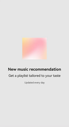
Example
import { SplitLayout } from '@ohos.arkui.advanced.SplitLayout'
@Entry
@Component
struct Index {
  @State demoImage: Resource = $r("app.media.music")

  build() {
      Column() {
        SplitLayout({
          mainImage: this.demoImage,
          primaryText:'New music recommendation',
          secondaryText: 'Get a playlist tailored to your taste;',
          tertiaryText: "Updated every day",
        }) {
          Text('Example: Components can be added to a blank area container.')
            .margin({top:36})
        }
      }
      .justifyContent(FlexAlign.SpaceBetween)
      .height('100%')
      .width('100%')
  }
}
Layout less than 600 vp:

Layout between 600 vp and 840 vp:

Layout greater than 840 vp: