Swiper
滑块视图容器,提供子组件滑动轮播显示的能力。
说明:
该组件从API Version 7开始支持。后续版本如有新增内容,则采用上角标单独标记该内容的起始版本。
子组件
可以包含子组件。
说明:
子组件类型:系统组件和自定义组件,支持渲染控制类型(if/else、ForEach和LazyForEach)。
Swiper子组件的visibility属性设置为None,Swiper的displayMode属性设置为SwiperDisplayMode.AUTO_LINEAR或displayCount属性设置为'auto'时,对应子组件在视窗内不占位,但不影响导航点个数。
Swiper子组件的visibility属性设置为None,或者visibility属性设置为Hidden时,对应子组件不显示,但依然会在视窗内占位。
当Swiper子组件个数小于等于Swiper组件内容区内显示的节点总个数(totalDisplayCount = DisplayCount + prevMargin? (1 : 0 ) + nextMargin? (1 : 0 ))时,按照非循环模式布局处理,此时,前后边距对应子组件不显示,但依然会在视窗内占位。Swiper组件按照totalDisplayCount个数判断测算规格。
当Swiper子组件设置了offset属性时,会按照子组件的层级进行绘制,层级高的子组件会覆盖层级低的子组件。例如,Swiper包含3个子组件,其中第3个子组件设置了offset({ x : 100 }),那么在横向循环滑动中,第3个子组件会覆盖第1个子组件,此时可设置第1个子组件的zIndex属性值大于第3个子组件,使第1个子组件层级高于第3个子组件。
接口
Swiper(controller?: SwiperController)
参数:
| 参数名 | 参数类型 | 必填 | 参数描述 |
|---|---|---|---|
| controller | SwiperController | 否 | 给组件绑定一个控制器,用来控制组件翻页。 |
属性
| 名称 | 参数类型 | 描述 |
|---|---|---|
| index | number | 设置当前在容器中显示的子组件的索引值。 默认值:0 说明: 设置小于0或大于等于子组件数量时,按照默认值0处理。 从API version 10开始,该属性支持$$双向绑定变量。 |
| autoPlay | boolean | 子组件是否自动播放。 默认值:false 说明: loop为false时,自动轮播到最后一页时停止轮播。手势切换后不是最后一页时继续播放。 |
| interval | number | 使用自动播放时播放的时间间隔,单位为毫秒。 默认值:3000 |
| indicator | DotIndicator10+ | DigitIndicator10+ | boolean | 设置可选导航点指示器样式。 - DotIndicator:圆点指示器样式。 - DigitIndicator:数字指示器样式。 - boolean:是否启用导航点指示器。 默认值:true 默认类型:DotIndicator |
| loop | boolean | 是否开启循环。 设置为true时表示开启循环,在LazyForEach懒循环加载模式下,加载的组件数量建议大于5个。 默认值:true |
| duration | number | 子组件切换的动画时长,单位为毫秒。 默认值:400 |
| vertical | boolean | 是否为纵向滑动。 默认值:false |
| itemSpace | number | string | 设置子组件与子组件之间间隙。 默认值:0 说明: 不支持设置百分比。 类型为number时,默认单位vp;类型为string时,需要显式指定像素单位,如'10px'。 |
| displayMode | SwiperDisplayMode | 主轴方向上元素排列的模式,优先以displayCount设置的个数显示,displayCount未设置时本属性生效。 默认值:SwiperDisplayMode.STRETCH |
| cachedCount8+ | number | 设置预加载子组件个数。 默认值:1 说明: 1、设置预加载子组件个数, 以当前页面为基准,加载当前显示页面的前后个数。例如cachedCount=1时,会将当前显示的页面的前面一页和后面一页的子组件都预加载。如果设置为按组翻页,即displayCount的swipeByGroup参数设为true,预加载时会以组为基本单位。例如cachedCount=1,swipeByGroup=true时,会将当前组的前面一组和后面一组的子组件都预加载。 |
| disableSwipe8+ | boolean | 禁用组件滑动切换功能。 默认值:false |
| curve8+ | Curve | string | ICurve10+ | 设置Swiper的动画曲线,默认为线性曲线,常用曲线参考Curve枚举说明,也可以通过插值计算模块提供的接口创建自定义的插值曲线对象。 默认值:Curve.Linear |
| indicatorStyle(deprecated) | { left?: Length, top?: Length, right?: Length, bottom?: Length, size?: Length, mask?: boolean, color?: ResourceColor, selectedColor?: ResourceColor } |
设置导航点样式: - left: 设置导航点距离Swiper组件左边的距离。 - top: 设置导航点距离Swiper组件顶部的距离。 - right: 设置导航点距离Swiper组件右边的距离。 - bottom: 设置导航点距离Swiper组件底部的距离。 - size: 设置导航点的直径,不支持设置百分比。默认值:6vp。 - mask: 设置是否显示导航点蒙层样式。 - color: 设置导航点的颜色。 - selectedColor: 设置选中的导航点的颜色。 从API version 8开始支持,从API version 10开始不再维护,建议使用indicator代替。 |
| displayCount8+ | value: number | string | SwiperAutoFill10+, swipeByGroup?: boolean11+ |
设置Swiper视窗内元素显示个数。 - value: 视窗内显示的子元素个数。 - swipeByGroup:是否按组进行翻页。如果设为true,在翻页时会按组进行翻页,每组内子元素的数量为displayCount value的值;如果为false,则为默认翻页行为,即按照子元素进行翻页。 默认值:1 说明: 1、字符串类型仅支持设置为'auto',显示效果同SwiperDisplayMode.AUTO_LINEAR。 2、使用number类型且设置小于等于0时,按默认值1显示。 3、使用number类型时,子组件按照主轴均分Swiper宽度(减去displayCount-1个itemSpace)的方式进行主轴拉伸(收缩)布局。 4、使用SwiperAutoFill类型时,通过设置一个子组件最小宽度值minSize,会根据Swiper当前宽度和minSize值自动计算并更改一页内元素显示个数。当minSize为空或者小于等于0时,Swiper显示1列。 5、当按组进行翻页时,如果最后一组的子元素数量小于displayCount时,会使用占位子元素补齐。占位子元素只是用于布局占位,不显示任何内容。在占位子元素的位置会直接显示Swiper自身的背景样式。 6、在按组翻页时,判断翻页的拖拽距离阈值条件,会更新为Swiper自身宽度的一半。(按子元素翻页时,该阈值为子元素自身宽度的一半) |
| effectMode8+ | EdgeEffect | 边缘滑动效果,loop = false时生效。 目前支持的滑动效果参见EdgeEffect的枚举说明。 默认值:EdgeEffect.Spring 说明: 控制器接口调用时不生效回弹。 |
| displayArrow10+ | value:ArrowStyle | boolean, isHoverShow?: boolean |
设置导航点箭头样式。 -value: 支持设置箭头和底板样式,异常场景使用ArrowStyle对象中的默认值。 -isHoverShow:设置鼠标悬停时是否显示箭头。 默认值:false 说明: isHoverShow为false时,常驻显示箭头,支持点击翻页。 isHoverShow为true时,只有在鼠标悬停时才会显示箭头,并支持点击翻页。 |
| nextMargin10+ | Length |
后边距,用于露出后一项的一小部分。 默认值:0 说明: 仅当SwiperDisplayMode为STRETCH模式时生效。 当主轴方向为横向布局时,nextmargin/prevmargin中任意一个大于子组件测算的宽度,nextmargin和prevmargin均不显示。 当主轴方向为纵向布局时,nextmargin/prevmargin中任意一个大于子组件测算的高度,nextmargin和prevmargin均不显示。 |
| prevMargin10+ | Length |
前边距,用于露出前一项的一小部分。 默认值:0 说明: 仅当SwiperDisplayMode为STRETCH模式时生效。 当主轴方向为横向布局时,nextmargin/prevmargin中任意一个大于子组件测算的宽度,prevmargin和nextmargin均不显示。 当主轴方向为纵向布局时,nextmargin/prevmargin中任意一个大于子组件测算的高度,nextmargin和prevmargin均不显示。 |
| nestedScroll11+ | SwiperNestedScrollMode | 设置Swiper组件和父组件的嵌套滚动模式。 默认值:SwiperNestedScrollMode.SELF_ONLY 说明: loop为true时Swiper组件没有边缘,不会触发父组件嵌套滚动。 |
SwiperDisplayMode枚举说明
| 名称 | 描述 |
|---|---|
| Stretch(deprecated) | Swiper滑动一页的宽度为Swiper组件自身的宽度。 从API version 10开始不再维护,建议使用STRETCH代替。 |
| AutoLinear(deprecated) | Swiper滑动一页的宽度为子组件宽度中的最大值。 从API version 10开始不再维护,建议使用AUTO_LINEAR代替。 |
| STRETCH10+ | Swiper滑动一页的宽度为Swiper组件自身的宽度。 |
| AUTO_LINEAR10+ | Swiper滑动一页的宽度为视窗内最左侧子组件的宽度。 |
SwiperNestedScrollMode11+枚举说明
| 名称 | 描述 |
|---|---|
| SELF_ONLY | Swiper只自身滚动,不与父组件联动。 |
| SELF_FIRST | Swiper自身先滚动,自身滚动到边缘以后父组件滚动。父组件滚动到边缘以后,如果父组件有边缘效果,则父组件触发边缘效果,否则Swiper触发边缘效果。 |
SwiperController
Swiper容器组件的控制器,可以将此对象绑定至Swiper组件,可以通过它控制翻页。
导入对象
let controller: SwiperController = new SwiperController()
showNext
showNext(): void
翻至下一页。翻页带动效切换过程,时长通过duration指定。
showPrevious
showPrevious(): void
翻至上一页。翻页带动效切换过程,时长通过duration指定。
finishAnimation
finishAnimation(callback?: () => void): void
停止播放动画。
参数:
| 参数名 | 参数类型 | 必填项 | 参数描述 |
|---|---|---|---|
| callback | () => void | 否 | 动画结束的回调。 |
Indicator10+
设置导航点距离Swiper组件距离。
| 参数名 | 参数类型 | 必填项 | 参数描述 |
|---|---|---|---|
| left | Length | 否 | 设置导航点距离Swiper组件左边的距离。 默认值:0 单位:vp |
| top | Length | 否 | 设置导航点距离Swiper组件顶部的距离。 默认值:0 单位:vp |
| right | Length | 否 | 设置导航点距离Swiper组件右边的距离。 默认值:0 单位:vp |
| bottom | Length | 否 | 设置导航点距离Swiper组件底部的距离。 默认值:0 单位:vp |
| static dot | 无 | 否 | 返回一个DotIndicator对象。 |
| static digit | 无 | 否 | 返回一个DigitIndicator对象。 |
DotIndicator10+
圆点指示器属性及功能继承自Indicator。
| 参数名 | 参数类型 | 必填项 | 参数描述 |
|---|---|---|---|
| itemWidth | Length | 否 | 设置Swiper组件圆点导航指示器的宽,不支持设置百分比。 默认值:6 单位:vp |
| itemHeight | Length | 否 | 设置Swiper组件圆点导航指示器的高,不支持设置百分比。 默认值:6 单位:vp |
| selectedItemWidth | Length | 否 | 设置选中Swiper组件圆点导航指示器的宽,不支持设置百分比。 默认值:12 单位:vp |
| selectedItemHeight | Length | 否 | 设置选中Swiper组件圆点导航指示器的高,不支持设置百分比。 默认值:6 单位:vp |
| mask | boolean | 否 | 设置是否显示Swiper组件圆点导航指示器的蒙版样式。 默认值:false |
| color | ResourceColor | 否 | 设置Swiper组件圆点导航指示器的颜色。 默认值:'#182431'(10%透明度) |
| selectedColor | ResourceColor | 否 | 设置选中Swiper组件圆点导航指示器的颜色。 默认值:'#007DFF' |
说明:
按压导航点时,导航点会放大至1.33倍显示,因此非按压态时导航点的可见范围边界至实际范围边界存在一定距离,该距离会随着itemWidth、itemHeight、selectedItemWidth、selectedItemHeight等参数变大而变大。
DigitIndicator10+
数字指示器属性及功能继承自Indicator。
| 参数名 | 参数类型 | 必填项 | 参数描述 |
|---|---|---|---|
| fontColor | ResourceColor | 否 | 设置Swiper组件数字导航点的字体颜色。 默认值:'#ff182431' |
| selectedFontColor | ResourceColor | 否 | 设置选中Swiper组件数字导航点的字体颜色。 默认值:'#ff182431' |
| digitFont | { size?:Length weight?:number | FontWeight | string } |
否 | 设置Swiper组件数字导航点的字体样式: - size:数字导航点指示器的字体大小,不支持设置百分比。 默认值:14vp - weight:数字导航点指示器的字重。 |
| selectedDigitFont | { size?:Length weight?:number | FontWeight | string } |
否 | 设置选中Swiper组件数字导航点的字体样式: - size:数字导航点选中指示器的字体大小,不支持设置百分比。 默认值:14vp - weight:数字导航点选中指示器的字重。 |
ArrowStyle10+
左右箭头属性。
| 参数名 | 参数类型 | 必填项 | 参数描述 |
|---|---|---|---|
| showBackground | boolean | 否 | 设置箭头底板是否显示。 默认值:false |
| isSidebarMiddle | boolean | 否 | 设置箭头显示位置。 默认值:false 默认显示在导航点指示器两侧。 |
| backgroundSize | Length | 否 | 设置底板大小。 在导航点两侧显示: 默认值:24vp 在组件两侧显示: 默认值:32vp 不支持设置百分比。 |
| backgroundColor | ResourceColor | 否 | 设置底板颜色。 在导航点两侧显示: 默认值:'#00000000' 在组件两侧显示: 默认值:'#19182431' |
| arrowSize | Length | 否 | 设置箭头大小。 在导航点两侧显示时: 默认值:18vp 在组件两侧显示时: 默认值:24vp 说明: showBackground为true时,arrowSize为backgroundSize的3/4。 不支持设置百分比。 |
| arrowColor | ResourceColor | 否 | 设置箭头颜色。 默认值:'#182431' |
SwiperAutoFill10+
自适应属性。
| 参数名 | 参数类型 | 必填项 | 参数描述 |
|---|---|---|---|
| minSize | VP | 是 | 设置元素显示最小宽度。 默认值:0 |
事件
除支持通用事件外,还支持以下事件:
| 名称 | 功能描述 |
|---|---|
| onChange(event: (index: number) => void) | 当前显示的子组件索引变化时触发该事件,返回值为当前显示的子组件的索引值。 - index:当前显示元素的索引。 说明: Swiper组件结合LazyForEach使用时,不能在onChange事件里触发子页面UI的刷新。 |
| onAnimationStart9+(event: (index: number, targetIndex10+: number, extraInfo10+: SwiperAnimationEvent) => void) | 切换动画开始时触发该回调。 - index:当前显示元素的索引。 - targetIndex:切换动画目标元素的索引。 - extraInfo:动画相关信息,包括主轴方向上当前显示元素和目标元素相对Swiper起始位置的位移,以及离手速度。 说明: 参数为动画开始前的index值(不是最终结束动画的index值),多列Swiper时,index为最左侧组件的索引。 |
| onAnimationEnd9+(event: (index: number, extraInfo: SwiperAnimationEvent) => void) | 切换动画结束时触发该回调。 - index:当前显示元素的索引。 - extraInfo:动画相关信息,只返回主轴方向上当前显示元素相对于Swiper起始位置的位移。 说明: 当Swiper切换动效结束时触发,包括动画过程中手势中断,通过SwiperController调用finishAnimation。参数为动画结束后的index值,多列Swiper时,index为最左侧组件的索引。 |
| onGestureSwipe10+(event: (index: number, extraInfo: SwiperAnimationEvent) => void) | 在页面跟手滑动过程中,逐帧触发该回调。 - index:当前显示元素的索引。 - extraInfo:动画相关信息,只返回主轴方向上当前显示元素相对于Swiper起始位置的位移。 说明: 多列Swiper时,index为最左侧组件的索引。 |
示例
示例1
// xxx.ets
class MyDataSource implements IDataSource {
private list: number[] = []
constructor(list: number[]) {
this.list = list
}
totalCount(): number {
return this.list.length
}
getData(index: number): number {
return this.list[index]
}
registerDataChangeListener(listener: DataChangeListener): void {
}
unregisterDataChangeListener() {
}
}
@Entry
@Component
struct SwiperExample {
private swiperController: SwiperController = new SwiperController()
private data: MyDataSource = new MyDataSource([])
aboutToAppear(): void {
let list: number[] = []
for (let i = 1; i <= 10; i++) {
list.push(i);
}
this.data = new MyDataSource(list)
}
build() {
Column({ space: 5 }) {
Swiper(this.swiperController) {
LazyForEach(this.data, (item: string) => {
Text(item.toString())
.width('90%')
.height(160)
.backgroundColor(0xAFEEEE)
.textAlign(TextAlign.Center)
.fontSize(30)
}, (item: string) => item)
}
.cachedCount(2)
.index(1)
.autoPlay(true)
.interval(4000)
.loop(true)
.duration(1000)
.itemSpace(0)
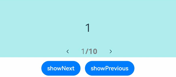
.indicator( // 设置圆点导航点样式
new DotIndicator()
.itemWidth(15)
.itemHeight(15)
.selectedItemWidth(15)
.selectedItemHeight(15)
.color(Color.Gray)
.selectedColor(Color.Blue))
.displayArrow({ // 设置导航点箭头样式
showBackground: true,
isSidebarMiddle: true,
backgroundSize: 24,
backgroundColor: Color.White,
arrowSize: 18,
arrowColor: Color.Blue
}, false)
.curve(Curve.Linear)
.onChange((index: number) => {
console.info(index.toString())
})
.onGestureSwipe((index: number, extraInfo: SwiperAnimationEvent) => {
console.info("index: " + index)
console.info("current offset: " + extraInfo.currentOffset)
})
.onAnimationStart((index: number, targetIndex: number, extraInfo: SwiperAnimationEvent) => {
console.info("index: " + index)
console.info("targetIndex: " + targetIndex)
console.info("current offset: " + extraInfo.currentOffset)
console.info("target offset: " + extraInfo.targetOffset)
console.info("velocity: " + extraInfo.velocity)
})
.onAnimationEnd((index: number, extraInfo: SwiperAnimationEvent) => {
console.info("index: " + index)
console.info("current offset: " + extraInfo.currentOffset)
})
Row({ space: 12 }) {
Button('showNext')
.onClick(() => {
this.swiperController.showNext()
})
Button('showPrevious')
.onClick(() => {
this.swiperController.showPrevious()
})
}.margin(5)
}.width('100%')
.margin({ top: 5 })
}
}
示例2
// xxx.ets
class MyDataSource implements IDataSource {
private list: number[] = []
constructor(list: number[]) {
this.list = list
}
totalCount(): number {
return this.list.length
}
getData(index: number): number {
return this.list[index]
}
registerDataChangeListener(listener: DataChangeListener): void {
}
unregisterDataChangeListener() {
}
}
@Entry
@Component
struct SwiperExample {
private swiperController: SwiperController = new SwiperController()
private data: MyDataSource = new MyDataSource([])
aboutToAppear(): void {
let list: number[] = []
for (let i = 1; i <= 10; i++) {
list.push(i);
}
this.data = new MyDataSource(list)
}
build() {
Column({ space: 5 }) {
Swiper(this.swiperController) {
LazyForEach(this.data, (item: string) => {
Text(item.toString())
.width('90%')
.height(160)
.backgroundColor(0xAFEEEE)
.textAlign(TextAlign.Center)
.fontSize(30)
}, (item: string) => item)
}
.cachedCount(2)
.index(1)
.autoPlay(true)
.interval(4000)
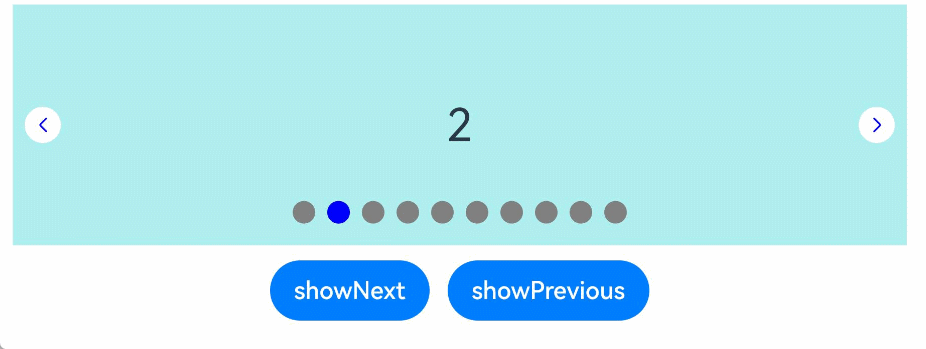
.indicator(Indicator.digit() // 设置数字导航点样式
.right("43%")
.top(200)
.fontColor(Color.Gray)
.selectedFontColor(Color.Gray)
.digitFont({ size: 20, weight: FontWeight.Bold })
.selectedDigitFont({ size: 20, weight: FontWeight.Normal }))
.loop(true)
.duration(1000)
.itemSpace(0)
.displayArrow(true, false)
Row({ space: 12 }) {
Button('showNext')
.onClick(() => {
this.swiperController.showNext()
})
Button('showPrevious')
.onClick(() => {
this.swiperController.showPrevious()
})
}.margin(5)
}.width('100%')
.margin({ top: 5 })
}
}
示例3
// xxx.ets
class MyDataSource implements IDataSource {
private list: number[] = []
constructor(list: number[]) {
this.list = list
}
totalCount(): number {
return this.list.length
}
getData(index: number): number {
return this.list[index]
}
registerDataChangeListener(listener: DataChangeListener): void {
}
unregisterDataChangeListener() {
}
}
@Entry
@Component
struct SwiperExample {
private swiperController: SwiperController = new SwiperController()
private data: MyDataSource = new MyDataSource([])
aboutToAppear(): void {
let list: number[] = []
for (let i = 1; i <= 10; i++) {
list.push(i);
}
this.data = new MyDataSource(list)
}
build() {
Column({ space: 5 }) {
Swiper(this.swiperController) {
LazyForEach(this.data, (item: string) => {
Text(item.toString())
.width('90%')
.height(160)
.backgroundColor(0xAFEEEE)
.textAlign(TextAlign.Center)
.fontSize(30)
}, (item: string) => item)
}
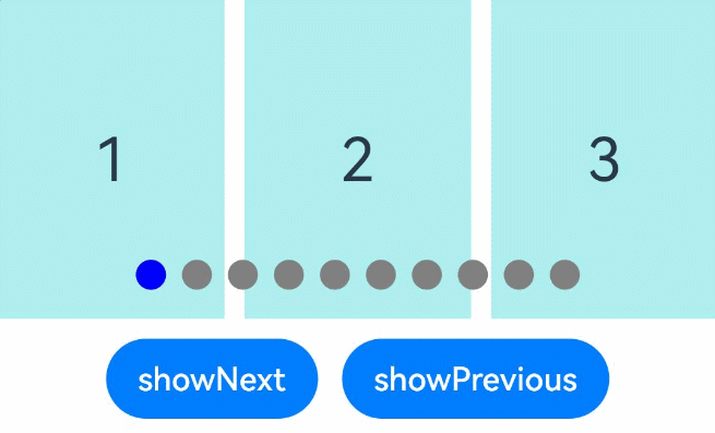
.displayCount(3, true)
.autoPlay(true)
.interval(4000)
.loop(true)
.duration(1000)
.itemSpace(10)
.indicator( // 设置圆点导航点样式
new DotIndicator()
.itemWidth(15)
.itemHeight(15)
.selectedItemWidth(15)
.selectedItemHeight(15)
.color(Color.Gray)
.selectedColor(Color.Blue))
Row({ space: 12 }) {
Button('showNext')
.onClick(() => {
this.swiperController.showNext()
})
Button('showPrevious')
.onClick(() => {
this.swiperController.showPrevious()
})
}.margin(5)
}.width('100%')
.margin({ top: 5 })
}
}