Opacity
You can set the opacity of a component.
NOTE
The APIs of this module are supported since API version 7. Updates will be marked with a superscript to indicate their earliest API version.
opacity
opacity(value: number | Resource)
Sets the opacity of the component.
Widget capability: Since API version 9, this feature is supported in ArkTS widgets.
System capability: SystemCapability.ArkUI.ArkUI.Full
Parameters
| Name | Type | Mandatory | Description |
|---|---|---|---|
| value | number | Resource | Yes | Opacity of the component. The value ranges from 0 to 1. The value 1 means opaque, and 0 means completely transparent. When being completely transparent, the component is hidden, but still takes up space in the layout. Default value: 1 NOTE A component inherits the opacity setting from its parent component and multiplies it by its own setting. For example, if the opacity of a component is 0.8 and that of its parent component is 0.1, then the actual opacity of the component is 0.1 x 0.8 = 0.8. |
Example
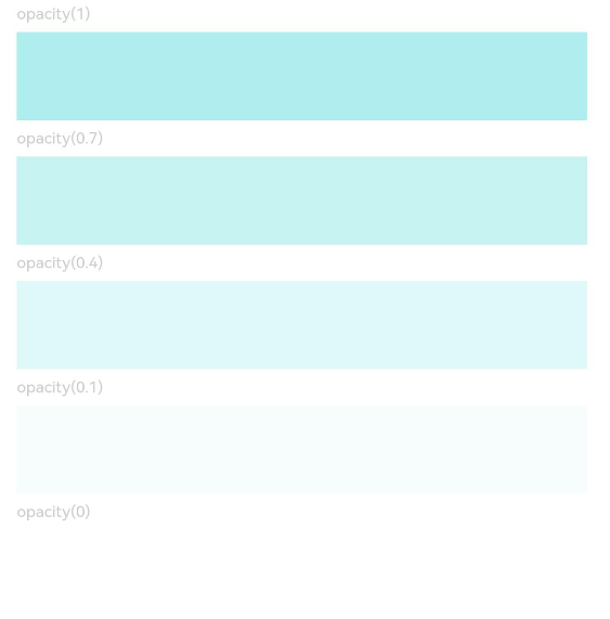
// xxx.ets
@Entry
@Component
struct OpacityExample {
  build() {
    Column({ space: 5 }) {
      Text('opacity(1)').fontSize(9).width('90%').fontColor(0xCCCCCC)
      Text().width('90%').height(50).opacity(1).backgroundColor(0xAFEEEE)
      Text('opacity(0.7)').fontSize(9).width('90%').fontColor(0xCCCCCC)
      Text().width('90%').height(50).opacity(0.7).backgroundColor(0xAFEEEE)
      Text('opacity(0.4)').fontSize(9).width('90%').fontColor(0xCCCCCC)
      Text().width('90%').height(50).opacity(0.4).backgroundColor(0xAFEEEE)
      Text('opacity(0.1)').fontSize(9).width('90%').fontColor(0xCCCCCC)
      Text().width('90%').height(50).opacity(0.1).backgroundColor(0xAFEEEE)
      Text('opacity(0)').fontSize(9).width('90%').fontColor(0xCCCCCC)
      Text().width('90%').height(50).opacity(0).backgroundColor(0xAFEEEE)
    }
    .width('100%')
    .padding({ top: 5 })
  }
}