<menu> Development
The <menu> component serves as a temporary pop-up window to display operations that users can perform. For details, see menu.
Creating a <menu> Component
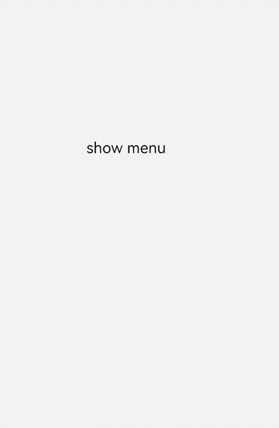
Create a <menu> component in the .hml file under pages/index and add the target, type, and title attributes.
<!-- xxx.hml-->
<div class="container">
  <text class="title-text" id="textId">show menu</text>
  <menu target="textId" type="click" title="title">
    <option value="Item 1">Item 1</option>
    <option value="Item 2">Item 2</option>
    <option value="Item 3">Item 3</option>
  </menu>
</div>
/* xxx.css */
.container{
  width: 100%;
  height: 100%;
  flex-direction: column;
  background-color: #F1F3F5;
  align-items: center;
  justify-content: center;
  width: 100%;
}
.title-text{
  font-size: 35px;
}
NOTE
The <menu> component supports only the option child component.
The <menu> component does not support the focusable and disabled attributes.
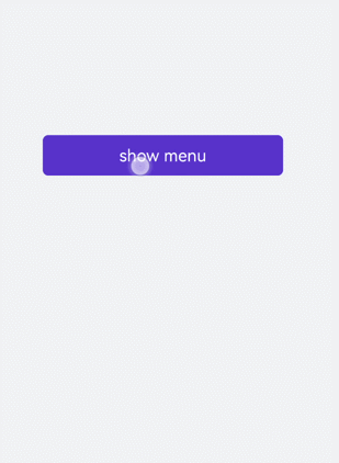
Setting Styles
Set the style for the <menu> component, such as the font color, size, and character spacing.
<!-- xxx.hml-->
<div class="container">
  <text class="title-text" id="textId">show menu</text>
  <menu target="textId" type="click" title="title">
    <option value="Item 1">Item 1</option>
    <option value="Item 2">Item 2</option>
    <option value="Item 3">Item 3</option>
  </menu>
</div>
/* xxx.css */
.container{
  width: 100%;
  height: 100%;
  flex-direction: column;
  background-color: #F1F3F5;
  align-items: center;
  justify-content: center;
  width: 100%;
}
.title-text{
  font-size: 35px;
  background-color: #5a5aee;
  color: white;
  width: 70%;
  text-align: center;
  height: 85px;
  border-radius: 12px;
}
menu{
  text-color: blue;
  font-size: 35px;
  letter-spacing: 2px;
}
option{
  color: #6a6aef;
  font-size: 30px;
}
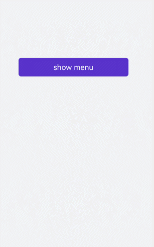
Binding Events
Bind the <menu> component with the onselected event (triggered when a value in the menu is selected) and the oncancel event (triggered when an operation is canceled). Click the <text> component to call the show method to set the coordinates of the <menu> component.
<!-- xxx.hml-->
<div class="container">
  <text  class="title-text" id="textId" onclick="textClick">show menu</text>
  <menu  title="title" onselected="select" oncancel="cancel" id="menuId">
    <option value="Item 1">Item 1</option>
    <option value="Item 2">Item 2</option>
    <option value="Item 3">Item 3</option>
  </menu>
</div>
/* xxx.css */
.container{
  width: 100%;
  height: 100%;
  flex-direction: column;
  background-color: #F1F3F5;
  width: 100%;
}
.title-text{
  font-size: 35px;
  background-color: #5a5aee;
  color: white;
  width: 70%;
  text-align: center;
  height: 85px;
  border-radius: 12px;
  margin-top: 500px;
  margin-left: 15%;
}
menu{
  text-color: blue;
  font-size: 35px;
  letter-spacing: 2px;
}
option{
  color: #6a6aef;
  font-size: 30px;
}
// xxx.js
import promptAction from '@ohos.promptAction';
export default {
  select(e) {
    promptAction.showToast({
      message: e.value
    })
  },
  cancel(){
    promptAction.showToast({
      message: "cancel"
    })
  },
  textClick() {
    this.$element("menuId").show({x:175,y:590});
  },
}
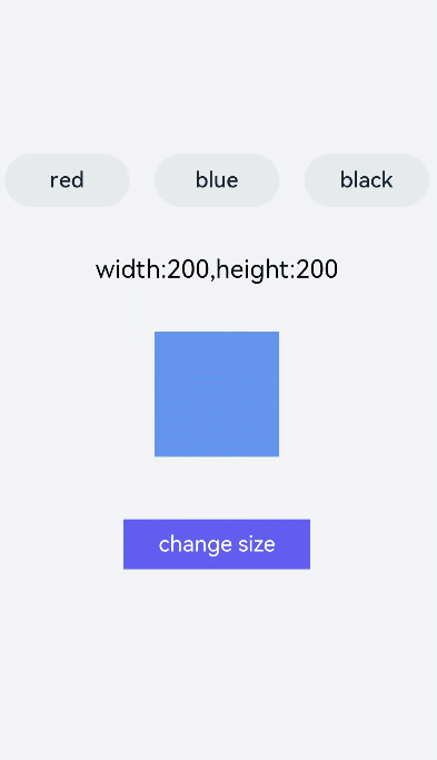
Example Scenario
Click the <toggle> component to change the text color and select the <menu> component to change the size of the gradient color block.
<!-- xxx.hml-->
<div class="container">
    <div class="contentToggle">
        <toggle class="toggle" for="{{item in togglesList}}" onclick="toggleClick({{$idx}})" checked="{{item.checked}}">{{item.name}}</toggle>
    </div>
    <text class="size" style="color: {{color}};">width:{{width}},height:{{height}}</text>
    <div style="width: {{width}}px;height: {{height}}px; background-color: cornflowerblue;"></div>
    <text id="menuId" class="text">change size</text>
    <menu onselected="select" oncancel="cancel" target="menuId">
        <option value="{{item.value}}" for="item in optionList">{{item.text}}</option>
    </menu>
</div>
/* xxx.css */
.container{
  flex-direction: column;
  background-color: #F1F3F5;
  width: 100%;
  justify-content: center;
  align-items: center;
}
.contentToggle{
  width: 100%;
  justify-content: space-around;
}
.toggle{
  padding: 10px;
  height:80px;
  font-size: 35px;
  width: 200px;
  height: 85px;
}
.size{
  width: 100%;
  height: 200px;
  text-align: center;
  font-size: 40px;
  text-align: center;
}
.text{
  width: 300px;
  height: 80px;
  background-color: #615def;
  color: white;
  font-size: 35px;
  text-align: center;
  margin-top: 100px;
}
menu{
  text-color: blue;
  font-size: 35px;
  letter-spacing: 2px;
}
option{
  color: #6a6aef;
  font-size: 30px;
}
// xxx.js
export default {
  data:{
    fresh: false,
    width: 200,
    height: 200,
    color: '',
    optionList:[
      {text:'200 x 200',value:2},
      {text:'300 x 300',value:3},
      {text:'500 x 500',value:5},
    ],
    togglesList:[
      {name:"red", checked:false},
      {name:"blue", checked:false},
      {name: "black", checked:false},
    ],
  },
  toggleClick(index) {
    for(let i=0;i<this.togglesList.length;i++) {
      if (i == index) {
      this.color = this.togglesList[index].name;
      this.togglesList[i].checked = true;
      }else {
        this.togglesList[i].checked = false;
      }
    }
  },
  select(e) {
    this.width = e.value * 100;
    this.height = e.value * 100;
  }
}